Make User-Centered FAQ Pages that Actually Help Your Potential Customers

Make User-Centered FAQ Pages that Actually Help Your Potential Customers

Content Marketing Copywriting UX

Imagine that one of your potential or current customers is desperately seeking help, and they land on your website. They find your FAQ page, scroll through dozens of entries about your “mission” and “values,” but can’t find the simple answer they need.

They leave and go on to the next website, still searching for answers. You’ve lost them.

91% of customers say they’d use an online knowledge base if it met their needs, but most FAQ pages fail them. They’re filled with corporate jargon and questions nobody actually asks.

The problem isn’t that FAQs don’t work—it’s that most companies build them backwards. They write questions they want to answer instead of questions customers actually ask. This guide shows you how to flip that script. You’ll learn exactly how to find the real questions your users are asking, organize them so people can actually find answers, and create an FAQ section that builds trust instead of frustration.

Contents

Source: ThirdEyeDesigners

Why Most FAQ Pages Are Inadequate

Most companies treat their FAQ section as a place to dump corporate talking points. They use it to explain policies that benefit the company, not to solve customer problems.

If your FAQ page isn’t helping people, it’s a waste of time.

The disconnect between company priorities and user needs

When you write “What makes our company special?” instead of “How do I return a damaged item?”, you’re wasting everyone’s time. Customers don’t care about your award-winning customer service philosophy when they’re trying to figure out shipping costs.

67% of customers prefer self-service over speaking to a company representative. They’ll only use self-service if it actually works.

But when your FAQ is full of vague answers and marketing speak, you force people to contact support anyway. That ineffective FAQ page increases your costs and frustrates your customers.

The cost of poor FAQs

Poor FAQs have real business consequences. They lead to:

  • Increased support tickets and calls for simple questions you could’ve answered online
  • Cart abandonment when shoppers can’t find basic information
  • Lost sales because customers give up and go to competitors
  • Damaged credibility when your “Help” section doesn’t actually help

Instead, of thinking about what you want to say, start thinking about what your customers need to know.

How to Find The Questions Your Customers Ask

You don’t need to guess what questions to answer. Your customers are already telling you—you just need to listen. Here’s where to find the real questions that matter.

Mine your customer support tickets and email inquiries

Your support inbox is a goldmine. Every ticket represents a question your FAQ should’ve answered but didn’t.

  • Start by reviewing your last 200 support tickets or inquiries. Look for patterns. You’ll notice the same questions appearing again and again.

    According to customer service data, about 70% of support inquiries fall into just 10 to 15 common question categories. Those repeated questions belong in your FAQ.
  • Pay attention to the exact words customers use. If 10 people ask “Can I change my order after I place it?” that’s an FAQ question.


Check your live chat transcripts

Live chat shows you what confuses people in real-time. Unlike support tickets, chat transcripts capture the moment of confusion. You can see exactly where customers get stuck in their journey.

Review 50 to 100 recent chat sessions or comments. Which pages do people visit where questions come up? If everyone chatting from your pricing page asks the same question, you need to add that to your FAQ.

Analyze your website search data

Your internal search bar tells you what people can’t find on their own. Log into your website analytics and pull up your site search reports.

Listen on social media

People ask questions on social media because they couldn’t find answers on your website. Check your:

  • Facebook and Instagram comments on your posts
  • Twitter mentions and DMs
  • LinkedIn company page comments
  • YouTube video comments if you have a channel

You’ll find questions you never thought to address. Social media gives you unfiltered feedback about what confuses people or what they wish you’d explain better.

Read your product and service reviews

Reviews aren’t just about ratings—they’re full of questions and confusion. Browse your reviews on your site, Amazon, Google, TrustPilot, Yelp, or industry-specific platforms.

Look for reviews that mention confusion or difficulty. Comments like “I wish I’d known this before buying” or “It would be helpful if they explained…” show you missing FAQ topics.

85% of consumers read up to 10 reviews before making a purchase decision, so addressing concerns in your FAQ can directly impact sales.

Talk to your sales and support teams

Your front-line teams hear everything. They know which questions come up daily and which explanations customers struggle to understand.

Schedule monthly FAQ check-ins with these teams. Ask: “What questions did you answer this week that we should add to the FAQ?” They’ll give you specific, actionable insights you can’t get from data alone.

The Best Research Methods to Find User Intent in Searches

Finding questions is step one. You need to understand why people ask them and how they think about their problems.

Set up a tagging system

Create a simple system to categorize every support inquiry. You can use tags like:

  • Pre-purchase questions
  • Shipping and delivery
  • Returns and refunds
  • Account issues
  • Technical problems

Tag at least 100 tickets/emails to find customers’ search patterns. You’ll quickly see which categories generate the most questions. Companies using structured ticket categorization reduced response times by 36%.

Track question frequency in a spreadsheet

Build a simple spreadsheet with columns for:

  • The question (in customer’s words)
  • How many times it appeared
  • Which channel it came from
  • Priority level (high/medium/low)

Update it weekly. Questions that appear 10+ times are high priority for your FAQ. Questions that appear once might not need to be there at all.

Use keyword research tools

Toolbox with different SEO monitoring icons

Tools like Google’s “People Also Ask” feature, Answer the Public, and your SEO platform show you what people search for online.

Enter your main topic and see what questions Google suggests. If Google thinks these questions are important enough to show in search results, they should probably be in your FAQ. Research shows “People Also Ask” (PAA) boxes appear in 85% of Google search results, making them a reliable indicator of common questions.

Run card sorting exercises with real users

Source: Interaction Design

Card sorting helps you understand how people naturally group information.

Test with 5 to 10 people from your target audience. Give your research participants 20 to 30 FAQ topics written on cards (physical or digital). Ask them to organize the cards into groups that make sense to them.

This is a great way to learn how they think about your content. Maybe they group all payment questions together, while you had them scattered across “Billing,” “Subscriptions,” and “Refunds.” Use their mental model to design the structure of your FAQs.

Conduct user testing on your current FAQ

Watch real people try to use your existing FAQ. Give them specific tasks like “Find out how to cancel your subscription” and observe where they struggle.

You can test with just 5 participants to see 85% of usability problems. You’ll see which questions are hard to find, which answers are confusing, and where your organization breaks down.

Write Answers That Actually Help People

Source: VRBO

Finding the right questions matters, but your answers need to deliver. Here’s how to write FAQ answers that people can actually use.

Use your customer’s language

Write like your customers talk, not like your legal team talks. If customers say “cancel,” don’t write “terminate your subscription agreement.” If they say “broken,” don’t write “manufacturing defect.”

Review 10 support tickets and note the exact phrases customers use. Those phrases become your FAQ vocabulary. Plain language improves comprehension. Readers with low literacy skills understand 70% of plain language content compared to just 30% of complex text.

Front-load the answer

Don’t make people read three paragraphs to find what they need. Start with the answer, then add details if needed.

  • Poor: “Our company values customer satisfaction. We’ve designed our return policy with flexibility in mind. After careful consideration of industry standards…”
  • Way Better: “You can return items within 30 days for a full refund. Keep your receipt and original packaging.”

The second version respects your reader’s time.

Keep answers scannable

Source: Ahrefs

Most people scan—they don’t read word by word. Make scanning easy with:

  • Short paragraphs (2-3 sentences max)
  • Bullet points for lists or steps
  • Bold text for key information
  • Clear headers that describe what’s in each section

People only read only 20-28% of words on an average web page. Make those words count.

Include specific examples

Abstract answers create more confusion. Concrete examples make everything clear.

  • Instead of: “Shipping times vary based on your location.”
  • Write: “Shipping takes 2-3 business days within the continental US, 5 to 7 days to Alaska and Hawaii, and 7 to 10 days internationally.”

Numbers, timeframes, and specifics eliminate ambiguity.

Add visuals when they help

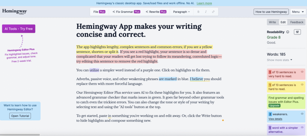
Some answers work better with screenshots, diagrams, or short videos. If you’re explaining how to use a feature, a 30-second video beats 300 words of text.

But only add visuals when they actually clarify something. Don’t add images just for decoration. Every element should have a purpose.

Smart Ways To Organize Your FAQ Architecture

Source: ResearchGate

Even perfect answers won’t help if people can’t find them. Your FAQ structure determines whether users get help or give up.

Group by the customer journey stage

Source: Funnelytics

Organize questions around where customers are in their relationship with you.

Before buying:

  • Pricing and payment options
  • Product features and specifications
  • Shipping and delivery

During use:

  • Getting started guides
  • Common tasks and how-tos
  • Tips for better results

When there’s a problem:

  • Troubleshooting steps
  • Returns and refunds
  • Contacting support

This structure matches how people think. A potential customer doesn’t want to wade through troubleshooting questions. (Someone with a broken product doesn’t care about your payment plans.)

Create clear categories with descriptive names

Your category names should be obvious. Don’t get creative here—clear beats clever.

Clear, intuitive category names:

  • Orders and Shipping
  • Returns and Refunds
  • Account and Billing
  • Technical Support

Unhelpful category names:

  • Getting Started (too vague)
  • Miscellaneous (meaningless)
  • Customer Care (what does this include?)

Clear labeling can improve task completion rates by up to 35%.

Make your search function work hard

Source: SearchStax

Your FAQ search needs to be smart. But building a fancy search function might not be realistic or necessary.

  • If you have fewer than 25 FAQ questions, you probably don’t need search at all. A simple, well-organized page with clear categories and a table of contents at the top works fine. Users can scan and find what they need quickly.
  • If you’re using a website builder like Squarespace, Wix, or WordPress, many come with basic built-in search. Turn it on if you have it, because even simple search is better than none. Most platforms include this feature in their standard plans.
  • For growing solopreneurs with 50+ FAQs, consider these free options:
    • Use your platform’s native search and make sure your FAQ titles include the exact words customers use
    • Add a “jump to section” table of contents at the top of your FAQ page with clickable links (just like this article)
    • Try Algolia’s free tier (up to 10,000 searches per month) if you need something more powerful
    • Use Google Custom Search Engine (free with ads, or $5/month without ads)

Don’t stress about having the “perfect” search experience. A well-organized FAQ with clear headings and a ctrl+F-friendly structure beats a poorly organized FAQ with expensive search any day.

Don’t make everyone scroll to find common questions. Put your top 5 to 10 questions right at the top of your FAQ page where everyone can see them.

Update this list quarterly based on your analytics. The questions people viewed most last month should be prominently displayed.

Technical SEO For Your FAQ Content

Good FAQs help customers. SEO-optimized FAQs help customers find you in the first place.

Source: RankMath

Use FAQ schema markup

Schema markup is code that tells Google “this is a question and answer.” It can make your FAQs appear in search results as rich snippets; those expanded results that show the question and answer right on the Google search page.

Pages with FAQ schema have been shown to get more clicks than regular listings. It’s worth the technical effort or asking your developer to add it.

Structure each question as a heading

Use H2 or H3 (subheading) tags for your questions (the heading above is an H3). This helps screen readers, improves accessibility, and tells search engines these are important questions.

Don’t just bold your questions, use proper heading tags. Search engines pay attention to headings when deciding what your page is about.

Target long-tail keywords

Long-tail keywords are specific phrases people actually search for. “How do I track my order?” is a long-tail keyword. “Tracking” is not.

Write your FAQ questions the way people search. Google Search Console shows you the exact phrases people use to find your site. Use those phrases as your FAQ questions when relevant.

Source: StickyPins

Over 50% of internet queries use voice search to find answers. Voice searches tend to be longer and more conversational than typed searches.

So for your FAQ page, write questions in natural, conversational language that matches how people speak.

Source: Japanese Class

Maintain And Improve Your FAQs Over Time

Your FAQ isn’t a one-and-done project. It needs regular care to stay useful.

Review quarterly

Set a reminder to review your FAQ every three months. Check that:

  • All information is still accurate
  • Links still work
  • Product features haven’t changed
  • Policies are up to date

Nothing destroys trust like outdated information. If your FAQ says “we ship within 24 hours” but you changed that policy six months ago, you’re creating problems instead of solving them.

Source: Powerslides

Add new questions as they emerge

When you get the same question multiple times, add it to your FAQ page ASAP. Keep your FAQ fresh and responsive to current customer needs.

Archive outdated questions

If a question no longer applies, remove it. Don’t leave it there with a note saying “this feature no longer exists.”

Don’t neglect to update your FAQs because old, irrelevant questions make your FAQ harder to navigate. They waste your users’ time sorting through them, and make your business look sloppy.

Track your FAQ metrics

Guy with braids looking at analytics data lightbulb moment

Use analytics to monitor:

  • Which FAQ questions get the most views
  • How long people spend on FAQ pages
  • Whether people contact support after viewing an FAQ
  • Search terms that lead people to your FAQ

If a question gets 1,000 views a month but your bounce rate is 90%, that answer isn’t working. Test a clearer version and see if engagement improves.

Common FAQ Mistakes To Avoid

Even with good intentions, it’s easy to mess up your FAQ. Watch out for these common problems.

Source: RCR Financial

Writing in corporate voice

Your FAQ should sound like a helpful friend, not a legal document. Compare these examples:

  • Corporate: “Upon receipt of your inquiry, our customer success team will endeavor to provide resolution within the timeframe specified in our service level agreement.”
  • Helpful: “We’ll respond to your message within 24 hours on business days.”

The second version is easier to understand and gets to the point.

Making answers too long

If your answer is three paragraphs long, break it into smaller pieces or use bullet points.

Give people the core answer fast, then add details for those who need them.

Using your FAQ as a dumping ground

Just because someone asked a question once doesn’t mean it needs to be in your FAQ. Focus on questions that come up repeatedly. A FAQ with 200 questions helps nobody—it’s too overwhelming to use.

Forgetting mobile users

More than 50% of web traffic comes from mobile devices. If your FAQ is hard to navigate on a phone, you’re failing most of your audience.

Test your FAQ on your phone right now. Can you easily:

  • Scan the categories?
  • Use the search function?
  • Read the answers without zooming?
  • Navigate back to find another question?

If any of these are difficult, you need to fix your mobile design to give customers a better experience.

Wrap Up

Your FAQ page should be one of your hardest-working assets. When built with real user questions and organized around how people actually think, it reduces support costs, builds trust, and helps customers succeed faster.

The key is to stop guessing what people want to know and start listening to what they’re already asking.

Your customers are searching for answers right now. Give them a FAQ page that actually delivers. Your support team will thank you, your customers will trust you more, and your business will benefit from the reduced friction.

The best FAQ pages don’t feel like FAQs at all—they feel like a helpful friend who knows exactly what you need.


References

Customer Effort Is at an All-Time High — Is Search the Key? (2025). Coveo. Retrieved from https://www.coveo.com/en/resources/reports/2025-cx-relevance-report/

Customer Service Benchmark Report. (2025). Freshworks. Retrieved from https://www.freshworks.com/resources/customer-service-benchmark-report-2025/

CX Trends. (2025). Zendesk. Retrieved from https://www.zendesk.com/customer-experience-trends/

From me to we: The rise of the purpose-led brand. (2018). Accenture. Retrieved from https://www.accenture.com/us-en/insights/strategy/brand-purpose/

Hitches, L. (2024). Structured Data for FAQs: Using FAQ Schema for SEO. Lawrence Hitches. Retrieved from https://www.lawrencehitches.com/faq-schema/

How to optimize your Mobile app for voice search in 2025. (2025). Smarther. Retrieved from https://www.smarther.co/blog/how-to-optimize-your-mobile-app-for-voice-search/

Montii, R. (2023). FAQ Schema: A Guide for Beginners. Search Engine Journal. Retrieved for https://www.searchenginejournal.com/schema-markup-guide/faq-schema/

Nielsen, J. (1997). How Users Read on the Web. Nielsen Norman Group. https://www.nngroup.com/articles/how-users-read-on-the-web/

Nielsen, J. (2000). Why You Only Need to Test with 5 Users. Nielsen Norman Group. Retrieved from https://www.nngroup.com/articles/why-you-only-need-to-test-with-5-users/

Paget, S. (2025). Local Consumer Review Survey 2025. BrightLocal. Retrieved from https://www.brightlocal.com/research/local-consumer-review-survey/

Plain Language Guide Series. (n.d.). Center for Plain Language. Retrieved from https://www.plainlanguage.gov/about/definitions/

Scott, E. (2025). Baymard Institute. Retrieved from https://baymard.com/blog/ecommerce-navigation-best-practice/

The Seventh Edition State of Service Report. (2025). Salesforce. Retrieved from https://www.salesforce.com/resources/research-reports/state-of-service/

Contrarian Content Strategy: Stand Out in a Crowded Market

Contrarian Content Strategy: Stand Out in a Crowded Market

Content Marketing

Disclaimer: This article has affiliate links. If you sign up using my links, I may receive a small commission at no cost to you. Thanks for your support.

Are you tired of pouring your energy into creating content, only to hear crickets? You share your expertise, post consistently, and follow all the “best practices,” but your message still gets lost.

The market is oversaturated with low-quality thought leadership. More than half of your potential clients scroll past the very content designed to attract them.

It’s a sea of sameness out there, and most consultants and coaches are drowning in it.

Your expertise is valuable, but it’s ignored because it sounds just like everyone else’s.

In this article I’ll give you a clear framework for a contrarian content strategy that challenges assumptions, builds real authority, and helps you become the only choice for your ideal clients. Forget the generic playbook; it’s time to build a unique perspective that wins attention and converts followers into high-value clients.

Contents

Why Most Thought Leadership Fails to Connect

Before we build a new strategy, we need to understand why the old one is broken. Most content fails not because the author lacks expertise, but because the approach is flawed from the start. It blends in when it needs to stand out.

The sea of sameness

Most content from consultants sounds eerily similar. It’s a mix of recycled quotes, generic tips, and popular opinions that everyone else is already sharing. This creates an “authority gap,” or a space where you’re producing content, but it isn’t building any real authority or trust with your audience. Decision-makers are looking for sharp, original insights, but they are mostly finding bland, repetitive advice.

A 2023 study by Edelman and LinkedIn found that even though 85% of decision-makers believe thought leadership can be a critical tool for vetting a business, only 15% rate the quality of what they consume as “excellent” or “very good.”

This goes to show that clients want valuable insights but rarely find them. Your opportunity is to be part of that top 15%.

Fear of a unique point of view

Why does so much content sound the same? Often, it comes down to fear. Many professionals worry that having a strong, different opinion will alienate potential clients. They stick to safe, agreeable topics to avoid rocking the boat. They post platitudes like “consistency is key” or “culture matters” because no one can argue with them.

But here’s the truth: if no one can disagree with you, no one will remember you either. You want to stop the scroll after all. Playing it safe is the fastest way to become invisible. The very thing you’re afraid of—standing out—is exactly what you need to do to attract the right clients.

I learned this lesson the hard way.

My contrarian experience on LinkedIn

A few years ago, I was posting on LinkedIn multiple times a week, sharing the same productivity tips, the same “Monday motivation,” the same advice everyone else was recycling.

My engagement was dismal. I had 1,200 followers or so, and most of my posts got 8 to 12 likes from the same people.

Source: Dreamstime

Then I took a chance and wrote a post on the premise of, “Stop telling your team to ‘work smarter, not harder.’ It’s lazy advice that helps no one.” I was so nervous, I almost deleted it three times before publishing it.

But within 2 days, that post had 47 comments, where half of them agreed with me, and the other half were furious with me or trolling.

But you know what? I got four DMs from potential clients who said something to the effect of, “Finally, someone gets it.”

That uncomfortable post taught me something crucial: the content that scares you a little is often the content your ideal clients are desperate to find. Some people will be repelled from you, and some people will feel a connection and be more drawn to you, and that’s what you need! But you’ll never know if you keep hiding your contrarian views and unpopular opinions.

Is the customer always right for real?

Consider the marketing industry. For years, the mantra was “the customer is always right.” Bob Hoffman, a writer and speaker known as “The Ad Contrarian,” built his entire brand by challenging that idea. He argues that focusing solely on customer demands can lead to bad business decisions.

His provocative stance has earned him a massive following and established him as a key voice in advertising, proving that a strong viewpoint attracts a loyal tribe.

Don’t play it safe

I get it—taking a stand feels risky, especially when you’re trying to build your business. I once had a colleague tell me, “You’re going to alienate half your potential market.” My response? “Good. I only want to work with the half that thinks like I do.” You WANT people to take sides on your content, not just scroll past your ho-hum content.

What I’ve noticed after working with coaches and consultants is the ones who play it safe don’t just blend in—they actively repel clients. Decision-makers aren’t looking for someone who agrees with everyone. They’re looking for someone who has the confidence to tell them what they need to hear, not what they WANT to hear.

The irony? By trying not to offend anyone, you become forgettable to everyone.

The focus on tactics over substance

The final nail in the coffin for generic content is the obsession with tactics over substance. Social media platforms push new formats daily—carousels, polls, short-form videos—and consultants scramble to keep up. They spend hours designing a perfect-looking carousel but only minutes thinking about the core idea it communicates.

Source: Behance

The format is just the container; the idea is the magic. A weak idea in a fancy package is still a weak idea. A powerful, contrarian idea, even if it’s just plain text, can stop a person mid-scroll and make them think. You need to spend less time worrying about the how (the format) and more time on the what (the message).

According to the Content Marketing Institute’s 2024 report, the most successful B2B marketers are those who prioritize building an audience and providing valuable, substantive content over simply increasing brand awareness through tactical execution. They found that 78% of top performers focus on the audience’s informational needs first and foremost.

If the problem is generic, safe, and tactical content, the answer is to be original, brave, and strategic.

What is a “Contrarian” Content Strategy?

A contrarian strategy is about providing a genuinely unique and valuable perspective that challenges a common belief in your industry.

The core of a contrarian approach

Source: Express Writers

At its heart, a contrarian content strategy involves three simple steps:

  1. Identify a widely held belief in your field (a “sacred cow”).
  2. Present an opposing or different viewpoint based on your unique experience and expertise.
  3. Back up your new perspective with logic, data, stories, or evidence.

Instead of adding another voice to the chorus, you become the person who makes the audience pause and reconsider what they thought they knew. You lead the conversation instead of just participating in it.

Source: Artofit.org

Adam Grant, an organizational psychologist and bestselling author, exemplifies this. In his book Think Again (affiliate link), he champions the idea of “intellectual humility” and argues against the common wisdom of “sticking to your guns.”

His entire platform is built on the contrarian idea that the smartest people are those who are constantly questioning their own beliefs. This approach has made him one of the most influential thought leaders in his field.

The benefits of a differentiated position

When you bravely adopt a contrarian view, you immediately separate yourself from the competition. This differentiation comes with powerful business benefits that go far beyond just getting more likes on a post, because you:

  • Attract higher-quality clients: People who resonate with your unique perspective are more likely to be your ideal clients. They aren’t just looking for any service provider; they are looking for your specific approach.
  • Command higher fees: A unique point of view creates a category of one. When you’re the only person who does what you do in the way you do it, you’re no longer a commodity. This gives you pricing power.
  • Build a memorable brand: People forget generic advice. They remember bold ideas that challenge them. Your contrarian stance becomes your brand’s signature.

Customers don’t just buy a service; they buy a unique perspective and the results it promises.

A Framework to Build Your Contrarian Content

Developing your contrarian voice is a repeatable process. You don’t need to wait for a lightning bolt of inspiration. You just need a framework to help you mine your own expertise for the gold that’s already there.

Identify the industry’s sacred cows

Source: Inc.com

Every industry has “sacred cows,” or ideas that are repeated so often they are accepted as fact without question. Your first job is to find them. These are your greatest opportunities.

Ask yourself these questions to start brainstorming:

  • What common advice in my field do I secretly disagree with?
  • What are clients constantly told to do that rarely works?
  • What popular trend do I think is a complete waste of time?
  • What “best practice” is actually just a common practice, not the best one?

A leadership coach might write down: “The belief that leaders should always have an open-door policy.”

Make a list of at least 10 ideas, and don’t filter yourself—this is for your eyes only.

In the world of project management, the dominant belief for years was that detailed, long-term planning (the “waterfall” method) was the key to success. Then a group of software developers introduced the “Agile Manifesto,” a contrarian document that argued for flexibility, collaboration, and responding to change over following a rigid plan.

This contrarian view has since become a dominant methodology, creating an entire industry of Agile coaches and consultants.

Develop your unique perspective

Source: Six Catalysts

Once you have your sacred cow, your next step is to build the case against it. You can’t just say, “That’s wrong.” You have to explain why it’s wrong and present a better alternative to establish your credibility.

Let’s use our example: “The belief that leaders should always have an open-door policy is flawed”:

  • Your contrarian argument could be: “An always-open door policy destroys a leader’s productivity, encourages dependency in their team, and prevents them from doing the deep strategic work they were hired to do.”
  • Your better alternative: “I propose a ‘structured access’ policy, where leaders schedule specific, predictable office hours. This respects the leader’s time while still ensuring the team feels supported.”

Your argument must be backed by evidence. Use your own client stories, data you’ve collected, or industry statistics to support your new way of thinking.

The University of California in Irvine found that it takes an average of 23 minutes and 15 seconds to get back on track after being interrupted.

Turn burnout into reclaimed time

Source: Eroppa

I developed my version of this framework after watching a executive coaching client burn out. She was brilliant, but her open-door policy meant she was managing everyone else’s crises instead of leading them.

When I suggested that she limit her access to scheduled time blocks, she was horrified. “Won’t my team think I don’t care?”

But we went ahead and tested it for a month. And you know what? Her team didn’t just survive—they thrived. They started solving problems on their own, and she reclaimed 15 hours a week for strategic thinking. Six months later, she got promoted. I’m really proud of her “glow up.”

That experience taught me that most sacred cows exist because no one bothered to question them with data.

Your job isn’t to be controversial for controversy’s sake—it’s to share what you’ve actually seen work in the real world.

A leader with a constantly open door is living in a state of perpetual interruption, which directly harms their effectiveness. You can use data like this to give your argument weight.

Create your content pillars

Source: Elevated Education

One contrarian idea is powerful, but it shouldn’t be a one-off post. You can turn your core contrarian viewpoint into three to five content pillars, which are the main themes you’ll talk about over and over again from a different angle each time.

Let’s stick with our “open-door policy” example. Your content pillars could be:

  • Pillar 1: The Myth of Constant Accessibility (productivity, deep work, and the role of a leader).
  • Pillar 2: Fostering Team Independence (empowerment, delegation, and building self-sufficient teams).
  • Pillar 3: The Structured Access Framework (explaining your specific methodology, office hours, and communication protocols).

Content pillars give your content strategy structure and consistency. Your audience will begin to associate you with this big idea, and you’ll never run out of things to say.

HubSpot, a leader in content marketing, built its empire on this pillar strategy. Their core idea was “Inbound Marketing,” a contrarian alternative to interruptive “Outbound Marketing.” All of their content, including blogs, videos, and courses, is organized around pillars that support this central theme (SEO, blogging, and social media).

With a solid framework in place, it’s time to take your message to the world.

Put Your Strategy Into Action on LinkedIn

Source: Dripify

LinkedIn is the perfect platform for this strategy. It’s a professional network where decision-makers are actively looking for insightful ideas that can help them solve their problems.

How to structure a contrarian post

Your post needs to grab attention and guide the reader through your logic quickly. Here is a simple, effective structure you can use as a template:

  • The Hook (Challenge the Norm): Start by stating the common belief.
    Example: “Everyone says leaders need an open-door policy.”
  • The Turn (Introduce Your View): State your contrarian opinion directly.
    Example: “I think that’s terrible advice. Here’s why.”
  • The Reasoning (Explain Your ‘Why’): Use 2 to 3 bullet points or short paragraphs to explain your logic, and back it up with a quick story, data point, or personal experience.
    Example: “It kills your productivity, creates a dependent team, and stops you from thinking strategically.”
  • The New Way (Offer Your Solution): Briefly present your alternative.
    Example: “Instead, I teach my clients the ‘structured access’ method…”
  • The CTA (Engage Your Audience): End with a question to encourage discussion.
    Example: “What’s your take? Is the open-door policy overrated?”

Using this structure will help you stop the scroll and start a conversation.

How I figured out this structure

My first contrarian post followed this structure by accident. I was just frustrated and ranting. But when I look back at which posts drove the most meaningful conversations and client inquiries, they all followed this pattern without me realizing it.

The key is the turning point—that moment where you challenge conventional wisdom. It should feel a little uncomfortable to write. If you’re typing it and thinking, “Can I really say this?,” then that’s usually a sign you’re onto something valuable.

The role of storytelling

Source: Telemark

Data and logic are important, but stories are what make your ideas stick.

People connect with people. When you share a personal experience or a client case study that demonstrates your contrarian point, you make your argument more relatable and trustworthy.

Instead of just saying that an open-door policy harms productivity, tell a short story about a client who was working 70-hour weeks, felt constantly behind, and was on the verge of burnout. Then explain how implementing your structured method or framework helped them cut their workweek by 20 hours while their team became more effective.

When you wrap your contrarian idea in a compelling narrative, you’re not just making a point; you’re making it unforgettable.

How to handle disagreement, push back, and build authority with discussion

Source: Elora Consulting

When you take a strong stand, you will get some pushback. This is a good thing! It means people are paying attention.

Disagreement is not a threat; it’s an opportunity to deepen the conversation and further establish your expertise. Here’s how to manage it:

  • Acknowledge and Validate: Start by showing you understand their point. (“That’s a great point,” or “I can see why you’d think that.”)
  • Reinforce Your Position Calmly: Don’t get defensive. Restate your perspective and explain your reasoning again, perhaps in a slightly different way.
  • Ask Questions: Turn the discussion back to them. (“What has your experience been with this?”)

By handling disagreements with grace, you show that you’re a confident, thoughtful leader, not a troublemaker trying to provoke arguments. This builds tremendous trust with everyone who’s watching (even LinkedIn lurkers).

Your Contrarian Content Action Plan

Source: Fractal Enlightenment

You now understand why a contrarian strategy works and what it looks like. But understanding something and doing it are two different things.

This section gives you the roadmap you need to implement your contrarian content strategy in the next 30 days. Let’s go!

Your first week: Finding your contrarian angle

So many coaches and consultants make the mistake of trying to find the “perfect” contrarian idea before they start.

Perfect doesn’t exist. Done beats perfect every time. (And I’m a perfectionist saying this!)

Source: Vecteezy

Days 1 and 2: The Sacred Cow Brainstorm

Set a timer for 15 minutes and complete these prompts without editing yourself:

  • “Everyone in my industry says ________, but I actually believe ________.”
  • “Clients come to me believing ________, and I have to undo that thinking.”
  • “The advice that makes me roll my eyes is ________.”
  • “If I could change one thing about how my industry operates, it would be ________.”

You should have at least 10 ideas. But don’t overthink this—write down everything, even if it feels obvious or small.

Day 3: The Validation Test

Look at your list and ask these three questions about each idea:

Source: ESIC University
  1. Do I have evidence? (client stories, data, personal experience)
  2. Would someone disagree with me? (if everyone would nod along, it’s not contrarian enough)
  3. Does this connect to a real problem my clients face? (intellectual debates don’t build businesses)

Circle the 2 to 3 ideas that get “yes” to all three questions.

Days 4 and 5: Build Your Argument

Pick your strongest idea and write out:

  • The conventional wisdom: “Most people believe…”
  • Why it’s wrong: “Here’s the problem with that…”
  • Your alternative: “Instead, I recommend…”
  • The proof: “I’ve seen this work when…” (specific story or data)

Don’t write a polished post yet—just get your thinking on paper. This is your foundation.

If you need help refining your overall content approach, my article on creating a content strategy as a solopreneur walks through how your contrarian angle fits into your broader positioning.

Days 6 and 7: Draft Your First Post

Use the structure from earlier in this article: LINK TO How to structure a contrarian post

  • Hook: State the common belief (2-3 sentences)
  • Turn: Challenge it directly (1 sentence)
  • Reasoning: Explain why with 2-3 points (3-5 sentences)
  • New Way: Present your alternative (2-3 sentences)
  • CTA: Ask a question to engage readers

Keep it under 300 words for your first attempt. You can always expand later.

Week 2 through 4: Publishing and refining your approach

Source: Pngtree

Week 2: Publish and Learn

Post your contrarian content on LinkedIn on a day when you can monitor comments for the first 2 to 3 hours after publishing. (Early engagement signals to LinkedIn’s algorithm that your post is valuable.)

When people comment—especially when they disagree—respond within the first hour if possible. Use the framework from earlier: Acknowledge → Reinforce → Ask.

Track what happens:

  • How many comments? (Any post with 10+ comments is winning)
  • How many shares or DMs?
  • What specific objections came up?
  • Did anyone say “I needed to hear this” or similar?

These answers tell you if you’ve struck a nerve.

Week 3: Develop Your Content Pillars

Once you’ve validated your core contrarian idea with your first post, expand it into 3-5 content pillars (see the framework section earlier). Each pillar should be a sub-theme you can explore in multiple posts.

For detailed guidance on building content pillars that showcase your expertise, see my article on making your invisible expertise tangible.

Week 4: Build Your Content Calendar

Here’s the realistic approach I recommend for busy consultants:

  • 2 posts per week: Make one contrarian/thought-provoking, one educational/helpful.
  • 1 engagement day per week: Spend 30 minutes commenting thoughtfully on others’ posts in your field.
  • 1 monthly deep-dive: Turn your contrarian idea into a longer article or newsletter.

This cadence is sustainable and effective. For more on maintaining consistency without burning out, check out my article on why 99% of coaches and consultants fail at content consistency.

What success actually looks like (and when to expect it)

Source: Motion

Let’s set realistic expectations. Contrarian content works, but not overnight. Consistency matters.

In your first month, look for:

  • Engagement quality over quantity: A post with 15 thoughtful comments is more valuable than a post with 100 generic or AI-driven “great post!” comments.
  • The right kind of disagreement: If people are engaging with your ideas, even to disagree, you’re creating conversation.
  • Direct messages: When people send you DMs like “this resonates with me” or “I’ve been thinking the same thing,” you’re attracting your tribe.
  • Profile views: Check if more people are clicking through to learn about you after reading your contrarian posts

In months 2 to 3, expect:

  • Recognition: People start associating you with your specific viewpoint.
  • Invitations: Speaking opportunities, podcast interviews, or collaboration requests based on your unique angle.
  • Client conversations: Prospects mention your content in discovery calls (“I saw your post about X and thought…”).
  • Less effort, more impact: Your contrarian angle becomes second nature because you’re not forcing it.

The main metrics you should care about:

Forget vanity metrics like follower count or total likes. Focus on:

  • Inbound inquiries from ideal clients
  • Meeting requests or DMs asking for advice
  • Content attribution in sales calls (“I’ve been following your content and…”)
  • Speaking/writing opportunities based on your specific viewpoint

Consider amplifying your contrarian content through a LinkedIn newsletter. My guide on lead generation using LinkedIn newsletters shows you how to build a subscriber base around your unique perspective.

Common questions (and honest answers)

Source: Marin County Management Employee’s Association (MCMEA)

“What if my contrarian view is wrong?”

First, if you have evidence (client results, personal experience, data), it’s not “wrong”—it’s your informed perspective. Second, being willing to say “I was wrong” or “I’ve updated my thinking” actually builds credibility. Adam Grant built his entire brand on intellectual humility and changing his mind based on new evidence.

The only truly wrong approach is pretending to have all the answers and never evolving.

“What if I lose potential clients by having a strong opinion?”

You will, and that’s the point.

I’ve had people unfollow me after reading my content. I’ve had prospects tell me they went with someone else because they “didn’t agree with my approach.” But I’m not mad at that, because every single time, it saved both of us from wasting time in a bad-fit engagement.

Meanwhile, the clients who do hire you will already trust your methods before a sales conversation. The close rate will be higher, the projects will be smoother, and the relationships will last longer because they already know where you stand.

“How controversial should I be?”

There’s a difference between contrarian and combative. Your goal is to challenge ideas, not attack people. Ask yourself:

  • Am I trying to help my audience think differently, or am I just trying to get attention?
  • Can I defend this position with evidence and experience?
  • Am I being respectfully provocative or needlessly offensive?

If your contrarian stance comes from genuine expertise and a desire to serve your clients better, you’re in the right place.

“What if no one engages with my contrarian content?”

It happens, especially early on. Here’s what to check:

  • Is it actually contrarian? If everyone nods along, it’s not challenging enough.
  • Is it relevant? Contrarian for its own sake doesn’t work; it must connect to a problem your audience faces.
  • Are you engaging? LinkedIn rewards accounts that engage with others. Spend 15 minutes before and after posting commenting on others’ content.
  • Did you post at a dead time? Tuesday to Thursday, 7 to 9 AM or 12 to 1 PM in your timezone typically perform better.

Wait until you publish at least 5 to 7 posts before judging whether the approach is working. The first few are about finding your voice and testing what resonates.

“Can I mix contrarian content with other types of posts?”

Absolutely, and you should! A feed that’s 100% controversial gets exhausting. I recommend a variety of types:

  • 60% educational/helpful posts where you give value (tactical advice, how-tos, frameworks)
  • 30% contrarian/thought-provoking (challenging assumptions, offering new perspectives)
  • 10% personal (stories, behind-the-scenes, failures and lessons)

This mix builds trust while keeping your unique perspective front and center. For a comprehensive approach to content variety and quality, see my article on creating consistent high-quality content.

Your content creation process (start here)

Here’s a workflow you can adapt that takes about 90 minutes per week.

Monday morning (30 minutes):

  • Review which of my content pillars I haven’t posted about recently
  • Choose one specific angle or story
  • Draft a rough outline (Hook, Turn, Reasoning, New Way, CTA)

Tuesday morning (30 minutes):

  • Write the full post
  • Read it out loud (if it sounds stiff, simplify)
  • Edit ruthlessly—cut at least 20%

Wednesday morning (10 minutes):

  • Final review and post
  • Respond to early comments immediately

Wednesday afternoon and Thursday (20 minutes):

  • Continue engaging with comments
  • Share interesting discussion points in new comments

This method is sustainable, repeatable, and effective.


It’s Time to Change the Conversation

Source: Dreamstime

A contrarian content strategy is the way to move to your next level of growth and impact. So stop contributing to the noise. The most successful consultants and coaches don’t add to the conversation—they change it.

When you challenge the status quo with a well-reasoned, unique perspective, you build true authority, attract your ideal clients, and create a brand that is impossible to ignore. You stop being just another option, and become the only logical choice.

So, which common belief in your industry are you ready to challenge first? Your audience is waiting for your unique point of view.


References

Beck, K., et al. (2001). Manifesto for Agile Software Development. Agile Alliance. Retrieved from https://agilemanifesto.org/

Dishman, L. (2024). If you’re struggling to find focus after vacation, read this. Fast Company. Retrieved from https://www.fastcompany.com/91146223/if-youre-struggling-to-find-focus-after-vacation-read-this

Edelman & LinkedIn. (2024). LinkedIn B2BThought Leadership Impact Report. Edelman. Retrieved from https://www.edelman.com/expertise/Business-Marketing/2024-b2b-thought-leadership-report/

Hoffman, B. (2021). How Adtech Helped To Radicalize the US. The Ad Contrarian. Retrieved from https://adcontrarian.blogspot.com/

HubSpot. (n.d.). “What Is Inbound Marketing?” Retrieved from https://www.hubspot.com/inbound-marketing

Stahl, S. (2024). B2B Content Marketing Benchmarks, Budgets, and Trends: Insights for 2025. Content Marketing Institute. Retrieved from https://contentmarketinginstitute.com/b2b-research/b2b-content-marketing-trends-research

Why 99% of Coaches and Consultants Fail at Content Consistency, and How to Fix It

Content Marketing

Disclaimer: This article has affiliate links. If you sign up using my links, I may receive a small commission at no cost to you. Thanks for your support.

Out of over 260 million monthly active users on LinkedIn, only 3 million share content every week.

That means only 1% of LinkedIn users post content weekly.

Coaches and consultants know content matters, but they treat content creation like a side project instead of a core business function.

But you don’t need to be a content machine. You need a system.

This guide breaks down why most consultants fail at content consistency and provides actionable strategies to build a sustainable content calendar that actually works for your business.

Contents

The 99% on LinkedIn

There’s a massive gap between content consumers and content creators on social platforms. According to recent LinkedIn data, approximately 1% of users create content regularly, while the remaining 99% primarily consume without contributing.

This pattern is true across most social platforms, but it’s especially pronounced on LinkedIn, where professionals often hesitate to share publicly.

Most start strong, posting daily for a week or two, then vanish for months. But this pattern kills momentum, confuses your audience, and wastes the effort you already invested.

The consumption vs. creation gap on social platforms

Source: Web FX

Think about how you use LinkedIn. How many posts do you read versus how many you actually publish? If you’re like most consultants and coaches, you probably scroll through dozens of posts each week, but only share something once a month—if that. So you’re a lurker.

While 99% scroll, consume, and disappear into the feed, a tiny fraction actually shows up consistently. For consultants and coaches, this isn’t just a social media statistic—it’s a business survival issue. Without consistent content, you’re invisible. Without visibility, you have no pipeline.

A massive opportunity for solopreneurs who commit to consistency

Your competition isn’t posting either. When you commit to showing up consistently, you automatically stand out. You become the visible expert in your field while your competitors remain invisible. 80% of B2B leads generated on social media come from LinkedIn, making it a critical platform for consultants seeking new business.

Let’s take the example of a leadership coach who increased her inbound consultation requests by 340% after committing to posting 3 times a week for 6 months.

She didn’t go viral, but she didn’t need to. Just by staying consistent, she became the go-to expert in her niche of helping tech executives improve team communication.

The compounding effect of being in the visible 1% over time

Source: Startup Talky

Content works like compound interest:

  • Your first post might reach 200 people.
  • Your 10th post reaches those same 200 people plus new connections.
  • By post #50, your network has expanded, and past posts continue generating conversations.

The LinkedIn algorithm rewards this behavior by showing your content to more people over time.

Creators who post at least once per week for 20 weeks or more achieve engagement rates that are 4.5 times higher per post compared to those who post less consistently, according to 2025 social media marketing research.

Why Consultants and Coaches Struggle With Content Creation

Source: Dion Marketing

You know content matters. So why is it so hard to actually do it? The barriers facing consultants and coaches are both practical and psychological.

The “expert’s curse”: waiting for perfect insights instead of sharing practical value

As a consultant or coach, you’ve spent years building expertise. This expertise becomes a trap when you believe every post needs to be groundbreaking. You think, “Everyone already knows this” or “This isn’t profound enough to share.”

Wrong. Your audience doesn’t need groundbreaking info, they need useful info.

That simple framework you use with every client? Your audience hasn’t heard it.

That basic mistake you see prospects make repeatedly? Worth sharing.

Time scarcity and prioritizing client work over business development

Source: Motion

You spend all your time serving current clients, leaving no time to attract future clients. It feels responsible. You’re honoring your commitments. But you’re also starving your pipeline.

Business professionals often struggle with time allocation, particularly around non-billable tasks that may include content creation.

The time exists. The prioritization doesn’t.

Fear of judgment from peers and potential clients

What will other consultants in your field think? What if a prospect sees your post and thinks it’s basic? What if you’re wrong about something? These fears paralyze otherwise confident professionals.

Career coach Dhairya Gangwani built an audience of over 100,000 followers on LinkedIn by consistently sharing straightforward career advice. She posts encouraging content and relatable stories that make an instant connection with her audience of other professionals seeking career guidance. Her consistent posting schedule helped her transform over 10,000 careers through her coaching practice.

Don’t worry about sounding “stupid.” Your peers aren’t your target audience, so it doesn’t matter what they think.

Lack of a clear content strategy or messaging framework

You sit down to write a post and stare at a blank screen. What should you talk about? Who are you even writing for? Without a clear content strategy, every post becomes an existential crisis.

A 2025 Content Marketing Institute study found that 58% of B2B marketers rate their content strategy as merely “moderately effective,” with nearly half saying their strategy struggles because they lack clear goals.

The Real Business Cost of Content Inconsistency

Inconsistent posting doesn’t just mean fewer likes. No content equals no inbound opportunities.

Irregular posting confuses your audience about your expertise

Woman checking her fitness watch
Source: Styled Stock Society

Imagine hiring a fitness coach who posts workout tips for two weeks, disappears for a month, returns with nutrition advice, vanishes again, then suddenly shares posts about mindfulness. It makes you wonder, ‘What does this person actually do?’

Your audience faces the same confusion when your content lacks consistency.

You lose trust and credibility when you disappear for weeks or longer

Trust requires consistency. When you post regularly for a few weeks then disappear, your audience questions your reliability. If you can’t maintain a simple posting schedule, how will you handle their complex business challenges?

Research examining over 100,000 social media users found that the most consistent posters received 5x more engagement—likes, comments, and shares—per post than users who posted inconsistently.

This applies equally to personal brands built by consultants and coaches.

It’s simple math. If each post reaches 500 people and generates one meaningful conversation, posting once per month gives you 12 conversations per year. Posting three times per week gives you 156 conversations per year. Which scenario builds a better business?

Build a Sustainable Content Calendar System

Source: Holly Bray

Systems beat motivation every time. You need a content calendar that works with your schedule, not against it.

The batch creation method: produce multiple posts in single-focused sessions

Stop trying to create content daily. Batch creation means sitting down once or twice per month to create weeks of content at once. This approach reduces decision fatigue and improves quality because you’re creating in a focused, creative state rather than squeezing posts between client calls.

Content batching saves time and mental energy by allowing creators to set aside dedicated blocks of time to create bulk content instead of spending hours every day brainstorming and producing individual pieces.

Example: A leadership consultant who dedicates every second Friday afternoon to content creation can create 15 to 20 posts within three hours. He schedules them throughout the month and rarely thinks about content between those sessions. This system is a great way to maintain consistency.

How to identify your core content pillars based on client problems

Source: Brew Interactive

Your content pillars should mirror the problems you solve for clients:

  • Sales coaches: prospecting, objection handling, closing techniques, and sales mindset.
  • Productivity consultants: time management, focus strategies, systems thinking, and leadership efficiency.

Start by listing the 5 most common problems your clients hire you to solve. These become your content pillars. Every post should fit into one of these buckets. This framework eliminates the “what should I post about” paralysis.

Weekly versus monthly planning

Monthly planning works best for batch creators who want to front-load their content work. Weekly planning suits consultants with unpredictable schedules who prefer shorter planning sessions. There’s no wrong choice—only what you’ll actually stick with.

Consider a career coach who tried monthly planning and found it overwhelming at first. Then she switched to Sunday afternoon planning sessions where she outlines 3 posts for the week.

This kind of commitment can reduce your anxiety and improve consistency.

Time-blocking strategies to protect content creation hours

Content creation won’t happen in your “spare time” because spare time doesn’t exist. Block specific hours in your calendar and treat them like client appointments. During these blocks, close email, silence your phone, and focus only on creating.

People who use time-blocking techniques complete creative tasks more efficiently than those who try to “fit them in” throughout the day, with focused time producing both higher quality and greater efficiency.

Batch Content Creation Strategies That Actually Work

Knowing you should batch create and actually doing it effectively are two different things. Here’s how to make batching work.

The power of dedicated creation days vs. only posting when you feel like it

Source: Planly

Choose one day per month as your content creation day. Clear your calendar. Go to a coffee shop or library if your office has too many distractions. Bring your content pillar list and a simple template. Spend 3-4 hours creating.

If you need to get away from distractions, consider doing your content creation as part of a mini-retreat. Just book a hotel conference room or a study room at the library once a month, and batch-create a month’s worth of content in a single session.

Generate 30 days of content ideas in one planning session

Use this simple exercise:

  1. List your five content pillars across the top of a page.
  2. Under each pillar, write three common client questions. That’s 15 post ideas.
  3. Now add three mistakes you see prospects make. That’s 30 ideas total.

This exercise takes 20 minutes and gives you a month of content.

Another variation on this is to:

  1. Review the past month’s client calls (you should record them or take notes).
  2. Pinpoint one lesson from each session.
  3. Use those insights to make the next month’s content.

Voice-to-text methods for consultants who hate writing

Source: Nordic APIs

Hate writing? Stop writing, and talk instead.

Use your phone’s voice-to-text feature to record your thoughts as if you’re explaining a concept to a client. Clean up the transcript, and you have a post.

You could record 10-minute voice memos during your morning routine, say, when you’re on a walk. Speak about one topic per recording, send the audio to a transcription app (like Otter.ai), and later you can edit the transcript into 3 or 4 posts. That’s a week’s content during your daily routine.

Repurpose client conversations into valuable content pieces

Source: Styled Stock Society

Your client conversations are content goldmines. After a coaching session where you helped a client work through a challenge, write a post about the general principle you applied (without identifying details). The problem was real, your solution worked, and now you have authentic content.

Keep a “content journal” with notes about interesting client situations immediately after their calls:

  • Record the problem
  • Your approach
  • The outcome

This journal can provide 5 to 10 post ideas per week based on real consulting work.

Use frameworks and templates to maintain quality AND increase speed

Templates provide structure without limiting creativity.

Create 3 to 5 post templates and cycle through them. One template might be “Problem → Insight → Solution.” Another could be “3 mistakes [target audience] make with [topic].”

You could do Monday posts using a “client win story” template. Wednesday posts could be about a “common objection breakdown” using another specific template. Friday posts could follow a “tactical tip” format.

This structure makes creation faster while keeping content varied.

Overcome the Psychological Barriers to Posting

Your biggest content barrier isn’t time or skill. It’s the voice in your head saying your content isn’t good enough.

Reframe “No One Cares” thoughts into reality checks

Source: Styled Stock Society

When you think “no one cares about this,” you’re usually wrong. That thought reflects your fear, not reality. Reframe it: “Some people will find this valuable, and I’m sharing it for them, not for everyone.”

The compound interest of content: early posts build future success

Your 10th post won’t go viral, and that’s fine. Your 100th post benefits from the foundation your first ninety posts created.

Think long-term. Each post is a brick in your visible expert foundation.

Separate self-worth from post-performance metrics

Source: Blue Space Consulting

A post with 5 likes isn’t a failure. A post with 500 likes isn’t a success. The only metrics that matter for your business are conversations started and clients acquired. Everything else is noise.

Imagine an executive coach who received only 8 likes on a post about meeting management. Three of those likes led to DM conversations. One conversation led to a $45,000 coaching contract.

Wouldn’t you rather make a “low-performing” post that generates business, instead of just likes?

Reduce perfectionism and ship imperfect content

Done is better than perfect. Your audience doesn’t expect perfection. They expect authenticity and value. Give yourself permission to publish “good enough” content. You can always refine your approach based on what resonates.

Measure What Matters in Your Content Strategy

Tracking the right metrics tells you what’s working. Tracking the wrong metrics wastes time and creates false anxiety.

Move beyond vanity metrics like likes and follows

Source: Vecteezy

Likes feel good but don’t pay bills. Focus on leading indicators of business growth: profile views, connection requests from ideal clients, direct messages, consultation requests, and actual revenue from content-driven relationships.

Track consultation requests and meaningful conversations

Source: Templates.net

Create a simple spreadsheet with columns for date, post topic, meaningful conversations started, and consultation requests received. Review this monthly. You’ll quickly identify which content types drive business results versus which generate empty engagement.

Example: A business coach tracked her posts and saw that her “unpopular” tactical how-to posts generated 3X more consultation requests than her “popular” inspirational posts. This data completely changed her content strategy and doubled her client acquisition rate.

Monitor which content types drive actual business results

Not all content serves the same purpose:

  • Educational content builds trust.
  • Storytelling content builds connection.
  • Opinion content builds authority.
  • Case studies drives decisions and share social proof.

B2B decision-makers are more likely to engage with educational content than promotional content, while case study content is significantly more likely to lead to direct outreach.

Track which types move people toward working with you.

Use LinkedIn analytics to understand your audience better

LinkedIn provides free analytics showing who views your content, when they’re most active, and what topics resonate. Check your analytics monthly. Look for patterns in which posts reach your target audience versus posts that reach random connections.

The 90-day consistency test: commit before judging results

Judging results after a few weeks or even a month is premature.

Commit to 90 days of consistent posting before evaluating whether content “works” for your business. This timeframe allows the algorithm to recognize your consistency, your audience to grow, and compound effects to materialize.

Tools and Resources to Maintain Consistency

The right tools remove friction from content creation and scheduling.

Content scheduling platforms that save time and mental energy

Tools like Buffer, Hootsuite, or LinkedIn’s native scheduler let you create content once and schedule it for optimal posting times. This separation between creation and publishing reduces daily content stress.

AI assistance for ideation without sacrificing authenticity

AI logos with optimized QA page online

Most marketers use generative AI for social media content creation, with adoption rates climbing significantly compared to previous years. However, 55% of consumers say they’re more likely to trust brands that are committed to publishing content created by humans versus AI.

Here’s an example:

  • You could use AI to generate 5 topic ideas based on your content pillars.
  • Pick one idea, record a voice memo with your perspective, and use AI again to structure her thoughts into a post.
  • This hybrid approach speeds up creation while preserving her authentic voice.

AI tools can help generate topic ideas, create first drafts, or reframe your thoughts. Use AI as a starting point, not a replacement for your voice. Your unique insights and client experiences are what make your content valuable.

Note-taking apps to capture ideas throughout your week

Ideas strike at random times. Use a note-taking app like Notion, Evernote, or Apple Notes to capture content ideas whenever they occur.

Tag them by content pillar, or record a quick voice note. Then when it’s time to batch create your content, you’ll have a library of ideas ready.

Simple spreadsheet systems for tracking your content calendar

A basic spreadsheet with columns for date, topic, content pillar, and status (drafted/scheduled/posted) keeps you organized. Add columns for engagement metrics and business outcomes if you want deeper tracking.

Join the 1% Who Show Up Consistently

99% of consultants and coaches treat content as an afterthought, but you can choose to be in the 1% who show up consistently. The difference between consultants who struggle and those who thrive often comes down to visibility. Consistent content creates that visibility.

You don’t need complicated funnels or viral ads. You need a system that fits your life, protects your time, and delivers valuable insights to your audience week after week.

Start simple: pick two days per week to post. Batch create content in focused sessions. Use templates to speed up production. Track what drives real conversations, not just vanity metrics.

The consultants and coaches winning in today’s market aren’t necessarily smarter or more talented. They’re simply more consistent.

Life coach Dipanshu Rawal built a six-figure coaching business and grew to nearly 30,000 LinkedIn followers through consistent, authentic content creation. His engaging posts, relatable stories, and fun-to-read “About” section helped him impact thousands of coaches and clients. He helps coaches grow their businesses and posts encouraging content that creates instant connections with his audience.

Join the 1%. Your future clients are waiting for you to show up.


References

Aslam, S. (2024). 90 LinkedIn Statistics You Need to Know in 2025. Omnicore Agency. Retrieved from https://www.omnicoreagency.com/linkedin-statistics/

Bellani, S. (2025). LinkedIn Marketing Strategy for Coaches 101. Simply.Coach. Retrieved from https://simply.coach/blog/linkedin-marketing-for-coaches-101/

Content Marketing Institute. (2025). B2B Content Marketing Benchmarks, Budgets, and Trends: Outlook for 2025. Retrieved from https://contentmarketinginstitute.com/b2b-research/b2b-content-marketing-trends-research

Hofstedt, M. (2025). How social media consistency builds unstoppable results. Storykit. Retrieved from https://storykit.io/blog/social-media-consistency

Karl. (2025). 130+ Social Media Marketing Statistics for 2025. DreamGrow. Retrieved from https://www.dreamgrow.com/21-social-media-marketing-statistics/

Osman, M. (2025). Mind-Blowing LinkedIn Statistics and Facts. Kinsta. Retrieved from https://kinsta.com/blog/linkedin-statistics/

Schieren, M. (2025). The state of social media in 2025: Data from Sprout’s latest pulse surveys. Sprout Social. Retrieved from https://sproutsocial.com/insights/the-state-of-social-media/

Simply.Coach. (2025). Effective LinkedIn Marketing Strategies for Your Coaching Business. Retrieved from https://simply.coach/blog/linkedin-marketing-strategies-for-coaching-business/

Do You Have Invisible Expertise? Showcase Your Professional Expertise and Make Your Knowledge Tangible Through Content

Do You Have Invisible Expertise? Showcase Your Professional Expertise and Make Your Knowledge Tangible Through Content

Content Marketing

Disclaimer: A few photos in this article have affiliate links. So if you sign up for Canva or Styled Stock Society using my links, I may receive a small commission at no cost to you. Thanks for your support.

You’ve spent years, even decades, honing your craft. As a consultant, coach, or voice actor, you’ve developed deep expertise that shifts your clients’ businesses and projects in the best way possible.

Yet, when someone asks “What exactly do you do?” or “Why should I hire you over someone charging half as much?,” you struggle to convey the full value of what you bring to the table.

The harder you’ve worked to develop sophisticated skills, the more difficult it becomes to communicate their value to those who need them most. Your expertise has become so natural that you can’t explain it. Meanwhile, less experienced competitors win clients with flashy websites and bold promises.

The problem isn’t your skills. It’s that nobody can see what makes you special. Your knowledge stays locked in your head while prospects compare you to cheaper options.

This “invisible expertise” is a problem costing solopreneurs like you thousands in profit every month. But what if you could show prospects exactly how you think? What if they could experience your expertise before hiring you?

Not just any content—strategic content that showcases your professional expertise, unique skills and process.

Contents

Why Expertise Becomes Invisible

The “curse” of knowledge makes your skills seem simple to you

Remember when you first started, and every project had challenges? Now you spot problems in seconds that others don’t even know exist.

The curse of knowledge is a cognitive bias where a person who has specialized knowledge assumes that others share in that knowledge.

Source: Common Craft

You’ve internalized so much knowledge that you forget how much you actually know. And the paradox of mastery is that the better you get at something, the more effortless it appears to outsiders. So when you:

  • Ask the exact coaching question that unlocks a breakthrough, it feels obvious.
  • Identify the root cause of a business problem in minutes, it seems like a no-brainer.
  • Deliver the perfect voiceover in one take that captures exactly the right emotion, it sounds natural and easy, like anyone could do it. (I’ve done this many times with cold reads, but it’s because I’ve worked on it for years.)

Clients can’t see the years of practice behind your work

Source: AZ Quotes

Your clients see the final result, not the journey. They don’t see the 10,000 hours of practice, the hundreds of books you’ve read, or the failed attempts that taught you what works.

Think about watching a master chef prepare a meal—they make it look effortless. The knife moves like an extension of their hand. They season without measuring. And it all comes together perfectly.

Source: The Daily Meal

But what you DON’T see are the burned dishes from culinary school. The cuts and scars from learning knife skills. The thousands of meals that came before this one.

The same is true for your expertise.

What clients don’t see are the thousands of hours of practice, the pattern recognition developed over hundreds of projects, or the intuitive leaps that come from deep experience. Your expertise has become so internalized that it’s hard to articulate all the micro-decisions and sophisticated judgments you make in your work.

Your internal mastery becomes harder to explain as you improve

The better you get, the more automatic your skills become. You don’t think about each step anymore—you just do it because that skill has become “second nature.”

This is called unconscious competence. It’s like trying to explain how you ride a bike or tie your shoes. You just… do it. Your brain has created shortcuts that work perfectly but are invisible to everyone else.

This unconscious competence is a sign of mastery. But it’s also a marketing nightmare.

Surface-level service comparisons lead to price shopping

The market compounds this problem. When prospects can’t see the difference between you and someone charging half your rate, they choose based on price. Why wouldn’t they?

Potential clients comparing services see surface-level similarities:

  • Your LinkedIn profile says “business consultant.” So does theirs.
  • Or your website offers “coaching services.” So does theirs.

Many industries don’t require a license or certification to practice that role. Anyone can call themselves a coach, claim to be a consultant, or put themselves out to be a pro voice actor. The market is flooded with people who took a weekend course and then hung out their shingle as an expert.

Source: Swift Media

As a voice actor, I remember a few times when a casting director or producer at an agency balked at my rates, saying that I was charging more than other talent. But I stuck to my guns because I know the value of what I do.

Outsiders doing comparisons between service providers think, “They all offer consulting,” “They’re all voice talent,” “They all provide coaching.” Without tangible proof of your unique expertise, you look the same on paper. So their purchasing decisions default to price, availability, or whoever has the flashiest website.

This isn’t their fault. They’re not experts in what you do. They can’t tell the difference between surface-level knowledge and deep expertise unless you show them.

The “Show, Don’t Tell” Framework for Solopreneurs

Source: The Marketing Sage

Instead of trying to tell people about your expertise, you need to show it.

Your content creation strategy should be to making your invisible expertise more visible through concrete examples, actionable insights, and tangible changes.

This framework has four components that work together to showcase your expertise naturally:

  1. Document your process
  2. Use before-and-after examples
  3. Share questions that help uncover issues
  4. Reveal the patterns that only a pro like you can spot

Document your process, not just your results

Most solopreneurs share success stories like, “I helped Company X increase revenue by 40%” or “I’ve booked 60% of my auditions this year and made over 6 figures.”

Stats like these may be impressive, but these results don’t help your prospects understand how you think or whether you can solve their specific challenges.

Instead, document your process. Thought leadership starts with revealing how you think, not just what you achieve. Show your approach, what questions you ask, which patterns you look for, how small changes create big results.

Source: Tango

For example, a management consultant might share a detailed case study walking through how they diagnosed a communication breakdown in a remote team, including the specific questions they asked, the behavioral patterns they observed, and the small interventions that created cascading improvements.

When you document your process, you’re showing prospects your analytical framework (how you approach script copy or challenging problems), and helps them recognize similar patterns in their own work.

Use before-and-after examples

Nothing shows expertise like a before-and-after example. But don’t just show the beginning and the end—people want to see the journey between them.

A few ideas:

  • Voice actors can share before-and-after recordings of the same script, showing how direction and technique transform a read. (But be sure to only share your reads online with permission. If the script you’re reading is confidential, don’t post it.)
  • Coaches can reveal (with permission) actual coaching conversations that led to breakthroughs. Note how your specific intervention created the shift to improve your client’s issue.
  • Consultants can share screenshots of the frameworks, worksheets, or analysis tools they’ve developed.

This transparency does 2 things:

  • It demonstrates your professionalism and systematic approach.
  • It educates your prospects about what working with you actually looks like, reducing anxiety about the unknown.

Develop diagnostic tools, sharing questions you ask and why

An amateur asks “What’s wrong?” An expert asks “When did you first notice this pattern, and what else changed around that time?”

Your questions reveal your expertise more than your answers.

So share your go-to diagnostic questions, explaining why you ask them and what the answers tell you. This shows prospects the depth of your analytical process.

Productize your expertise into interactive tools and programs that let prospects experience your value directly. Create assessment frameworks, audit checklists, diagnostic questions and courses that help potential clients understand their own situations better and improve them.

Examples:

  • A voice coach might create a “Voice Brand Alignment Assessment” that helps businesses identify gaps between their brand personality and their current voice talent.
  • A business consultant could develop a “Team Dysfunction Diagnostic” that reveals specific collaboration breakdowns.

These tools showcase your analytical frameworks while giving prospects immediate value.

Reveal the patterns only you can spot by teaching the “Why” behind the “What”

After hundreds of projects, you see patterns others miss.

Like the executive who says they need time management help but really needs better boundaries. Or the business that thinks they have a sales problem, but actually has a retention issue.

Source: Styled Stock Society

Document these patterns and share them publicly. This positions you as someone who sees beyond symptoms on the surface.

Share the principles and mental models that guide your work. Don’t just tell people what to do—explain the thinking behind your recommendations. This demonstrates depth of understanding that differentiates you from those simply following playbooks.

When you explain why certain voice inflections create specific emotional responses, why particular meeting structures improve decision-making, or why certain coaching questions unlock resistance, you show people a sophisticated understanding that only comes from true expertise.

Content Formats That Make Your Expertise Tangible

Different formats work for different types of expertise. Choose the formats that best showcase your unique skills.

Case study walk-throughs

Don’t just share a success story. Walk through your entire problem-solving process:

  1. Start with the initial problem.
  2. Show what you noticed that others missed.
  3. Explain each decision point.
  4. Include the small adjustments that made big differences.

Be sure to also include:

  • The presenting problem versus the real issue
  • Your process
  • Why you chose specific interventions
  • Unexpected discoveries along the way
  • Lessons that apply to other situations

Diagnostic tools and assessments

Woman writing in a pink notebook

Source: Styled Stock Society

Showcase your expertise with interactive tools prospects can use immediately.

Create:

  • Self-assessment checklists
  • Diagnostic questionnaires
  • Evaluation templates
  • Scoring rubrics
  • Decision trees

For instance, a voice coach could make a “Voice Brand Alignment Assessment” that helps businesses identify gaps between their brand personality and their current voice talent to generate leads.

Behind the scenes content

Daree is at desk and squinting at her computer screen

Pull back the curtain on your actual work process. This builds trust while educating prospects about what working with you looks like.

Record yourself analyzing a problem. Share your marked-up notes on a script or strategy document.

Whatever it is, show the messy middle part of your process, not just the polished final product. This humanizes you to foster connection with your audience.

Practical Strategies for Consultants

Your analytical process is your superpower. Make it visible using systematic content creation. Here are some ideas to add to your content strategy as a consultant.

Weekly diagnosis posts analyzing common business problems

Pick one problem you see repeatedly, and break down:

  • Warning signs or symptoms to look for
  • Questions you ask to confirm your hunches
  • Why it happens
  • Common wrong solutions
  • Your recommended approach

Professional consulting firms like McKinsey, BCG, and Bain demonstrate ROI through systematic case studies showing specific problem-solving approaches, diagnostic frameworks, and measurable business outcomes.

For example, transformation projects at major firms typically follow structured methodologies with clearly defined phases like:

  • problem identification
  • analytical framework development
  • solution design
  • implementation planning

Screen recordings of your analytical process

Record yourself reviewing actual data (anonymized). Describe your thought process as you spot patterns others miss, and connect seemingly unrelated issues.

This “thinking out loud” type of content is incredibly powerful for demonstrating your expertise.

Templates and frameworks from actual client work

Source: Canva

Turn your best tools and frameworks into downloadable resources like email templates, meeting agendas, project plans, and analysis frameworks—anything that shows your systematic approach.

According to government contract data, top-tier strategy consultants (McKinsey, BCG, Bain) charge premium rates averaging 2-3 times industry standard. These firms justify premium pricing through systematic methodologies, proven frameworks, and documented case studies showing measurable business impact. Their success comes from demonstrating expertise through detailed problem-solving processes, not free downloadable resources.

Email scripts that show your communication expertise

Share the exact emails you use to handle difficult situations. How you deliver bad news. How you push back on unreasonable requests. How you get buy-in from resistant stakeholders.

This shows your soft skills—often the most valuable part of consulting work.

Workshop agendas that reveal your facilitation skills

Don’t just say you run great workshops. Share the actual agenda. Include timing, exercises, and the psychology behind each section.

Content Approaches for Coaches

Your ability to create breakthroughs is valuable. Make it visible through story and pattern recognition. Your content marketing strategy works best when it shows a transformation in action.

Client stories

Source: Styled Stock Society

Share specific moments when a question or reframe created a breakthrough. Include:

  • The context and stuck point
  • What you noticed that prompted your intervention
  • The exact question or reframe you used
  • Why you chose that approach
  • The shift that happened

Common client patterns

You’ve seen the same issues hundreds of times. Create content around these patterns, along with pivotal coaching moments of specific scenarios where a particular question or reframe created a breakthrough for your client, without breaking confidentiality. This will help prospects understand your coaching philosophy and recognize their own stuck points.

Examples:

  • The entrepreneur whose “time management problem” is really a fear of delegation or a boundaries issue.
  • The executive whose “communication issues” stem from unprocessed grief about a merger.
  • The creative whose “motivation problem” is actually misaligned values.
  • The person who discovers their perfectionism actually stems from risk aversion.

These patterns showcase your ability to see beyond surface symptoms.

Executive coaching demonstrates substantial ROI:

  • SparkEffect’s healthtech client shaved their time-to-market by 2 months after receiving 6 months of executive coaching.
  • A Metrix Global study of a Fortune 500 company reported 788% ROI, while 86% of companies can calculate positive returns from coaching programs.

Visibility Tactics for Voice Actors

The author Daree recording a voiceover demo.

Your voice is your instrument, but your expertise goes far beyond just sound. Your voiceover content marketing should showcase your interpretive and technical skills.

Same script recorded five different ways with explanations

To demonstrate your range and technical skill, take one piece of copy and record it using five different approaches. Then explain:

  • The emotional target for each version
  • Technical adjustments you made
  • How you made your creative choice for each version
  • Why each approach works for different contexts
  • Which version you’d recommend and why

Content like this showcases not just your voice, but your interpretive skills and directability.

Script markup showing your analytical process

Source: Premium Beat

Share the process you go through to analyze a script.

Take a piece of commercial copy and mark it up with your notes:

  • Where you’ll breathe
  • Which words need emphasis
  • How your choice creates an emotional arc for the listener

This content shows the strategic thinking behind your performance that clients never see but always benefit from, and probably take for granted.

Technical breakdowns of voice techniques

Explain the mechanics behind different voice qualities and choices, such as:

  • Changing your tone to create warmth versus authority.
  • Performing different voices and then explain why you’d choose each approach for different brands or contexts.
  • Using physicality in your voice acting, including how you adjust based on the type of script or character you have.

Direction interpretation examples

Source: Flickside

During a recording session, clients often have a hard time explaining or describing how they want you to sound, or they don’t really know what they want, period. So this is a great opportunity for you to show how you translate vague direction into specific performance choices.

For instance, what does “Give me more energy, but not too pushy” actually mean? How do you interpret “Pretend you’re a storyteller”? Break it down.

If you can explain how to handle vague direction from a client, you show your professionalism and ability to work with almost anyone.

The Compound Effect of Visible Expertise

Source: Dreamstime

When you make expertise tangible with consistent demonstration, everything changes about how prospects interact with you:

  • Prospects begin to self-qualify. Your content helps them recognize whether their challenges match your expertise. You spend less time on dead-end discovery calls, and more time with potential clients who already understand your value and are likely a better fit.
  • Referrals become more targeted. When clients and colleagues can clearly articulate your unique expertise, they send you exactly the right opportunities.
  • Trust builds before the first conversation. By the time someone reaches out, they’ve already experienced your thinking and approach, so they feel like they already know you. The sales conversation shifts from proving your credibility to discussing specific ways you can help them.
  • Premium pricing becomes justifiable. When expertise is visible and tangible, price comparisons become less relevant. Clients aren’t buying a commodity service based on your time—they’re buying your specific talent, approach, and proven frameworks.

Moving from Invisible to Undeniable

Your invisible expertise is costing you. Every day, your ideal clients choose someone else because they can’t see what makes you special.

But you can change that!

The shift from invisible to visible expertise requires that you market yourself by creating content that shows the depth and sophistication of your work. Every piece should make someone think, “I never realized how much goes into this” or “I hadn’t thought about it that way.”

Source: Pikbest

Pick your most common client challenge or desire. Then create one piece of content that shows—not tells—how you solve it. Share your process. Reveal your frameworks. Document your thinking.

Don’t wait for perfect. Don’t overthink it. Just start showing what you know, and how well you do your thing.

Your expertise deserves to be seen, understood, and valued at the price it’s worth. The world needs what you know and what you do.

Your expertise is already extraordinary. It’s time to make it visible.

If you’re ready to make your expertise tangible and attract clients who truly value your work, let’s talk about your content strategy.

References

Unconscious Competence. (n.d.). Teachfloor. Retrieved from https://www.teachfloor.com/elearning-glossary/unconscious-competence

Hazard Kampmann, A. (2024). Management consulting fees: How Bain, BCG, and McKinsey price projects. Slideworks. Retrieved from https://slideworks.io/resources/management-consulting-fees-how-mc-kinsey-prices-projects

Matuson, R. Is Executive Coaching Really Worth the Money? (2023). Forbes. Retrieved from https://www.forbes.com/sites/robertamatuson/2023/07/27/is-executive-coaching-really-worth-the-money/

Smith-Allen, R. (2025). 32 Case Interview Examples for Consulting Interview Prep (2025). Retrieved from https://www.myconsultingoffer.org/case-study-interview-prep/examples/

Tate, J. (2025). How to Calculate the ROI of Executive Coaching for Your Organization. SparkEffect. Retrieved from https://sparkeffect.com/blog/executive-coaching-roi-calculate-your-leadership-investment-returns-2025-guide/

Tullis J.G., and Feder, B. The “curse of knowledge” when predicting others’ knowledge. (2022). Memory & Cognition; 51(5):1214-1234. doi:10.3758/s13421-022-01382-3

Make Your Site Pop: Master These Squint Test Strategies So Visitors See What Matters Most

Make Your Site Pop: Master These Squint Test Strategies So Visitors See What Matters Most

Content Marketing UX

Did you know that users form an opinion about your website in just 50 milliseconds? That’s faster than a blink. And that snap judgment often determines whether someone will stayad or leave.

You’ve spent hours crafting the perfect About page, meticulously describing your coaching methodology or consulting process and ways of working. But when visitors land on your site, they bounce in seconds, because the design is unclear, and hard to read or navigate.

The squint test is a simple technique that can make or break the user experience (UX) of your website. It’s a way to assess the whether websites, social media posts, and marketing materials guide attention effectively.

For solopreneurs like coaches, consultants, content creators, and voice actors, who often wear multiple hats and manage their own marketing, this technique can mean the difference between a visitor who converts and one who clicks away. 94% of users judge a website based on its design within the first impression, and effective visual hierarchy can increase conversion rates by up to 591% when applied strategically.

Contents

What’s the Squint Test?

The squint test is a quick way to make sure users notice the most important parts of a website or app first.

When you squint, details blur and only the strongest elements (shapes, colors, and buttons) stand out. The big picture becomes clear. Elements that grab attention first reveal themselves. Poor contrast disappears into the background.

This simple action works because it mimics how people actually process visual information: people often scan content before deciding to whether to read it.

When someone lands on your coaching website or scrolls past your LinkedIn post, they don’t carefully read every word. Instead, their brain rapidly scans for the most prominent visual elements to decide whether to engage further or move on. So the squint test helps you check whether the main elements of your content, like headlines, buttons, and main sections, are clear and easy to spot, or if they get lost.

For solopreneurs, this matters even more because you’re competing against businesses with dedicated design teams and marketing departments.

When someone searches for “life coach in Denver,” “African American voice actor” or “business consultant for small companies,” your website might appear alongside competitors who’ve invested heavily in professional design and SEO. The squint test levels the playing field by helping you make strategic visual choices that capture attention effectively.

Why visual hierarchy matters for your solo business

In the typical customer journey, potential client finds your website, landing page, or social media profile. Within seconds, they need to understand three things: what you do, who you help, and why they should choose you. If your visual hierarchy doesn’t guide them to these answers quickly, they’ll leave.

Trust signals are even more critical for solopreneurs. Unlike established companies with brand recognition, you’re often building credibility from scratch with each new web visitor.

Source: Jagadeesh Chundru

Your visual hierarchy needs to strategically highlight testimonials, credentials, and social proof to establish authority. Studies show that business credibility depends on website quality, and professional visual hierarchy signals competence before visitors even read your content.

The psychology works in your favor when done right. Clean, organized layouts create a halo effect where visitors assume your services are equally well-organized and professional. This perception can justify charging higher rates and differentiate you from competitors with cluttered, confusing websites.

For voice actors and content creators, visual hierarchy serves additional functions:

  • Portfolio/Demos: Your portfolio needs to guide attention to your best work first.
  • Contact info: Your booking information must be immediately accessible and easy to find. Prospective clients, casting directors and producers will NOT hunt for it–they’ll just move on to the next.

Research shows that conversion-focused design relies heavily on proper visual hierarchy. According to a study by Roger West, strategic use of visual hierarchy can significantly impact conversion rates by guiding users’ attention to key conversion points like calls-to-action (CTAs) and special offers.

Your personality should shine through consistent visual branding that supports your unique voice in a crowded market.

How the Squint Test Works for Better Content Design

Performing a squint test is surprisingly straightforward, but doing it at the right time and in the right way makes the difference.

How to do a squint test

Step 1

Start with your homepage open on your computer screen. Sit back about arm’s length from your monitor, and slowly squint your eyes until text becomes blurry but you can still make out shapes, colors, and general layout. Don’t strain—just gently reduce your vision until details fade. And always test in normal lighting since too much glare or darkness can distort results.

Step 2

Now ask yourself: How do your eyes travel across the page? What grabs your attention first? Is it your headline, a client testimonial, your professional photo, or perhaps a distracting graphic element you never intended to emphasize? The elements that remain most visible when squinting represent what your visitors will notice first.

Design elements to review

Pay attention to these key indicators during your test:

  • Size and spacing create natural focal points. Larger elements command attention, while generous white space around important content makes it stand out. If your call-to-action button disappears when squinting, it’s probably too small or lacks sufficient contrast with surrounding elements.
  • Color and contrast determine visual prominence. High contrast draws the eye, while similar tones blend together. Your most important information should maintain strong contrast even when squinting. If everything looks gray and muddy, your hierarchy needs work.
  • Typography variations should create clear levels of importance. Headlines should remain visible when squinting, subheadings should be secondary, and body text should recede into the background. If all your text looks the same size when blurred, you need stronger typographic hierarchy.

Repeat the test on mobile devices

Go back and repeat steps 1 and 2 with a phone and a tablet, staying about 12 inches from the screen. Mobile visual hierarchy differs significantly from desktop because of screen constraints and different usage patterns. Your squint test results should make sense for both viewing contexts.

Benefits of Using Squint Tests for Readability

When applied correctly, the squint test offers direct benefits to usability and readability.

Customers can digest your content much easier

Users need to process information in the right order. A squint test shows whether your information architecture guides users naturally through your content. When you blur details, the remaining elements should tell a clear story about what’s most important.

It also directly impacts user engagement, as people need clear visual cues to process information efficiently.

Enhanced contrast and color accessibility compliance

The squint test acts as a quick accessibility check. Elements that disappear when you squint likely have insufficient contrast. This is beyond aesthetics—proper contrast ratios are required for web accessibility compliance.

Source: San Diego State University

The Digital.gov accessibility guidelines emphasize creating “a clear hierarchy of importance by placing items on the screen according to their relative level of importance.”

Low contrast creates accessibility problems. The squint test naturally emphasizes contrast, making weak text-to-background combinations easy to spot. 90 million Americans over 40 have vision problems, and 7 million have vision impairment.

Orange you accessible?” featured a case where white text on orange buttons passed both squint tests and WCAG 2.1 color contrast checks. Before the fix, users with vision impairment missed key actions, but afterward, the click-through rate (CTR) improved by 18%.

Better font size and typography decisions

Typography choices become obvious during squint testing. Headers that should stand out but don’t indicate hierarchy problems. Body text that dominates the page suggests sizing issues.

If your body text disappears when squinting, your font size or weight may be too light. Adjusting typography can make a major impact.

NUMI Tech’s study on Typeform showed that the clearest forms were those with single, bold CTAs and solid font weight. People were more likely to finish forms if they quickly identified the main action, driving up completion rates.

Common Design Problems the Squint Test Reveals

Squint testing reveals hidden flaws that traditional review often misses, but many solo business owners unknowingly sabotage their own success with predictable visual hierarchy errors. These mistakes stem from trying to communicate everything at once instead of guiding visitors through a logical information sequence.

Cluttered layouts with too many competing elements

It may seem like everything is important on your website—especially the homepage. Your services, testimonials, about story, contact information, and credentials all compete for attention simultaneously. But when you squint at these sites, nothing stands out clearly because everything’s fighting for visual prominence. Then your web visitors leave because they can’t quickly identify the most relevant information.

Too many elements competing for attention creates visual chaos and overwhelms users. The squint test simplifies the noise, highlighting whether a dominant focus exists.

Ineffective CTA buttons, placement and styling

Source: EngageBay

CTAs that disappear during squint testing signal major conversion problems.

Your primary action button should be the star of your layout. If it vanishes when squinting, it’s likely too small, poorly colored, or positioned incorrectly. Conversion studies show button placement impacts click-through rates and increases revenue by 83%.

Your “Schedule a Discovery Call” or “Download My Free Guide” buttons should be among the most prominent elements when squinting. Yet many solopreneurs bury these important conversion elements in small text or low-contrast colors that disappear during the squint test.

Inconsistent branding across platforms

Your LinkedIn profile, website, email newsletters, and social media posts should pass the squint test with similar visual priorities. If your Instagram posts emphasize completely different elements than your website, you’re confusing potential clients about what matters most.

Web template constraints

Squarespace, Wix, Webflow and WordPress templates come with predetermined visual hierarchies that may not align with your business needs. Many solopreneurs accept these defaults without testing whether they actually guide attention to business-critical information.

Let’s get into more detail on the specific limitations of each platform.

Squarespace

Squarespace has beautiful templates but limits customization.

When performing the squint test on Squarespace sites, you’ll often find that template designers prioritized aesthetic appeal over conversion optimization. The large, gorgeous images that look stunning at full resolution might overwhelm your actual business message when viewed through the squint test lens.

To optimize within Squarespace’s constraints, focus on strategic content placement and typography choices. Use their built-in style editor to increase contrast on important elements. Choose templates where the navigation and primary call-to-action naturally pass the squint test, even if other elements need adjustment.

Wix

Wix provides complete creative freedom, which can be good and bad. The drag-and-drop interface allows you to place elements anywhere, but this freedom often results in layouts that fail basic hierarchy principles if you don’t have design experience.

Use Wix’s built-in design assistance features and grid alignment tools. Test your layouts frequently with the squint test as you build, rather than waiting until the site is complete. Pay special attention to mobile responsiveness, as Wix’s absolute positioning can create hierarchy problems on smaller screens.

Webflow

Webflow is best for advanced, tech savvy users, but offers powerful hierarchy control if you’re willing to learn it. The visual CSS editor allows precise control over typography, spacing, and color without coding knowledge. However, the learning curve can be steep for solopreneurs focused on growing their businesses rather than mastering web design.

WordPress

WordPress offers more flexibility but requires more decision-making.

The abundance of themes and customization options can actually hurt your visual hierarchy if you’re not careful. Many solopreneurs install multiple plugins and design elements that compete for attention, creating visual chaos that fails the squint test dramatically.

When working with WordPress, start with themes specifically designed for service businesses. Look for designs where testimonials, service descriptions, and contact information are visually prominent. Avoid themes with too many sidebar widgets or navigation options that could distract from your primary business goals.

Let’s shift to discussing how to use the squint test for your social media content.

The squint test for social media content

Social media platforms present unique visual hierarchy challenges because you’re competing for attention in crowded feeds with minimal time to make an impression. The squint test becomes even more critical when you have only seconds to capture someone’s interest as they scroll.

LinkedIn

LinkedIn requires professional hierarchy that builds authority.

Your posts need to establish credibility quickly while encouraging engagement. When you squint at successful LinkedIn content from coaches and other solopreneurs, you’ll notice that personal branding elements, key statistics, and clear value propositions remain most visible.

Here’s how you can do the same:

  • Start with an irresistible hook: Structure your LinkedIn posts with strong opening lines that remain readable when squinting.
  • White space and readable design: Use line breaks and formatting to create visual separation.
  • Branded photo: Include your professional photo consistently to build recognition.
  • CTA: Most importantly, ensure your call-to-action (whether it’s commenting, connecting, or visiting your website) stands out visually from surrounding content.

Instagram

Instagram demands immediate visual impact since the platform is inherently visual.

Your images need to pass the squint test independently of text elements. This is particularly important for content creators and voice actors who rely on visual storytelling to showcase their personality and expertise.

Test your Instagram posts by squinting at them in your phone’s preview before publishing. Your key message should be apparent even when details blur. Text overlays should contrast strongly with background images. For voice actors, ensure your recording setup or the subject of your post is prominently visible.

Facebook

Facebook’s algorithm favors engagement, making hierarchy crucial for organic reach.

Posts that capture attention quickly receive more comments and shares, which signals the algorithm to show them to additional people. The squint test helps ensure your most engaging elements like questions, compelling statistics, or striking visuals get noticed first.

YouTube

For video content across YouTube and all other social platforms, apply squint test principles to thumbnails and opening frames.

These elements determine whether people click to watch your content. Your face, key text, or compelling imagery should remain visible when squinting at thumbnail previews.

Use Visual Hierarchy in Your Email Marketing

Your email newsletters and marketing campaigns need strong visual hierarchy, because people scan emails even faster than websites.

Subject lines

Source: Grammarly

Subject lines represent the first level of your email hierarchy, but once opened, your email design takes over.

The squint test reveals whether your most important elements, like your value proposition, main CTA or key announcement, gets the appropriate visual emphasis.

Structure your emails with a single, clear focal point per message. If you’re promoting a new coaching program or event, that announcement should dominate the visual hierarchy. When you squint at the email preview, make sure the supporting elements like testimonials, bonus information, or secondary offers are visually subordinate to the main elements above.

Mobile optimization

According to Adestra, 61.9% of emails are opened on mobile devices. Your email hierarchy might work perfectly on desktop, but fail completely on phone screens. Always test your email campaigns with the squint test on both desktop and mobile before sending.

Many email marketing platforms provide mobile preview tools, but the squint test offers additional insight into whether your hierarchy actually works in practice. Your unsubscribe link should be minimally visible, while your main message and CTA should remain prominent even when squinting at a small screen.

How to Use the Squint Test for Your Content Marketing

Source: Styled Stock Society

Blog posts, resource guides, and lead magnets all benefit from strong visual hierarchy, particularly for solopreneurs who use content marketing to demonstrate expertise and attract clients.

Blogs

Long-form blog posts need hierarchical structure to maintain reader engagement. Your headline should pass the squint test by being significantly larger and more prominent than body text. Subheadings should create clear visual breaks that remain visible when squinting, helping readers scan for relevant information.

Use the squint test to evaluate whether your key points stand out sufficiently. Important statistics, quotes, or takeaways should be formatted to remain visible when details blur. This might mean using pull quotes, bullet points, or highlighting techniques that create visual emphasis.

Lead magnets

Lead magnets like webinars, checklists and resource guides serve 2 purposes: to provide immediate value to your audience and position you as an expert in your field. The squint test helps ensure these materials look professional and guide readers through the content logically.

Your lead magnets should have a clear visual hierarchy that makes them easy to scan and use. Key action items should be visually prominent, while supporting explanations can be less visually dominant.

Doing this makes your resources more valuable to busy professionals who need quick access to relevant information.

Case studies and testimonials

These items require strategic visual hierarchy to build credibility effectively.

The client’s results and your role in achieving them should be the most prominent elements when squinting. Supporting details about methodology or process can be visually secondary.

Measuring Squint Test Results and Success

Unlike large or mid-size companies with dedicated analytics teams, solopreneurs need simple ways to measure how visual hierarchy improvements impact business results. Understanding how to track and validate your design changes ensures continuous improvement in user experience.

Focus on the data that directly affect your business goals instead of vanity metrics that don’t drive revenue.

The value of squint testing shines when you measure real outcomes. All good design choices should have measurable impact. Squint testing delivers quick wins—and long-term gains.

Track website conversions

Monitor your consultation booking rates, email signup conversions, and resource download numbers before and after implementing squint test recommendations. Even small improvements in these metrics can significantly impact your business growth over time.

Set up Google Analytics goals for key actions like contact form submissions or resource downloads. Compare conversion rates month-over-month as you refine your visual hierarchy. A 1% improvement in conversion rate can mean substantial revenue increases for service-based businesses with high-value offerings.

Check your email engagement metrics

Source: Slide Team

Check whether your hierarchy improvements translate to better content performance. Open rates indicate whether your subject lines and sender name stand out in crowded inboxes.

Click-through rates (CTRs) show whether your email hierarchy successfully guides readers to take a specific action. CTRs on primary CTAs provide direct feedback about hierarchy effectiveness. If your main action button becomes more prominent after hierarchy adjustments, click-through rates should increase accordingly.

Monitor which types of visual hierarchy changes produce the best results for your specific audience. You might find that larger call-to-action buttons significantly improve click-through rates, or that restructuring your email templates increases consultation bookings.

Review your social media analytics

Source: BrandBastian

Track engagement rates on posts where you’ve applied squint test principles compared to older content. Look for patterns in which visual approaches generate more comments, shares, and profile visits.

Pay attention to the quality of engagement, not just quantity. Posts that successfully guide attention to your key messages should generate more relevant comments and inquiries from potential clients rather than just generic engagement.

Collect feedback

Qualitative feedback complements quantitative metrics. Ask visitors about their first impressions and navigation experience. This feedback often reveals hierarchy issues that metrics alone might miss.

Five-second tests work well for validating squint test improvements. If people can quickly identify your page’s purpose and main action within 5 seconds, your hierarchy is likely working effectively.

A/B test to validate squint test improvements

A/B testing validates squint test improvements with real user data.

Set up an A/B test where one design is optimized using findings from a squint test, while the other isn’t.

Focus on testing one hierarchy change at a time. This isolation helps you understand which specific improvements worked to drive results. Complex tests with multiple changes make it difficult to identify successful elements.

Monitor your design improvements over time

Visual hierarchy effectiveness can change over time as content updates and user expectations evolve. You should do squint testing regularly to be sure your design continues performing optimally.

Set up automated monitoring for key conversion metrics. Sudden drops might indicate hierarchy problems introduced during content updates or design changes. Regular testing catches these issues before they significantly impact performance.

Don’t stop testing after a single improvement. Monitor metrics monthly. Users’ expectations and devices change, so designs that pass now may need adjustments later.

Wrap Up

The squint test is a way to help improve how potential clients experience your marketing materials and websites. Instead of guessing if your content captures attention effectively, you can quickly evaluate and refine your visual hierarchy to guide visitors toward the actions that will grow your business.

Whether you’re using Squarespace templates, creating LinkedIn posts, or designing email newsletters, the squint test shows whether your most important messages get the appropriate visual emphasis. For coaches, consultants, content creators, and voice actors competing in crowded and competitive spaces, this competitive advantage costs nothing to implement, but can dramatically improve business results.

Every visual choice should either guide potential clients toward working with you or provide value that builds your authority in your field. The squint test ensures these priorities remain clear even when visitors are scanning quickly through their busy digital lives.

Start with your homepage. Squint at it, adjust what doesn’t work, and begin building a visual hierarchy that turns casual visitors into paying clients.


References

Accessibility for visual designers. (2018). Digital.gov. Retrieved from https://digital.gov/guides/accessibility-for-teams/visual-design/

Çakırca, S. (2025). 150+ UX (User Experience) Statistics and Trends (Updated for 2025). UserGuiding. Retrieved from https://userguiding.com/blog/ux-statistics-trends

Do You Look Legit? The Psychology Behind Website Design & Credibility. (n.d.). Rosewood. Retrieved from https://rosewoodmarketing.ca/do-you-look-legit-the-psychology-behind-website-design-credibility/

Fast Facts: Vision Loss. (2024). (n.d.). CDC. Retrieved from https://www.cdc.gov/vision-health/data-research/vision-loss-facts/index.html

Five-Second Testing: Step-by-Step Guide + Example. (2025). Maze. Retrieved from https://maze.co/collections/user-research/five-second-test/

Increase Conversion Rates with High Quality Design: A Comprehensive Guide. (2024). Roger West. Retrieved from https://www.rogerwest.com/design/increase-conversion-rates-with-high-quality-design/

Kennedy, E. D. (2020). UI Tutorial: Scheduling App Redesign (in under 10 Minutes). Learn UI Design. Retrieved from https://www.learnui.design/blog/squint-test-ui-design-case-study.html

Learning from the Best: Top CRO Case Studies. (2025). Retrieved from https://lineardesign.com/blog/conversion-rate-optimization-case-studies/

Lindgaard, G., Fernandes, G., Dudek, C., & Brown, J. (2006). Attention web designers: You have 50 milliseconds to make a good first impression! Behaviour & Information Technology, 25(2), 115-126. Retrieved from https://www.tandfonline.com/doi/abs/10.1080/01449290500330448

Looking Ahead: Improving Our Vision for the Future. (2024). CDC. Retrieved from https://www.cdc.gov/vision-health/data-research/vision-loss-facts/improving-vision-for-future.html

Nielsen, J. (2015). Legibility, Readability, and Comprehension: Making Users Read Your Words. Nielsen Norman Group. Retrieved from https://www.nngroup.com/articles/legibility-readability-comprehension/

Seastrand, E. (2019). Orange You Accessible? A Mini Case Study on Color Contrast. UX Design. Retrieved from https://uxdesign.cc/orange-you-accessible-65afa6cf0a2

Steven, K. (2024). 45 Urgent Call-to-Action Statistics for Marketers. Persuasion Nation. Retrieved from https://persuasion-nation.com/call-to-action-statistics/

The Squint Test: Accessibility Test for Every Interface. (n.d.). NUMI. Retrieved from https://www.numi.tech/post/the-squint-test-accessibility-test-for-every-interface

van Rijn, J. (2025). The ultimate mobile email statistics overview. Email Monday. Retrieved from https://www.emailmonday.com/mobile-email-usage-statistics/

Clean Up Your Website: Find SEO Success by Content Pruning

Clean Up Your Website: Find SEO Success by Content Pruning

Content Marketing SEO UX

As a solopreneur, every minute you spend on your website counts. Are you wasting time on content that’s actually hurting your SEO?

Content pruning is the process of removing or improving low-quality, outdated, or duplicate pages from your website to boost overall site performance.

Think of it as cleaning out your digital closet—keeping what works and tossing what doesn’t serve you anymore.

“Less is more” rings true in SEO—prune unhelpful content and watch your important pages grow. Removing old or weak web pages often leads to better search rankings. When you use content pruning as part of a content audit, you can boost traffic, streamline your site, and help search engines focus on your best work.

Contents

You might think having more content is always a good thing, but that’s not the case.

Why Content Pruning Matters for Your Site

When I first started my business, I thought a bigger blog meant more traffic.

I was wrong. More content doesn’t necessarily equal better SEO results.

Google’s algorithm focuses on quality over quantity, which means weak pages can actually hurt your site’s authority.

According to a recent case study, HomeScienceTools.com saw a 64% increase in strategic content revenue after removing just 200 underperforming blog posts. That’s impressive results from deleting content, not adding it.

How much could your business benefit from a 64% increase in revenue? A lot, I bet.

Common types of content to prune

If you’re ready to get started, you need to know what kinds of pages to look for:

  • Thin content: Pages with little useful information
  • Outdated posts: Content with old dates or incorrect facts
  • Duplicate topics: Multiple pages targeting the same keywords
  • Zero-traffic pages: Content that gets no visits or engagement

Taking action to remove or improve your content is a crucial part of a full website review. The key is finding pages that drain your site’s SEO power without giving anything back in return.

Benefits you’ll see from pruning content

So, what’s in it for you? A clean website leads to some amazing results.

Content pruning plays a major role in comprehensive website and content audits. When you remove content with no value, you’re essentially telling search engines to focus on your best content instead of wasting time on weak material.

Robotic spider crawling the web with papers

Here’s what happens when you clean up your site:

A case study by Seer Interactive shows the real impact of content pruning. Their client experienced declining traffic for five years straight. After removing 14,000 low-value pages, they achieved a 23% increase in organic traffic year-over-year.

Imagine what a 23% traffic increase could do for your business.

Steps to Prune Your Website

Ready to clean up your site? Here’s a simple process that works for websites of any size.

4 steps to prune your website content

Conduct a full content inventory

Start by creating a complete list of all your pages. You can use tools like:

  • Google Analytics for traffic data
  • Google Search Console for search performance
  • Screaming Frog for technical crawls
  • Your content management system (CMS) export for a basic page list

Export everything into a spreadsheet so you can analyze the data easily. (I’ve listed more tools further in this article.)

Review analytics to find problem pages

Look for pages that meet these criteria:

  • Less than 50 organic sessions in the past 12 months
  • Fewer than 50 search impressions
  • No backlinks from other sites
  • High bounce rates with short time on page

CNET’s recent content pruning experiment shows how powerful this can be. They removed thousands of articles and saw a 29% increase in organic traffic in just two months.

What could a 29% traffic increase could do for your business in two months?

Make decisions about each page

For every underperforming page, you have four options:

  1. Keep as-is: High-quality content that just needs time
  2. Update: Good topics that need fresh information
  3. Merge: Combine similar pages into one stronger piece
  4. Delete: Remove pages that serve no purpose

Don’t rush this step. Take time to evaluate each page’s potential value.

To make sure you get the best results, it’s smart to follow a clear process that we’ll go over next.

Best Practices for Effective Content Pruning

Source: Styled Stock Society

Following a clear process helps you avoid mistakes and get better results from your pruning efforts.

Keep a regular schedule

Content pruning works best as an ongoing process, not a one-time cleanup.

You should review your content every quarter, or 6 to 12 months as part of your regular SEO maintenance to prevent low-quality content from building up over time and keep your site performing at its best.

Use a systematic approach

The most successful content pruning follows these steps:

  1. Inventory: List all your content
  2. Audit: Analyze performance data
  3. Decide: Choose what to keep, fix, or remove
  4. Act: Implement your changes carefully

Follow this methodical approach so you don’t accidentally delete valuable content or create technical difficulties.

When you delete pages, always set up 301 redirects to send visitors and search engines to relevant replacement content. This preserves any SEO value the old page had.

Also check for:

Avoid These Common Pruning Mistakes

Source: Inquivix

Even with a good plan, it’s easy to make pruning mistakes. Here are the biggest pitfalls to watch out for.

Removing valuable pages that need updates

Don’t delete content just because it’s old. Some pages have good bones or evergreen content, but need fresh information or better optimization.

Before removing any page, ask yourself:

  • Does this topic still matter to my audience?
  • Could I make updates to improve this content instead of deleting it?
  • Are there any valuable backlinks I’d lose if I delete this?

Source: Bluehost

One of the costliest mistakes is deleting pages without setting up proper redirects. This creates 404 errors and frustrated users. Always redirect deleted pages to the most relevant existing content on your site.

Not involving stakeholders

Content pruning can affect other parts of your business. For instance:

  • Marketing campaigns may link to pages you’re considering for removal.
  • Sales teams might reference specific articles.

Since solopreneurs make all the decisions, you don’t have a team to notify before making major changes and deletions. Just be sure to document your decisions in case you ever decide to outsource.

Make Content Pruning Easier with These Tools

Source: Webgator

The right tools can speed up your content audit and help you make better decisions about what to keep and what to get rid of.

Essential analytics tools

Start with these free options:

  • Google Analytics: Shows traffic, bounce rates, and user behavior
  • Google Search Console: Reveals search performance and indexing issues
  • Screaming Frog: Crawls your site for technical SEO problems

For deeper analysis, consider paid tools like:

  • Ahrefs: Comprehensive SEO data and competitor research
  • SEMrush: Keyword tracking and content gap analysis
  • Clearscope: Content optimization and performance insights

Simple scoring systems

Create a simple point system to evaluate each page:

  • Traffic: 0 to 10 points based on monthly visitors
  • Engagement: 0 to 10 points for time on page and bounce rate
  • Links: 0 to 10 points for backlinks and internal links
  • Relevance: 0 to 10 points for topic alignment with your goals

Pages scoring below 15 to 20 points are good candidates for pruning.

Organizing your audit data

Use spreadsheets to track your decisions and results. Include columns for:

  • URL and page title
  • Current performance metrics
  • Action taken (keep, update, merge, delete)
  • New redirect URL (if applicable)
  • Implementation date

This documentation helps you track results and avoid repeating work.

Wrap Up

Content pruning is a smart way to strengthen your SEO and help your site’s best content shine. Include regular audits to review and trim low-quality content, to keep your site health and support higher search rankings.

It may seem like a big job, but remember, every small step you take to improve your website’s health is a win for your business. By focusing on quality, you’re not just improving your SEO; you’re building a stronger, more efficient business that works for you.

Try content pruning in your next website audit for greater visibility.

References

Ashbridge, Z. (2025). Content pruning: Boost SEO by removing underperformers. Search Engine Land. Retrieved from https://searchengineland.com/guides/content-pruning

Content Pruning: Remove Low-Quality Content to Improve SEO. (2025). Conductor. Retrieved from https://www.conductor.com/academy/content-pruning/

Content Pruning Efforts Content Pruning. (2023). Seer Interactive. Retrieved from https://www.seerinteractive.com/work/case-studies/content-pruning-efforts-help-reverse-traffic-loss

Deleting Website Content? SEO Best Practices. (n.d.). Slim SEO. Retrieved from https://wpslimseo.com/deleting-website-content-seo-best-practices/

Goodwin, D. (2023). Improving or removing content for SEO: How to do it the right way. Search Engine Land. Retrieved from https://searchengineland.com/improving-removing-content-seo-guide-430571

Gray, T. (2022). Content Pruning Case Study: How This Online Store Increased Strategic Content Revenue by 64%. Inflow. Retrieved from https://www.goinflow.com/blog/content-pruning-case-study/

Højris Bæk, D. (2024). Content Pruning Case Study: CNET search data suggests it works. SEO.AI. Retrieved from https://seo.ai/blog/content-pruning-case-study-cnet

Huang, B. (2024). What is Content Pruning and Why it Matters for SEO. Clearscope. Retrieved from https://www.clearscope.io/blog/what-is-content-pruning

Patel, N. (2024). Examining a Content Pruning Case Study. BacklinkManager. Retrieved from https://backlinkmanager.io/blog/examining-content-pruning-case-study/

In a Time Crunch? Here’s How to Do a Content Audit in 15 Minutes

In a Time Crunch? Here’s How to Do a Content Audit in 15 Minutes

Content Marketing SEO UX

A full content audit can feel like a massive project, taking days or even weeks to complete. But you’re busy running a business—nobody’s got time for that.

What if you could find your biggest content problems and opportunities in the time it takes to drink your morning coffee? ☕

You don’t need to block out your entire week to make a real impact on your website’s performance. This guide will walk you through a simple, focused process to audit your website’s content in just 15 minutes.

We don’t need to find every little flaw. In 15 minutes, you can spot the “low-hanging fruit,” or quick fixes that can boost your organic traffic and improve your site’s user experience (UX) right now.

Let’s set a timer and get started.

Contents


What’s the difference between a content gap analysis and a content audit?

Before we dive in, let’s clear something up. People often use the terms “content audit” and “content gap analysis” interchangeably, but they are two very different tasks with different goals. Knowing the difference helps you choose the right tool for the job.

Define the terms “content gap analysis” and “content audit”

A content audit is like looking in the mirror. You’re analyzing the content you already have on your website. The goal is to evaluate its performance, find weaknesses, and see what’s working well. You’ll look at metrics like page views, keyword rankings, and bounce rates to decide if a piece of content should be kept, updated, or removed.

A content gap analysis on the other hand, is like looking out the window at your neighbors. You’re researching what content your competitors have that you don’t. The goal is to find topics and keywords that your audience is searching for but that you haven’t covered. This helps you plan future content that can attract a wider audience.

When to do a content gap analysis

You should run a content gap analysis when you’re focused on growth and expansion. It’s the perfect tool for when you need to:

When to do a content audit

You should perform a content audit when you want to improve what you already have. It’s your go-to move for content consolidation and optimization. An audit is ideal when you need to:

  • Improve the performance of underperforming content.
  • Clean up outdated or irrelevant pages (thin content).
  • Find quick SEO wins to boost your rankings.
  • Ensure your existing content still meets your quality standards and business goals.

For example, case studies by cognitiveSEO show that several companies who conducted content audits led to significant increases in organic traffic just by pruning and improving existing content.

Source: Search Engine Land

What a 15-minute content audit can show you

This quick audit is all about speed and impact, so we’re not getting lost in the weeds. We’re looking for a handful of actionable insights that can make a difference right away.

Here are some things to do before you start that 15-minute timer.

Set realistic goals for a quick audit

In 15 minutes, you won’t be able to analyze every single page on your site, and that’s okay.

Your goal is simple: find 3 to 5 high-impact action items. This could be identifying a blog post to update, a title tag to rewrite, or a broken page to redirect.

Focus on big problems, not small details

This audit uses the 80/20 principle. We’re looking for the 20% of problems that are causing 80% of your performance issues.

Don’t worry about a typo on a page that gets two visits a month. Instead, focus on a high-traffic page with a terrible bounce rate or a page that has high impressions but almost no clicks. These are the big problems that, once fixed, deliver the biggest returns.

Identify your content’s “low-hanging fruit”

“Low-hanging fruit” refers to opportunities that require minimal effort for maximum gain. In a quick content audit, this typically includes:

  • Pages ranking on the bottom of page one or the top of page two in Google search results.
  • Content with high impressions but a low click-through rate (CTR).
  • Popular posts that can be updated with new information to boost their rankings further.
Source: Ahrefs

Updating existing content is one of the fastest ways to see results. Ahrefs continuously refreshes and republishes old blog posts with new data and optimized keywords to increase their organic traffic.

Think of this as a first step, not a complete fix

This 15-minute audit is like a health screening, not major surgery. It’s designed to give you a quick, actionable snapshot of your site’s condition. It will give you a clear to-do list to get started on, but it won’t replace the need for a deeper, more comprehensive audit every 6 to 12 months.

Create a content inventory or content audit matrix

To keep your findings organized, you need a simple content inventory spreadsheet, sometimes called an inventory or matrix.

Don’t overcomplicate it. Create a new sheet with these basic columns:

  • URL: The address of the page.
  • Topic/Keyword: The main topic the page covers.
  • Traffic (30 days): The number of sessions from organic search.
  • Impressions (30 days): How many times it appeared in search results.
  • CTR (30 days): The click-through rate, or how many times someone clicked on your webpage.
  • Action: A simple note on what to do (“Update,” “Improve Title,” “Redirect”).

Here’s how to do a content audit in 15 minutes.


Minutes 1 to 2: Get your tools ready

Source: Styled Stock Society

Okay, it’s time to start the clock! ⏱️ The first two minutes are for getting your workspace set up. Efficiency is key, so have these tools open and ready to go.

Get these tools for an effective content audit

For this quick audit, you only need three things, and they’re all free:

  1. Google Search Console (GSC): Shows how your site performs in Google search.
  2. Google Analytics (GA): Reveals what visitors do once they are on your site.
  3. A spreadsheet: Google Sheets or Excel to create your content inventory.

(Paid tools like Ahrefs and Semrush are fantastic for deep dives, but you don’t need them for this rapid-fire check-up.)

Open your Performance report in Google Search Console

Log in to your Google Search Console account. Then go to the Performance report, and set the date range to the last 28 or 30 days.

This is where you’ll find data straight from Google, including impressions, clicks, CTR, and your average position for different queries.

Access your All Pages report in Google Analytics

In a separate tab, open your Google Analytics (GA4) account. Go to Reports > Engagement > Pages and screens.

Filter the report to show only organic search traffic. This view will show you your most visited pages, average engagement time, and other on-site metrics.

Prepare a simple spreadsheet or a notepad

Have your spreadsheet ready with the columns we discussed earlier. As you go through the next steps, you’ll quickly paste in URLs and jot down notes. This prevents you from getting sidetracked and ensures you have a clear action plan when the 15 minutes are up.

Use a timer to stay on track

Set a real timer on your phone or computer for 15 minutes. This creates a sense of urgency and forces you to stay focused on the high-impact tasks instead of falling down a rabbit hole of data analysis.


Minutes 3 to 7: Find your best and worst pages

With your tools open and your timer running, it’s time to dig in. In this four-minute block, you’ll be a detective, quickly scanning for clues about your content’s health.

Spot your top-performing content

In Google Analytics, sort your Pages and screens report by organic users to see your most popular pages. These are your workhorses.

For the top 3 to 5 pages, ask yourself: “Is this content fully up-to-date?” and “Can I add internal links from this page to other important pages?” Add these URLs to your spreadsheet with a note like “Check for internal linking opportunities.”

Find pages with high impressions but low clicks

Switch back to Google Search Console. In the Performance report, click the Pages tab. Then filter your results to find pages that have a high number of impressions but a low CTR.

Backlinko found that simply moving from position #3 to position #2 in search results can double your CTR, and improving your title tag is a key way to do that. So add 2 or 3 of these URLs to your spreadsheet with the action: “Rewrite title/meta to improve CTR.”

Look for important pages with almost zero traffic

Source: Ahrefs

Do you have important product pages or cornerstone or pillar blog posts that aren’t getting any love from Google?

Scan your page list in GA for these critical assets. If they have very few organic sessions, they are prime candidates for an update. Some estimates suggest for many sites, over 50% of their content gets almost no traffic, and with the rise of AI Overviews in search, zero-click searches are the new normal.

Mark 1 or 2 of pillar posts in your spreadsheet with: “Needs a full refresh and re-optimization.”

Note pages that get traffic but have a high bounce rate

Back in Google Analytics, look for pages that get a decent amount of traffic but have a low average engagement time. This often signals a mismatch between what the user expected to find (based on your title) and what the page actually delivers.

This is a red flag for a poor user experience. Add one of these pages to your spreadsheet with the note: “Review for search intent mismatch.”


Minutes 8 to 12: Look for quick SEO wins

Now that you’ve identified some key pages, let’s spend the next four minutes looking for technical and on-page issues that are easy to fix but can have a big impact.

Check for pages with missing title tags

A missing or duplicate title tag is a basic SEO mistake that can hold your webpage back. You can spot these using GSC or a free browser extension.

If you find any, fixing them is one of the quickest wins you can get. A unique, compelling title tag is critical for both search engines and users.

Find content that ranks for the wrong keywords

In GSC, click on a specific page from your list, then click the “Queries” tab. Are the keywords listed here relevant to your page’s content?

Sometimes a page will rank for an unexpected term. This isn’t always bad! It could be an opportunity to re-optimize the page for that term or create a new piece of content that serves that search intent even better.

Source: Zyppy

Internal linking is one of the most underrated SEO tactics. It helps Google understand your information architecture and spreads authority throughout your site.

Look at one of your top-performing blog posts you found earlier. Read through it and see if there are any places where you can naturally link to a weaker (but important) page. Strategic internal linking can boost your site’s organic traffic.

Note any obvious UX problems

Quickly open the pages on your list in a new tab. How do they look? Have you viewed these pages on a mobile device?

Check for things that would annoy a user, like:

  • Aggressive pop-ups that block the content.
  • Slow load times.
  • Text that’s hard to read.
  • Broken images or videos.

Make a quick note of any glaring UX issues in your spreadsheet. Fixing these can directly impact how long people stay on your site and how Google perceives its quality.


Minutes 13 to 15: Decide what to do next

The timer is about to go off! In these final minutes, your goal is to turn your messy notes into a clean, prioritized action plan. This is where the audit becomes truly valuable.

Use a simple “keep, update, or remove” framework

Source: SEOBuddy

For every URL in your spreadsheet, assign it one of three statuses:

  • Keep: The content is performing well and is up-to-date. No action is needed right now.
  • Update: The content has potential but needs work. This could be a small tweak (like a new title), combining elements from two or more posts, or a major rewrite.
  • Remove: The content is outdated, irrelevant, and gets no traffic. These pages can be deleted and redirected (using a 301 redirect) to a more relevant page, called content pruning. Pruning this “dead weight” can sometimes improve your site’s overall SEO health.

Prioritize tasks that will have the biggest impact

How do you choose your priorities? Go back to the 80/20 rule. Which task will likely drive the most traffic or conversions for the least amount of effort? Updating the title tag on a page with 50,000 monthly impressions is more important than fixing a typo on a page with 10 monthly impressions (although you can do the latter quickly).

Look at your list of “Update” and “Remove” tasks, and choose the 3 to 5 you think will have the biggest and fastest impact. This is your official to-do list. You can’t do everything at once—save the rest for later.

Schedule a deeper audit for a later date

Finally, acknowledge that this was just a sprint. Put a reminder on your calendar three or six months from now to perform a more in-depth site audit. Consistent, iterative improvement is the key to a long-term, successful content performance strategy.

Your 15-Minute Audit is Complete!

And just like that, within just 15 minutes, you’ve moved from feeling overwhelmed by your website’s content to having a clear, prioritized list of actions that can improve your SEO.

This quick content audit proves you don’t need weeks to make real progress. While it doesn’t cover everything, it gives you an actionable list to start improving your SEO and providing more value to your audience right away. Run this quick check today and take the first step toward more organic traffic.

You don’t need weeks to make progress. By focusing on high-impact tasks and ignoring the small stuff, you can make meaningful changes quickly. Now, take that short to-do list you created and schedule time to get it done. Run this quick audit every quarter, and you’ll build powerful momentum toward better rankings and a healthier website.


References

Antara. (2025). Google AI Search Impact: Website Traffic Slashes by 50%. Analytics Insight. Retrieved from https://www.analyticsinsight.net/news/google-ai-search-impact-website-traffic-slashes-by-50

Content pruning for SEO. (n.d.). LearningSEO. Retrieved from https://learningseo.io/seo_roadmap/deepen-knowledge/content/content-pruning/

Dean, B. (2022). We Analyzed 4 Million Google Search Results. Here’s What We Learned About Organic Click Through Rate. Backlinko. Retrieved from https://backlinko.com/google-ctr-stats

Hardwick, J. (2020). Republishing Content: How to Update Old Blog Posts for SEO. Ahrefs. Retrieved from https://ahrefs.com/blog/republishing-content/

Sauciuc, A. (2025). Is Content Pruning Good for SEO? Case Studies + Experts’ Opinions. cognitiveSEO. Retrieved from https://cognitiveseo.com/blog/17548/content-pruning-for-seo/

Shepard, C. (2025). 23 Million Internal Links – SEO Case Study. Zyppy. Retrieved from https://zyppy.com/seo/seo-study/

Soulo, T. (2023). 96.55% of Content Gets No Traffic From Google. Here’s How to Be in the Other 3.45% [New Research for 2023]. Ahrefs. Retrieved from https://ahrefs.com/blog/search-traffic-study/

Content Gap Analysis: A Step-by-Step Guide for Better SEO

Content Gap Analysis: A Step-by-Step Guide for Better SEO

Content Marketing Copywriting SEO

Are you creating content, but still feel like you’re falling behind your competition? You publish blog posts, update your site, but it seems like everyone else is getting more traffic and ranking higher on Google.

Do you know exactly what your audience is searching for, that you haven’t covered in your content? A content gap analysis is a powerful way to find those hidden opportunities as a clear roadmap to attract more visitors with your content.

Let’s go over a 4-step process to find these gaps, fill them with valuable content, and grow your audience.

Contents

What Is a Content Gap Analysis?

It’s a great question, and the answer is simpler than you might think. A content gap analysis is a powerful way to find opportunities for your business.

A content gap analysis finds topics and keywords important to your audience that your business doesn’t cover. It usually involves looking at the keywords your competitors rank for in search results that you don’t.

The goal is simple: identify holes in your content that your audience needs you to fill. Creating useful resources builds trust and authority with potential customers.

Think of it like a grocery store owner checking a rival’s aisles. If they see customers constantly buying a popular brand of organic granola that they don’t stock, they’re missing out on sales. That’s called a “product gap.”

You’re doing the same thing, but with information. You’re looking for information your audience wants, but they can’t find on your site.

Content strategies must be hyper-focused on customer needs to be effective. A content gap analysis is the most direct way to align your strategy with your audience’s needs.

Now that we’ve covered the basics, let’s look at how this can help your search engine optimization (SEO) and make your content work harder for you.

How Content Gap Analysis Affects Your SEO

Conducting a content gap analysis is a core part of a smart SEO and content strategy that delivers real results. It helps you stop creating content based on guesses and start making data-driven decisions that directly impact your growth. Here’s why it’s so important.

Find new keyword opportunities

Think you know all the important keywords for your industry? There’s always more to discover.

A content gap analysis uncovers valuable keywords your competitors are using to attract visitors—visitors that could be yours. These are often long-tail keywords or specific questions that show a user is further along in their buying journey.

Long-tail keywords (phrases of 3+ words) make up a significant portion of all Google searches. These less-competitive phrases often have higher conversion rates because the user’s search intent is much more specific. By finding gaps, you’ll also find these high-intent long-tail keywords.

Different types of content gaps

There are four types of content gaps you can address to be sure that your content strategy is thorough and promotes conversions:

  1. Keywords: Searches your competitors rank for, but you don’t.
  2. Topics: Categories and subtopics relevant to your audience that you’ve not addressed.
  3. Audiences: Segments of your target market whom you’ve neglected.
  4. Formats: Content types like videos, blogs, case studies and podcasts your audience likes, but you don’t have.

Understand your audience

What questions are your potential customers asking? What are their biggest problems? A content gap analysis helps you get a clearer picture of what your audience needs at every stage of their journey. By seeing what topics are popular on competitor sites, you get direct insight into the conversations happening in your industry. This allows you to create content that truly resonates and helps people.

Let’s say for example that you’re a B2B software company, and you see your main competitor has an entire section of their blog dedicated to “integrations with other software.” If you have no content on this topic, you could address this gap by creating a series of articles on how their product works with other popular tools, and get an increase in qualified leads from your blog within a few months.

Outperform competitors

To get ahead, you have to be better than your competitors and cover the topics they’ve missed.

You can systematically cover topics your competition already ranks for, but you can create more comprehensive, up-to-date, and helpful content to win the top spot on Google. You can also find the “gaps within the gaps”—topics that none of your competitors are adequately covering. This analysis gives you a strategic advantage.

Competitor analysis is an important piece of your marketing and content strategy. It’s the foundation for identifying opportunities to gain a competitive edge in search rankings.

Improve the customer journey

The customer journey isn’t a straight line. People move from being aware they have a problem, to considering different solutions, to making a final decision. You need content that supports them at every stage.

Source: Talkative

A content gap analysis helps you see if you’re missing content for a critical stage. For example, you might have great blog posts for the “awareness” stage, but no comparison guides for the “consideration” stage.

Ensuring a seamless customer journey with helpful information at each touchpoint can significantly increase customer satisfaction and conversion rates. Customers who receive helpful content throughout their journey are more likely to become loyal brand advocates. Filling your content gaps can help you do that.

4 Steps to Content Gap Analysis

Now that you understand why it’s so important, let’s get into the how. Here’s a four-step process to find and fill the gaps in your own content strategy.

Step 1: Analyze Your Competitor’s Content

What’s already working for others in your space? Let’s find out, using SEO tools to get a data-backed look at your competitors’ content performance.

First, identify your SEO competitors. These are websites that consistently show up on the first page of Google for the keywords you want to rank for.

Next, use an SEO tool to do the heavy lifting. Tools like Ahrefs, Semrush, and Moz have specific “gap analysis” features built for this exact purpose. These competitive analysis tools are essential for your digital marketing strategy, saving you hundreds of hours of manual research.

Source: Semrush

Here’s a typical workflow using Semrush’s Keyword Gap tool:

  1. Enter the domains: Input your own website’s domain and the domains of up to four of your top SEO competitors.
  2. Run the analysis: The tool will compare the keyword profiles of all the websites.
  3. Find the gaps: Filter the results to show keywords where your competitors rank (e.g., in the top 10 results), but your site does not. Semrush has a “Missing” filter perfect for this.

This process will give you a spreadsheet full of valuable keywords and topic ideas that are already proven to attract visitors in your industry. This data-driven approach removes guesswork and gives you a clear starting point.

Step 2: Map the Customer Journey

A content gap can also exist within your own site. You might be missing content for crucial stages of the customer journey, leaving potential customers stuck.

Think about the journey in three simple stages:

  • Awareness Stage: The person knows they have a problem but doesn’t know the solution yet. They are looking for educational, top-level information.
    Examples: “Why is my skin so dry in the winter?” “How to improve team productivity.”
  • Consideration Stage: The person now understands their problem and is researching different solutions or methods to solve it. Examples: “Hyaluronic acid vs. glycerin for dry skin.” “Asana vs. Trello for project management.”
  • Decision Stage: The person has decided on a type of solution and is now comparing specific products or services to make a purchase. Examples: “CeraVe Moisturizing Cream review.” “Best price on Asana business plan.”

Now audit your existing content. To do a content audit, create a simple spreadsheet and categorize your current articles, guides, and landing pages into these three stages. You’ll quickly see where the gaps are. Do you have dozens of “awareness” blog posts but no “consideration” comparison guides? That’s a huge content gap you need to fill to guide users toward a purchase.

Step 3: Use Keyword Research to Find Questions

Sometimes the biggest opportunities lie in the specific questions people are asking. These questions are a goldmine for content ideas because they tell you exactly what’s on your audience’s mind.

Source: Swarm Digital

There are several free and easy ways to find these questions:

  • Google’s “People Also Ask” (PAA) Box: When you search for a keyword, Google often shows a box with related questions. This is a direct look into what other users are searching for. Click on a question, and more will appear.
  • AnswerThePublic: This free tool takes your keyword and generates a visualization of hundreds of questions related to it, broken down by who, what, where, when, why, and how.
  • Forums: Search for your topic on these sites like Reddit and Quora and look at the discussions. What are people confused about? What problems are they trying to solve? The language is natural, giving you raw insight into your audience’s pain points.

For example, if your main topic is “email marketing,” you might discover from the PAA box that people are asking, “How often should a small business send emails?” or “What are the best free email marketing tools?” These are perfect topics for new articles that address a very specific need.

Step 4: Organize and Prioritize Your Ideas

By now, you should have a long list of potential content ideas from your competitor analysis, customer journey mapping, and question research. The final step is to organize these ideas and decide what to work on first.

Create a master spreadsheet for your content ideas. For each idea, include these columns:

Topic IdeaTarget/Focus KeywordStage of Customer JourneyMonthly Search VolumeKeyword DifficultyBusiness Relevance
(1 to 5)
How to Choose Project Management Softwarechoose project management softwareConsideration800Medium5
Asana vs. Trelloasana vs trelloConsideration2,500High4
Best Free Email Marketing Toolsfree email marketing toolsDecision5,000High3

Use this data to prioritize. A good approach is to look for topics with a sweet spot of:

  • High business relevance
  • Decent search volume (100 to 1,000 searches per month minimum)
  • Manageable keyword difficulty (KD)

Then group related topics into topic clusters to build authority on a subject and improve your internal linking structure. This ensures you’re creating content that will not only attract traffic but attract the right leads who are likely to be interested in your products or services.

Once you’re done, you’re actually not done. Measure the success of your new or updated content by tracking keyword rankings, organic traffic, conversions, and other important metrics.

Wrap Up

A content gap analysis takes the guesswork out of your content strategy. Instead of wondering what to write next, you’ll have a clear roadmap based on real data about your audience and competitors. Do a content gap analysis regularly to fill the holes in your content, meet your audience’s needs, and steadily grow your organic traffic.

References

Ahrefs. (2023). Ahrefs Keyword Explorer Data. Ahrefs Pte. Ltd. Retrieved from [https://ahrefs.com/keywords-explorer.

AirOps (2024). Content Gap Analysis: Types, Examples & Step-by-Step Guide. Retrieved from https://www.airops.com/blog/content-gap-analysis-examples

du Plessis, C. (2022). A Scoping Review of the Effect of Content Marketing on Online Consumer Behavior. SAGE Open, 12(2). https://doi.org/10.1177/21582440221093042

Search Engine Journal. (2025). The State of SEO: A 2025 Report. Retrieved from https://www.searchenginejournal.com/state-of-seo/

“It Needs to Sound More Conversational”: Simple Hacks to Write More Human-Sounding Copy to Engage Your Audience

“It Needs to Sound More Conversational”: Simple Hacks to Write More Human-Sounding Copy to Engage Your Audience

Content Marketing Copywriting UX

Ever read a block of text and felt completely lost? It happens. A lot of writing sounds stiff, formal, and, well, robotic. It’s packed with jargon and complex sentences that make you feel like you need a secret decoder ring just to understand the main point.

But what if you could write in a way that truly connects with people? What if your words could make them feel like they’re having a friendly chat with you over a cup of coffee?

In a world where attention is the most valuable currency, how you say something is just as important as what you say.

A conversational style, with its simple language and direct address, is perfectly designed for this behavior. It grabs attention, pulls readers in, and holds them there.

Let me show you how to adopt a conversational writing style to build trust, boost engagement, and keep your readers hooked from the first sentence to the last.

Contents

What is a Conversational Writing Style?

Source: Styled Stock Society

Conversational writing is a style that mimics the patterns and rhythm of natural, spoken conversation. It’s warm, approachable, and personal.

Think of it as writing for a friend rather than for a panel of judges. The goal is to close the distance between you and your reader, making your message feel less like a lecture and more like a one-on-one dialogue.

This approach isn’t just about sounding friendly; it’s a strategic choice that can have a big impact on how your audience receives your message.

Write the way you talk (but better)

It’s popular advice to “write like you talk.” This is a great starting point, but actually, when you write the way you talk, you should make it clearer and more concise.

When we speak, we often ramble, use filler words (“um,” “like,” “you know”), and jump between ideas. But conversational writing takes the best parts of talking—the natural flow, the simple vocabulary, the personal touch—and edits out the messiness.

It’s a polished version of your spoken voice that keeps the personality, while ensuring the message is direct, organized, and easy to follow. (You’re aiming for the clarity of a great public speaker, not the rambling of a long, unfocused story.)

The difference between a conversational and a formal tone

The easiest way to understand conversational writing is to see it next to its opposite: formal writing. Formal writing is what you see in academic papers, legal documents, or traditional corporate reports. It’s impersonal, objective, and often complex.

A few examples:

Formal ToneConversational Tone
The organization will implement a new strategy to enhance customer satisfaction.We’re rolling out a new plan to make you, our customers, happier.
All employees are required to complete the mandatory training by the specified deadline.Hey team, please make sure you finish the required training by the deadline.
Further investigation is needed to ascertain the cause of the discrepancy.We need to look into what caused this issue.
It has been determined by management that remote work will be permitted on Fridays.Good news! We’ve decided you can work from home on Fridays.

See the difference? The conversational examples are direct, use personal pronouns, and feature simpler words. They feel more human and are much easier to understand at a glance.

How a conversational style builds trust with your audience

Trust is the foundation of any good relationship, which includes the one between you and your audience. A conversational tone helps build that trust by making your brand or message feel more authentic and relatable.

When you write in a stiff, corporate voice, you create a barrier. It can feel like you’re hiding behind a wall of formality. In contrast, a conversational voice feels open and honest. It signals that there’s a real person behind the words.

A brand voice that is authentic and consistent helps build customer trust and loyalty over time because it makes the brand more memorable and reliable (Gaidar, 2023). People trust what they can understand and who they feel connected to. By ditching the corporate-speak, you’re telling your readers, “We’re on the same level, and we want to help you.”

How it improves clarity and readability

Source: Styled Stock Society

Have you ever tried to assemble furniture using a poorly written instruction manual? It’s frustrating because it’s not clear.

Conversational writing is all about clarity. It prioritizes simple language, active voice, and shorter sentences—all elements that make your text easier to read and understand.

This isn’t just a matter of preference; it’s about how our brains process information. When text is easy to read, it lowers the “cognitive load,” meaning your reader doesn’t have to work as hard to get the message. This makes them more likely to stay on the page and absorb what you’re saying.

Plain language is for everyone—even experts—because all users appreciate content that is clear, concise, and easy to understand.

Now that you understand what conversational writing is and why it’s so effective, let’s get into the practical side of things. How do you do it?

Simple Tricks to Write in a Conversational Tone

Adopting a conversational tone isn’t about changing who you are; it’s about letting more of your natural voice shine through in your writing. Here are some simple, powerful techniques you can start using right now.

Use the first and second person (“we,” “I,” and “you”)

This is the fastest way to make your writing feel like a dialogue.

  • “You” and “Your”: These words speak directly to the reader, making them feel seen and included. It changes the experience from passive observation to active participation. Instead of “A user can benefit from this feature,” you’d write, “You can benefit from this feature.”
  • “I” and “We”: These pronouns establish your presence in the conversation. “I” adds a personal touch and shows you’re sharing your own perspective. “We” creates a sense of community and shared purpose, making the reader feel like they’re part of a team.

Write with simple words and avoid jargon

Source: Norman Nielsen Group

Imagine you’re explaining a topic to a friend who knows nothing about it. You wouldn’t use technical jargon or complicated vocabulary, would you? You’d use simple, everyday words. Do the same in your writing.

Industry-specific terms can make you sound smart to your peers, but they alienate everyone else. If you absolutely must use a technical term, take a moment to explain it in simple language.

For example:

  • Instead of: “We must leverage our core competencies to synergize our cross-functional teams.”
  • Try: “We need to use our team’s main strengths to work together more effectively.”

Clarity always wins over complexity.

Use contractions like “you’re,” “it’s,” and “don’t”

In spoken conversation, we naturally use contractions. We say “don’t” instead of “do not” and “it’s” instead of “it is.” Using them in your writing is a simple cue that tells the reader your tone is informal and friendly.

For a long time, formal writing guides advised against contractions, but for modern web content, they are essential for creating a natural, conversational flow. Omitting them can make your writing sound stiff and overly formal.

Ask your reader direct questions

Source: Learn English with Harry

Have you noticed how questions are used in this article? Questions are a powerful tool for engagement. They break up the text, create a mental pause for the reader, and encourage them to think about the topic in a personal way.

You can use questions to:

  • Introduce a new section.
  • Check for understanding (“Make sense?”).
  • Encourage reflection (“What would you do in this situation?”).
  • Make a point more impactful.

Asking questions turns a monologue into a dialogue, even if the reader’s answer is only in their head.

Keep your sentences and paragraphs short

When you talk, you naturally pause for breath. Short sentences and paragraphs create a similar rhythm in your writing. They serve as visual and mental resting spots for your reader.

Long walls of text are intimidating, especially on a screen. Here’s a good rule of thumb:

  • Sentences: Aim for an average of 15 to 20 words. Mix it up with some very short sentences for emphasis. Like this.
  • Paragraphs: Try to keep paragraphs to 3 to 4 sentences. A one-sentence paragraph can also be very effective for highlighting a key idea.

This structure makes your content more scannable and much less overwhelming for your audience.

Tell a story or use a good analogy

Source: Techfunnel

Humans are wired for stories. We’ve been using them to share information and connect with each other for thousands of years. A well-placed story or analogy can make even the most complex topic relatable and memorable.

Neuroeconomist Paul J. Zak’s research, featured in Harvard Business Review, shows that our brains release oxytocin—a chemical associated with empathy—when we are engaged in a compelling narrative. This neurochemical response makes us more likely to trust the storyteller and internalize the message.

  • Instead of: “Our software improves efficiency by 30%.”
  • Try: “Meet Sarah. She used to spend 10 hours a week on manual data entry. After switching to our software, she now gets the same work done in 7 hours, giving her more time to focus on what really matters.”

Stories stick with people long after they’ve forgotten the statistics.

Once you’ve written your draft using these techniques, the most important step comes next. It’s a simple action that can make the biggest difference in your writing.

Read Your Copy Aloud to Find Awkward Phrasing

This might be the single most effective editing trick in a writer’s toolkit. When you read your work aloud, you engage a different part of your brain. You’re not just seeing the words; you’re hearing them. This process reveals awkward phrasing, clunky sentences, and unnatural rhythms that your eyes might have skimmed over.

Why your ear catches what your eye misses

When you read silently, your brain is incredibly efficient. It often autocorrects small mistakes, fills in missing words, and glides over slightly awkward sentences without you even noticing. You read what you intended to write, not necessarily what’s on the page.

However, when you speak the words, that shortcut is gone. You are forced to process each word and sentence structure exactly as it is. Your ear, trained from years of listening to conversations, is a natural detector for what sounds human and what sounds robotic. If it sounds weird when you say it, it will definitely feel weird for your audience to read it.

How to spot clunky sentences and unnatural words

As you read your text aloud, listen for specific red flags:

  • Sentences where you run out of breath: This is a clear sign the sentence is too long or convoluted.
  • Words that make you stumble: If you have trouble pronouncing a word, it’s probably too complex. Swap it for a simpler alternative.
  • Clumsy or repetitive rhythms: Does every sentence sound the same? Do you use the same word too many times in one paragraph? Your ear will pick up on this monotony.
  • Phrases that just don’t sound like something a real person would say: If you find yourself thinking, “I would never say this in a real conversation,” that’s your cue to rewrite it.

A step-by-step process for an “out loud” edit

To get the most out of this technique, follow a simple process:

  1. Find a quiet space. You need to be able to hear yourself clearly without distractions.
  2. Read at a natural pace. Don’t rush. Speak the words as if you were having a conversation.
  3. Use a pen or your cursor. As you read, mark or highlight any part that feels awkward, clunky, or confusing. Don’t stop to fix it yet—just mark it and keep going to maintain the flow.
  4. Review your notes. Once you’ve finished reading, go back to the parts you highlighted. Now is the time to edit.
  5. Read it aloud again. After making your changes, do one final read-aloud to make sure the new version flows smoothly.

What to do when you find an awkward phrase

When you hit a stumbling block, don’t panic. The fix is usually straightforward.

  • If a sentence is too long, break it into two or three shorter sentences.
  • If a word is too complex, find a simpler synonym. (Use an online thesaurus to find them.)
  • If the phrasing is unnatural, ask yourself, “How would I say this to a friend?” Then write that down. Often, the most natural-sounding fix is the one that comes to mind first.

While your own ear is your best tool, you don’t have to go it alone. Technology can offer a helpful second opinion.

Tools That Help Your Conversational Tone

Modern writing tools can act as a great co-pilot, helping you spot issues and refine your tone. They can analyze your text in seconds and provide data-driven suggestions to make your writing more conversational and accessible.

Use a readability score checker

Source: Readable

Readability scores measure how easy your text is to understand. The most common one is the Flesch-Kincaid Grade Level. This score estimates the U.S. school grade level required to comprehend the text. For most web content, the best practice is to aim for a maximum 7th- or 8th-grade reading level.

Many platforms, like WordPress with the Yoast SEO plugin, have built-in readability checkers. You can also use free online tools where you simply paste your text to get a score.

How apps like Hemingway help simplify your text

The Hemingway App is a fantastic tool specifically designed to make your writing bold and clear. It doesn’t just check for spelling and grammar; it highlights common problem areas that hurt readability:

  • Sentences that are hard to read: It flags long, complex sentences in yellow.
  • Sentences that are very hard to read: These get highlighted in red.
  • Use of passive voice: It points out instances of passive voice, which can make your writing weaker and less direct.
  • Complex words: It suggests simpler alternatives for multisyllable words.
  • Adverbs: It helps you cut down on weak adverbs.

Using Hemingway is like having a tough but fair editor looking over your shoulder, constantly pushing you to be more direct and clear.

The benefit of grammar tools for flow and clarity

Source: Grammarly

Tools like Grammarly have also evolved beyond simple spell-checking. The premium versions now offer sophisticated suggestions for tone, clarity, and fluency. Grammarly can detect if your tone sounds formal, confident, or friendly, and it will offer changes to better match your intended voice.

It can also help you rewrite wordy sentences to be more concise and rephrase passages that might be unclear to the reader. These AI-powered suggestions can be incredibly helpful for catching subtle issues and ensuring your conversational style is consistent throughout your piece.

A conversational tone is powerful, but like any tool, it can be misused. To keep your writing effective and professional, you need to be aware of the common pitfalls.

Common Mistakes in Conversational Writing

Writing conversationally doesn’t mean abandoning all the rules. The goal is to be clear, engaging, and professional—not sloppy. Here are a few common mistakes to watch out for.

Overusing slang and emojis

Source: Intellum

While a well-placed emoji or a bit of modern slang can add personality, it’s easy to overdo it. The key is to know your audience. A blog post for Gen Z marketers might benefit from a 🔥 or a bit of slang, but the same approach would likely fall flat in a report for C-suite executives.

Overusing these elements can make your writing seem unprofessional or, even worse, like you’re trying too hard. Use them sparingly and only when you’re confident they match your audience’s expectations and your brand’s voice.

Mismatching the tone to your brand voice

Your conversational style should always align with your overall brand identity. Is your brand playful and witty? Or is it more helpful and reassuring? Your tone should be a reflection of that personality.

A consistent brand voice is essential for building brand recognition and fostering customer loyalty. When customers can reliably predict a brand’s personality through its voice, it builds a stronger, more trusting relationship.

If your website’s homepage is formal and corporate, but your blog is suddenly filled with casual banter, that inconsistency can be jarring for your audience. Make sure your conversational efforts feel authentic to your brand.

Forgetting basic grammar and spelling rules

Source: Your Dictionary

Conversational does not mean careless. Proper grammar, spelling, and punctuation are still essential for credibility. Errors can make your writing look unprofessional and distract the reader from your message.

While you can bend some rules (like starting a sentence with “And” or “But”), the fundamentals still matter. Always proofread your work or use a grammar tool to catch any mistakes before you publish. A clean, error-free copy shows respect for your reader’s time and attention.

Using filler words

Filler words are the verbal clutter of writing. They sneak into sentences and add length without adding any meaning. They weaken your message and make you sound less confident.

Here are some common filler words to watch out for and cut:

  • Just
  • Really
  • Very
  • Actually
  • Basically
  • In order to (just use “to”)
  • That (often unnecessary, e.g., “He said that he was going” vs. “He said he was going”)

Many filler words are adverbs (words that end with “-ly”).

Be ruthless in your editing. If a word doesn’t add value, delete it. Your writing will be stronger and more direct as a result.

Wrap Up

Mastering conversational writing doesn’t happen overnight, but it’s a skill that pays off in every piece of content you create. By using simple language, writing directly to your reader with “you,” and telling stories, you can make your work more relatable, engaging, and effective.

But if you take only one thing away from this guide: read your work aloud. It’s the most powerful tool you have for bridging the gap between the words on the screen and the human voice you want your audience to hear. It’s simplest and fastest way to ensure your message sounds natural, clear, and, most importantly, human.

Try one or two of these tips in your next email, LinkedIn article or blog post. You’ll be surprised at how a friendly, conversational tone can help you connect with your audience on a much deeper level.

References

Loranger, H. (2017). Plain Language Is for Everyone, Even Experts. Nielsen Norman Group. Retrieved from https://www.nngroup.com/articles/plain-language-experts/

Zak, P. J. (2014). Why Your Brain Loves Good Storytelling. Harvard Business Review. Retrieved from https://hbr.org/2014/10/why-your-brain-loves-good-storytelling

How to Create Consistent, High-Quality Content to Stand Out and Attract More Clients

How to Create Consistent, High-Quality Content to Stand Out and Attract More Clients

Content Marketing Copywriting UX

Ever wonder why some brands just feel more trustworthy? It’s not magic—it’s consistent high-quality content.

But producing great blog posts, videos, and social media updates week after week isn’t easy — especially when you’re a solopreneur without a team. One week you’re ahead of schedule; the next, you’re scrambling to post something.

This guide gives you a clear, repeatable content creation system to produce high-quality content every time.

Contents

Summary

To create high-quality content consistently, define a clear content style guide, use a content calendar to plan topics, follow a structured workflow for writing and editing, and leverage tools like Grammarly and Hemingway for proofreading. Maintain a consistent brand voice across all platforms, adapt your message for each format, and repurpose existing content to maximize reach. This combination builds trust, improves SEO, and keeps your audience engaged.

Why content quality and consistency matter

Before we dive into the “how,” let’s talk about the “why.”

You might think producing a lot of content is the goal. But what’s the point if it’s messy, off-brand, or full of errors?

High-quality, consistent content isn’t just a “nice-to-have.” It’s the engine that drives brand growth, builds relationships with your audience, and ultimately, helps your business succeed.

Consistency drives real results. Here’s how.

Source: Buffer

Build brand trust and authority with your audience

Trust is the currency of the modern internet. When your content is consistently helpful, well-researched, and professional, your audience learns to see you as a reliable expert.

This brand trust is critical. 77% of customers are more likely to buy a product or service if they follow that brand on social media. An audience can sense whether you’re reliable.

Every error-free article or on-brand video you publish is like a deposit in your audience’s trust bank. Inconsistent messaging or sloppy work does the opposite, eroding the confidence you’ve worked so hard to build.

Improve user experience and keep readers engaged

High-quality content creates a positive user experience. It’s easy to read, answers the user’s questions, and guides them smoothly. This engagement is a signal to search engines that your content is valuable. Clear, valuable, and predictable content keeps people on your site longer, and coming back for more.

HubSpot found that companies publishing 16+ blog posts per month get 3.5× more traffic than those posting 0 to 4 times per month.

When users enjoy your content, they stay longer, share more, and are more likely to become loyal followers.

Boost your SEO and search engine rankings

SEO vs Creativity Venn diagram

Google’s mission is to give people the best possible answers to their questions, which is why they prioritize high-quality, authoritative, and helpful content. Google’s Helpful Content update rewards sites with original, helpful, well-structured, people-first content posted consistently.

While keywords are important, Google’s algorithms have become incredibly sophisticated at recognizing content that truly satisfies user intent. Backlinko found a strong correlation between in-depth, high-quality content and top search engine rankings.

Consistently publishing excellent content sends signals to search engines that your site is a trustworthy source, which can lead to better visibility and more organic traffic over time.

Create a recognizable and memorable brand voice

Source: VTiger

Your brand voice is your company’s personality. Is it witty and fun? Professional and authoritative? Warm and friendly?

Consistency in your tone and style makes your brand instantly recognizable, no matter where someone encounters it, whether on your blog, on TikTok, or in an email newsletter. This consistent personality builds a stronger connection with your audience.

When your tone and style are consistent, readers know what to expect. This familiarity builds a stronger emotional connection as your audience gets to know you.

Your Foundation for Quality: The Style Guide

If you want to build a sturdy house, you need a blueprint. For content, that blueprint is a style guide.

A style guide is a document that outlines all your brand’s content rules. It’s the single source of truth that ensures everyone on your team—from writers to designers to marketers—is on the same page.

Think of a style guide as your brand’s rulebook for content creation. This document is what turns chaotic content creation into a smooth, streamlined process. It saves time, prevents mistakes, and ensures every piece sounds like you.

Define your brand voice and tone

Your brand voice is what you say, while your tone is how you say it in different situations. Your style guide should clearly define this.

For example, your voice might be “helpful expert,” but your tone could shift from “reassuring and calm” on a support page, to “exciting and energetic” for a new product announcement.

Your style guide should include a list of “we are” and “we are not” words (“We are: clear, friendly, direct. We are not: academic, silly, vague”).

Think: who are you online? Friendly? Straight to the point? Formal or casual? Inspirational or instructional?

Mailchimp, for example, describes its voice as “plainspoken with a dry sense of humor,” and every piece matches it.

Write a few sample sentences in your brand’s voice. Then test them: do they feel right? Ask a friend, then take the time to develop your brand personality.

Establish your editorial guidelines for grammar

Nothing shatters credibility faster than a typo. Your style guide must set clear rules for grammar, spelling, and punctuation.

Do you use the Oxford comma? Do you write out numbers one through nine? How do you format titles? These small details add up to a professional and polished final product.

A 2022 survey by a professional editing service found that 59% of consumers would be less likely to buy from a company with obvious grammar or spelling mistakes on its website (Global Lingo, 2022).

Decide whether to follow AP, Chicago, or a custom style. Document preferred word choices, and how and when you will use things like serial commas, capitalization, numbered lists, and contractions in your writing.

Make a QA checklist: “Use Oxford comma? Yes.” “Capitalize ‘Internet’? No.” Stick to it. Your brain will thank you when it’s time to review a draft.

Clear rules and guidelines make it easier to edit your content and keep a consistent look and feel.

Set content formatting rules

How your content looks is just as important as what it says. Good formatting makes your content scannable and easy to digest. Your style guide should specify standards for formatting items like:

  • headings and subheadings
  • bullet points
  • paragraph length
  • use of bold or italics

Choose heading styles (like H2 for sections, H3 for steps), bullet styles, and link style. Then build a template to write your draft copy.

Include guidelines for visual elements

Source: 350

Consistent use of colors, fonts, and imagery strengthens your brand identity and improve brand recall.

When using screenshots, charts, logos and other visuals in your content, determine and document the following in your style guide:

  • brand color palette
  • fonts and font sizes
  • exact logo sizes (in pixels)
  • hex codes (for your brand colors)
  • logo placement rules

Keep a style sheet or brand kit in Google Slides or a Canva template, and refer to it when creating visuals or approving them.

Canva Pro lets you set brand kits so every design matches your style guide, something I rely on often (affiliate link)!

Pro tip: If you’re not using Canva Pro, store your style guide in a shared, easily accessible location like Google Docs or Notion.

Now that your foundation is set, let’s build a process that uses it like a well-oiled machine.

A Simple Process for Content Creation

A style guide gives you the rules, but a defined process tells you how to win the game. A streamlined content workflow prevents bottlenecks, reduces stress, and ensures nothing falls through the cracks.

Without a standard, documented content creation process, you’ll waste hours deciding what to write next or redoing work. Here’s a simple, repeatable workflow to keep things going smoothly.

Start with a content calendar for planning

Source: Semrush

A content calendar helps you map topics weeks or months in advance. Planning your content in advance helps you stay organized, align your content with marketing campaigns, and ensure a steady flow of posts.

Use a simple calendar or tool like Notion, ClickUp or Asana to plan:

Seeing your schedule at a glance helps you stay on track and avoid gaps. Revisit it weekly and adjust ideas if needed.

Use content briefs for every piece you create

A content brief is your blueprint that outlines the goal, target audience, main points, and SEO keywords of a piece before you write it. This keeps writing focused, and freelance writers love a good content brief.

In your content brief, include the:

  • Topic or title
  • Target audience
  • Primary/focus keyword and related semantic keywords
  • Goal (drive sign ups, increase awareness)
  • Outline with key points
  • Word count
  • Format or media (blog, checklist, video)
  • Call-to-action (CTA)
  • Links to resources/research

Source: Narrato

When you have a templated content brief, it’s fast to fill and saves time later. Keep a brief template handy, duplicate it each time, and fill it in before you start writing. Jasper is an AI tool that’s great for generating content briefs.

By using briefs with freelancers, you ensure every writer starts with the same clear vision, dramatically reducing the need for heavy edits later on. While specific data on briefs is sparse, marketing agencies widely report using content briefs cuts down on revision cycles and improves alignment between strategy and execution.

Implement a clear review and approval workflow

A documented approval workflow is essential for quality control. It defines the steps a piece of content must go through before it goes live.

Even as a solopreneur, build in a pause before publishing to re-read your work with fresh eyes. Your workflow might be:

Draft → Self-edit → Editor/peer review → Final review → Publish.

Source: SpeechSilver

If you have a team, assign each step, set realistic deadlines, then mark tasks done and move on. This could be as simple as:

  1. Writer – Completes the first draft.
  2. Editor – Reviews for grammar, style, and clarity.
  3. Subject Matter Expert (SME) – Checks for technical accuracy. Use comments in Google Docs or Trello cards for feedback.
  4. Approver – You, a manager or stakeholder gives the final sign-off.

Following a clear review process prevents you from publishing content with errors or inaccuracies, which can hurt your brand reputation.

Establish a feedback loop

Your content process shouldn’t be set in stone. A feedback loop is a system for gathering insights to make your content better over time.

Once content is live, track its performance. Look at analytics like comments, shares, time on page, and bounce rate monthly to see what’s working.

  • Did it rank for its target keyword?
  • Did it engage users?
  • Also, gather feedback from your team (if you have one): Was the brief clear? Did the review process work smoothly?
Source: Emgage (sic)

This agile approach allows you to continuously refine your strategy based on real-world data and team input, ensuring your content engine gets more effective over time.

Ask readers for feedback in posts or via forms. Double down on topics that get engagement, then tweak future topics, tone, or formatting to improve your content.

With your core workflow dialed in, tools can make each step faster and more reliable.

Essential Tools for Editing and Proofreading

Even great writers make mistakes. The right editing tools act as a safety net to catch mistakes and help refine your message. Integrating these tools into your workflow automates parts of the quality control process, saving you time and improving the final product.

The tools in this section can catch mistakes, improve clarity in your writing, and keep your content fresh.

Make grammatical mistakes and spelling errors obsolete

Grammarly and ProWritingAid are tools that spot grammar errors, typos, and style issues instantly. While they have similar stats, you can compare them.

Run your draft through one tool, then skim suggestions. But don’t accept everything they suggest—these tools are meant to assist you, not to be prescriptive. Use your own judgment and style guide.

Check for originality with plagiarism checkers

Source: Elsevier

Original content is non-negotiable for building trust and for SEO. Plagiarism can damage your brand, hurt SEO, and erode audience trust. Plagiarism checkers scan your content against online sources to flag potential matches, catching poor paraphrasing, AI-generated text, and hidden text tricks.

No tool is perfect, so always review the results. Free tools offer basic protection but have smaller databases and weaker privacy. Paid tools provide better accuracy, access to premium sources, and stronger security. Tools like Copyscape and Unicheck ensure your content is unique, which is critical for SEO.

Protect your brand by ensuring every blog, ad, and social post is original before it goes live. If you find overlap, tweak phrases, and reword your ideas so they feel fresh and unique.

Improve clarity with readability analysis tools

Hemingway desktop homepage
Source: Hemingway

Readability is a measure of how easy your text is to understand. These tools analyze your writing and provide suggestions for making it clearer and more concise.

Apps like Hemingway App and Readable check sentence length, active voice, and grade level, and suggest simpler options as needed. Research shows that content written at a 7th-grade level improves engagement for a wider audience.

Paste in your draft, fix long sentences and simplify words. Your audience will thank you.

Track progress with project management tools

Trello, Monday, Asana Notion, or ClickUp can keep you on track with deadlines and help you manage your entire content workflow, from idea to publication.

Use them to assign tasks, track drafts, reviews, and schedules. Set up boards like “Ideas,” “Writing,” “Review,” “Published.” It keeps work visible and momentum strong.

These tools help polish your work. But how do you maintain quality across all kinds of content?

Maintain Quality Across Different Content Formats

Your brand exists in many places at once. You might have a blog, a YouTube channel, an Instagram account, and a weekly newsletter.

Maintaining content quality and consistency across all these different content formats is a major challenge, but it’s essential for a seamless brand experience.

Quality means consistency, no matter the format. Here’s how to repurpose your content while keeping your message strong, clear, and consistent.

Adapt your messaging for different content types

Longer content lets you go deeper. Social media content needs punch.

You can’t just copy and paste a blog post into Twitter (X). Each platform has its own language and expectations.

Long-form blog posts allow depth, while a platform like Instagram demands brevity and visuals. A detailed “how-to” guide on your blog can become a quick tip video on Instagram, a professional discussion on LinkedIn, and a short, punchy thread on Twitter.

Source: Aufgesang

Write your core ideas first, then repurpose them: It’s best to start with cornerstone or macro content like a pillar blog post, and then chunk it out to smaller pieces of content.

A quick checklist:

  • Blog – Headline + intro + body + CTA
  • Social post – Teaser copy + link + hashtag

Use templates

Templates speed up production and keep your branding consistent. Save time with reusable layouts:

  • Infographics – title, sections, icons, brand color pallette
  • Videos – intro, outro, text overlay, color palette

Duplicate, then customize.

Repurpose long-form content into smaller pieces

Source: sitecentre

Don’t let your best content die after you publish it once.

Repurposing increases the life of your content, and its reach, without increasing workload. For instance, you can re-use content from a blog post for a/an:

This strategy allows you to get the maximum value out of the time and effort you put into creating your cornerstone content pieces. It ensures your core message is distributed widely across all your channels in a format native to each one.

Bonus Tips to Keep Your Content Engine Running

Let’s add some power-ups to your content system:

  • Audit content regularly – Every few months, review what performed well and what didn’t. Delete or update posts that are outdated.
  • Batch your work for efficiency – Write three posts or make two videos in one sitting instead of piecemeal. Use that focus time to draft, then edit in batches.
  • Stay in the know – Continue learning about topics, news and trends your audience cares about. Watch for comments, questions, and common themes in social media for clues, then adapt your plan to deliver on them.
  • Keep a swipe file and resource list – Save headlines, design ideas, formats, and hooks that inspire you. When writer’s block hits, open it up for fresh ideas. (It’s ok to be inspired as long as you don’t plagiarize.)

Wrap Up

Achieving consistent, high-quality content isn’t about luck — it’s about having the right system.
By creating a style guide, following a clear content process, and using the right tools, you’ll produce work that earns trust, boosts SEO, and grows your audience.

start small—draft your style guide, make a calendar, pick your editing tools. Then add visual standards, reuse content smartly, and keep improving. Stick with your system, and in no time, your work will shine—every post, video, and update—day in, day out.Over time, you’ll see your brand authority rise, one post at a time.

References

Adelmann, J. & Kharbach, M. (2025). How Does Plagiarism Checking Work? Educators Technology. Retrieved from https://www.educatorstechnology.com/2025/04/plagiarismcheck.html

Dean, B. (2023). We Analyzed 11.8 Million Google Search Results. Here’s What We Learned About SEO. Backlinko. Retrieved from https://backlinko.com/search-engine-ranking

Dey, M. (2025). Grammarly vs ProWritingAid Statistics – Which Is Better (2025). Retrieved from https://electroiq.com/stats/grammarly-vs-prowritingaid-statistics/

Google Search Central. (2023). Helpful Content Update. https://developers.google.com/search/blog/2022/08/helpful-content-update

Johnson, H. (2020). The Big Question: Does Poor Grammar and Spelling Affect Your Business Reputation? Linguix. Retrieved from https://linguix.com/blog/the-big-question-does-poor-grammar-and-spelling-affect-your-business-reputation/

The 2025 Sprout Social Index: Edition XX. (2025). Sprout Social. Retrieved from https://sproutsocial.com/insights/index/

Ultimate Showdown: Grammarly vs ProWritingAid. (2024). Toolify. Retrieved from https://www.toolify.ai/gpts/ultimate-showdown-grammarly-vs-prowritingaid-337115

Vora, A. (2024). How Often Should You (or Your Company) Blog? [New Data]. HubSpot. Retrieved from https://blog.hubspot.com/marketing/blogging-frequency-benchmarks