Many small businesses dive into content creation with high hopes, only to find themselves spinning their wheels without results. Their content marketing fails not for lack of effort, but because of easily avoidable mistakes.
You’re not alone in this struggle. Solopreneurs everywhere face the same content marketing pitfalls, but once you know what they are, you can sidestep them completely.
Mistake #1: Publishing Content Without Planning or Clear Business Goals
When you’re running a one-person business, time is your most precious (and limited) resource. Yet many solopreneurs jump straight into content creation without a strategic plan, wasting countless hours on content that doesn’t move the needle. This scattershot approach is the fastest way to burn out without getting good results in return.
Don’t post without a purpose
Content without clear goals becomes “pseudo content”–material that looks like marketing, but fails to serve any real business purpose. Publishing blog posts and engaging social media updates means nothing if they’re not aligned with your business goals.
Signs your content strategy lacks direction include:
Creating content based only on what interests you
Publishing sporadically without considering timing or frequency
Focusing on vanity metrics instead of meaningful business outcomes
The hidden cost of directionless content runs deeper than wasted time. When your content lacks strategic focus, you confuse your audience about what you actually do. Potential clients can’t see the connection between your expertise and their problems, which doesn’t motivate them to take the next step toward working with you.
Align your content with what your audience needs
Before you create content, answer these questions:
What specific business goal does this serve?
Who exactly am I trying to reach?
What action do I want them to take after consuming this content?
Without clear answers to these, you’re not doing content marketing–you’re just making more noise in an already-noisy online world.
Sources: Content Marketing Institute & MarketingProfs
Change random content into strategic assets by aligning every piece of content with your customer’s journey. Map your content to specific stages (awareness, consideration, and decision), ensuring each piece serves a clear purpose in moving prospects closer to hiring you.
Mistake #2: Trying to Be Everywhere Instead of Choosing Strategic Platforms
The biggest trap solopreneurs fall into is platform overload.
Platform overload symptoms include:
Posting the same content across all channels without customization
Struggling to keep up with posting schedules
Seeing declining engagement as you add more platforms to your mix9
Each platform has its own culture, optimal posting times, and content preferences. Ignoring these nuances ensures your content gets lost in the noise.
Doing “all the things” will wear you out
You don’t need to maintain an active presence across every social media channel to succeed. That shotgun approach dilutes your message and exhausts your limited resources, leaving you burned out with mediocre results everywhere instead of excellent results somewhere.
When you spread yourself thin across multiple platforms, each one receives a fraction of your attention. The quality of your content suffers, your posting becomes inconsistent, and you never build the momentum needed to establish authority on any single platform. It’s like trying to dig a bunch of shallow holes instead of one deep well. All that effort backfires.
Prioritize quality over quantity
Research shows that focusing on 1 to 2 platforms where your audience actually spends time produces better engagement and conversions than maintaining a weak presence across 5 to 6 platforms.
For most solopreneurs, this means 1 to 2 primary platforms with occasional cross-posting to 1 to 2 secondary channels.
The platform selection process should start with audience research, not platform popularity. Your ideal clients may not be scrolling TikTok during their lunch break–they could be reading industry publications or chatting in professional forums.
A strategic approach involves choosing platforms based on:
Where your ideal clients spend their professional time
Which formats allow you to best showcase your expertise
Which platforms you can realistically and consistently maintain with high-quality content
Building authority on one platform is WAY more valuable than being mediocre on many. When potential clients see that you consistently deliver value in their preferred space, they will associate you with expertise in your field.
Mistake #3: Creating Content Your Audience Doesn’t Want
You may love discussing industry trends or sharing behind-the-scenes glimpses of your work process, but if your audience is looking for practical solutions to specific problems, your content will fall flat.
Create content that serves your audience (not you)
Source: Connected Social Media
Most solopreneurs assume their personal interests align with business strategy, leading to content that fails to address real pain points or advance the customer journey. This self-serving approach may satisfy your creative urges, but it won’t generate leads or sales.
Survey your existing clients about their biggest challenges
Monitor industry forums where your target audience discusses problems
Analyze which of your past content pieces generated the most meaningful engagement.
Using client interviews, one consultant discovered that while she was creating content about general business strategy, her audience desperately wanted tactical advice about managing remote teams. When she shifted her content focus accordingly, her email list grew by 300% in 6 months!
To discover your audience’s preferences, use:
Customer surveys using platforms like Typeform
Social media listening to understand conversations around industry topics
Analytics reviews to identify which existing content drives the most conversions (not just traffic)
Validate your content ideas
Content validation becomes crucial before investing time in creation. Test content ideas through polls, direct messages, or small email segments before producing full pieces. For instance, if your LinkedIn post gets strong engagement, you may want to create a blog article or video series on that topic.
The most successful solopreneurs create content that showcases their expertise while solving immediate problems for their audience. This helps to build trust with your audience, and positions you as the obvious choice when they’re ready to hire help.
Mistake #4: Publishing on an Inconsistent Schedule
Sporadic posting destroys your momentum
Source: Small Business Coach
The stop-and-start content cycle is a momentum killer that undermines everything you’re trying to build. Posting 5 times in one week, and then disappearing for a month sends a message that you’re unreliable.
It’s exactly the opposite of what potential clients want to see from someone they may hire.
Inconsistent publishing habits hurt you in other ways too:
Search engines favor websites with regular content updates, meaning sporadic posting limits your organic visibility.
Your audience can easily forget about you during those gaps, requiring you to rebuild awareness every time you return to publishing.
Sporadic content creation could be a sign of perfectionism or a lack of systems in your business. Waiting for the “perfect” post or video idea means missing dozens of opportunities to stay connected with your audience. Meanwhile, competitors with consistent but imperfect content gain market share.
Set up a content creation schedule
To help you create and maintain content consistently, set up a content calendar with a realistic publishing schedule to batch your content creation.
Instead of creating content day-by-day, dedicate specific time blocks to producing multiple pieces at once. This approach maintains creative flow while building a content buffer for busy periods.
Batch your content
A practical batching system may involve spending 4 hours every Sunday creating the following week’s content: writing 2 blog posts, filming 3 short videos, and designing social media graphics.
This front-loaded approach prevents the daily scramble to create something new while maintaining consistent audience touchpoints.
Repurpose your content
Smart solopreneurs alsorepurpose content to maintain consistency without constant creation. One well-researched blog post can become a video, multiple social media posts, a newsletter segment, and a podcast episode. This maintains your publishing frequency and maximizes the value of each piece of original content you’ve made.
The key is setting expectations you can realistically meet long-term. Publishing twice weekly consistently is better than publishing daily for 3 weeks, and then disappearing for 2 months. Your audience would rather know they’ll hear from you every Tuesday and Friday than wonder when you’ll show up next.
Mistake #5: Not Doing SEO or Keyword Research Before Content Creation
Many solopreneurs treat SEO as either too technical to attempt or unnecessary for their small-scale operations. But this mindset costs them countless opportunities to be discovered by ideal clients actively searching for their expertise.
Ignoring SEO limits your reach
You don’t need to be an SEO expert, but ignoring basic SEO principles will severely limit your content’s reach. A successful content strategy must include keyword research.
The most common SEO mistakes are:
Skipping keyword research entirely
Stuffing keywords unnaturally into content
Neglecting on-page optimization elements like meta descriptions and header tags.
These oversights mean your carefully crafted content remains invisible to people specifically looking for solutions you provide.
These longer, more specific search terms often have less competition and higher intent.
On-page SEO is fairly easy, and makes a huge difference in search performance:
Include your target keyword in the title, first paragraph, and one or two header tags throughout your content.
Write compelling meta descriptions that encourage clicks, and ensure your website loads quickly on mobile devices.
Keyword research resources
Free SEO tools provide actionable insights without breaking your budget:
Google’s Keyword Planner and Ubersuggest provide sufficient data for most solopreneurs to identify terms their target audience uses when searching for help.
Google Search Console reveals which terms people use to find your content.
Google Analytics shows which organic traffic converts best.
Bing Webmaster Tools offers additional keyword research and site analysis features that many solopreneurs overlook.
Content that answers specific questions performs well in search results. Structure blog posts around problems your audience frequently asks about, using natural language that matches how people search. This approach attracts organic traffic while demonstrating your expertise to potential clients.
The effect of consistent SEO basics compounds over time. Content published today may rank poorly initially, but is likely to improve steadily as search engines recognize your topical authority if you do your SEO correctly.
This long-term visibility provides sustainable lead generation that doesn’t require ongoing advertising spend.
Mistake #6: Producing Too Much Pushy Content
Source: Mental Floss
Serve more than you sell
The hard sell approach backfires in content marketing. If every piece of content you publish includes a pitch, you’re training your audience to ignore your messages, or unsubscribe entirely. This promotional overload destroys the trust and authority that effective content marketing builds.
Social media users don’t log in to see ads. They want connection, entertainment, and valuable information. When your content feels like a constant sales pitch, people tune out because you’re not meeting their needs. The result is declining engagement and missed opportunities to build meaningful relationships with potential clients.
Balance value and promotional content
The 80/20 rule provides the ideal balance between value and promotion. Educational content builds stronger business relationships than promotional material.
When you consistently help people solve problems through your content, they begin to trust your expertise and see you as a valuable resource. This trust becomes the foundation for future business relationships when they need professional help.
Give actionable advice that people can implement immediately
This approach positions you as the obvious choice when they need professional guidance.
People need multiple touchpoints before making buying decisions. Content that serves them creates those positive touchpoints, building the relationship equity that eventually converts into clients. Every helpful blog or video becomes a deposit in your trust account with potential customers.
Mistake #7: Obsessing Over Metrics That Don’t Drive Business Results
Source: Express Writers
Measure your business impact, not vanity metrics
Likes, shares, and follower counts may provide an ego boost and make you feel good, but they don’t pay your bills or indicate whether your content marketing is working.
Vanity metrics are easy to track, but create a false sense of success. You may celebrate a blog post that received thousands of views while ignoring that it generated zero email subscribers or consultation requests. This focus on surface-level metrics prevents you from optimizing for outcomes that actually matter.
Focus on metrics that affect your bottom line and ROI
Meaningful metrics directly connect to business objectives. The most important content marketing metrics for solopreneurs include:
email subscriber growth rate
consultation or discovery call bookings
qualified lead generation
revenue attributed to content marketing efforts
These indicators reveal whether your content is moving prospects through your business funnel.
Instead of tracking total followers, measure how many followers convert into email subscribers, consultation requests or inquiries. Rather than celebrating blog traffic, analyze which posts generate the most qualified leads and then repeat those topics and formats.
Track conversions and ROI
Set up goals in Google Analytics to monitor when website visitors complete actions like downloading resources, booking calls, or requesting proposals. This data shows which content pieces contribute to your bottom line versus those that merely entertain.
Your prospects will likely consume multiple pieces of content before hiring you, so track the entire customer journey—not single touchpoints.
To calculate the ROI of content marketing, compare the revenue generated from content-driven leads against your total content creation and distribution costs. If you spend $500 monthly on content creation and it generates $3,000 in new business, your 600% ROI justifies the investment and suggests scaling your efforts.
When to pivot your content strategy
Sources: Content Marketing Institute & MarketingProfs
When you shift from vanity metrics to business impact measurements, your entire content strategy becomes more focused and effective. Every piece of content gets evaluated based on its contribution to your actual business goals rather than its ability to generate social media engagement.
Wrap Up
Be sure your content is strategic, consistent, and focused on serving your audience. Avoid these common pitfalls, and you’ll be ahead of the solopreneurs who give up too soon. Small improvements compound over time.
Ready to turn your content around? Pick a mistake from this list and commit to fixing it this week. Your future customers are waiting for the value you provide.
Are you struggling with consistent content creation? Creating a content strategy as a solopreneur doesn’t have to be complicated.
While building a content strategy as a one-person business can feel overwhelming, you don’t need a big team or endless budget to create content that works.
With 72.7 million independent workers in the US in 2024, and 84% of businesses run by solopreneurs as of 2020, building a content strategy as a solopreneur is a must. This guide shows you exactly how to build a content strategy that fits your solo business, using simple steps to create content that connects with your audience and drives real results.
Posting randomly and hoping for the best is NOT a content strategy. Creating a content strategy as a solopreneur means building a systematic approach that turns your expertise into trust, your knowledge into authority, and your consistency into customers.
A content strategy is your roadmap for creating content that builds relationships with your audience and supports your business goals. Unlike random posting, a strategic approach ensures every piece of content serves a purpose in your customer journey.
Content marketing generates 3x more leads per dollar than traditional advertising methods, making it valuable for solopreneurs working with limited budgets.
Random posting is not a strategy—it’s like throwing darts blindfolded. Strategic content answers specific questions your audience has and guides them through their decision-making process.
Strategic content creation is the way. It involves:
understanding your audience
planning your topics
aligning your content with your business goals
Use high-quality content to build trust and authority
Source: Kapwing
Content marketing helps establish you as a thought leader in your industry, and quality content influences buying decisions. 58% of decision-makers spend an hour or more each week engaging with thought leadership content.
When you consistently provide valuable information, solve your audience’s problems, and share insights, you build credibility that builds their trust.
Consistent content creation has long-term benefits
Source: Shutterstock
Consistency builds familiarity and reliability. When your audience knows they can count on you for valuable insights, they’re more likely to turn to you when they need your services.
Consumers favor custom content, and businesses that create content consistently see better brand recognition and customer loyalty.
Common myths about content marketing for solopreneurs
Myth 1: You need viral content to succeed.
Reality: Evergreen content that consistently provides value outperforms one-hit wonders.
Myth 2: Content marketing only works for certain industries.
Reality: Quality trumps quantity. It’s better to post high-quality content once a month than post mediocre content every week.
Know Your Audience Before You Create Content
Source: HubSpot
Identify your ideal customer profile
Start by creating detailed buyer personas that go beyond basic demographics. Your ideal customer profile should include pain points, goals, challenges, and how they consume information.
When you understand your audience’s behavior, needs, interests, and motivations, it helps you create content that resonates with them.
Research where your audience spends time online
Different audiences prefer different platforms. B2B audiences favor LinkedIn, while creatives prefer Instagram and TikTok. Use analytics tools to identify where your current customers spend their time online.
Create simple buyer personas without complex tools
You don’t need expensive software to create effective buyer personas. Start with basic questions:
What problems do they face?
What solutions are they seeking?
How do they prefer to consume content?
Free templates from HubSpot and Delve AI can help you get started.
Use social media insights to understand audience behavior
Platform analytics provide valuable data about your audience’s behavior. Check metrics like:
engagement rates
peak activity times
content preferences
This data helps you understand what resonates with your audience and when they’re most likely to engage.
Test content ideas with your existing network
Before investing heavily in content creation, test your ideas with your existing network. Share concepts with current clients, colleagues, or social media followers to gauge interest and gather feedback.
Define Your Brand Voice and Style
Source: brandloom
Define your unique perspective and personality
Your brand voice is what sets you apart from competitors. If your business were a person, how would you describe it? Are you approachable and friendly, or authoritative and professional?
Your voice should reflect your values and resonate with your target audience.
Create simple brand guidelines for consistency
Source: Aimtal
Document your brand voice characteristics, tone variations for different scenarios, and do’s and don’ts. Brand voice guidelines should include your brand’s personality traits, audience insights, and examples of appropriate messaging.
Create style guides for consistency
To maintain high-quality content, document your brand voice, writing style, and content standards for your internal team, freelancers and other vendors to follow. Following a style guide ensures consistency and reduces the time needed for revisions.
Use storytelling to connect with your audience
Source: Hubspot
Stories create emotional connections and make your content more memorable. Share your entrepreneurial journey, client success stories, and behind-the-scenes insights. People need to connect with you before they trust what you have to say.
Maintain authenticity while staying professional
Authenticity builds trust, but maintain professionalism appropriate for your industry. Share personal insights while keeping your business goals in mind. Balance personality with expertise to build credibility.
Adapt your voice for different platforms
While maintaining consistency, adapt your voice for platform-specific audiences and formats. LinkedIn content may be more professional, while Instagram content can be more casual and visual.
Pick the Right Content Types for Your Business
Compare blog posts, videos, podcasts, and social media content
The choices of how to distribute your content are endless:
Blog posts are SEO-friendly and help establish authority. They’re cost-effective and can be repurposed into other formats.
Videos are highly engaging and can succinctly deliver complex messages.
Podcasts offer convenience for busy audiences and provide intimacy through voice connection.
Social media content enables real-time engagement and community building.
Choose content formats that align with your skills and available time. If you’re a natural writer, start with blogging. If you’re comfortable on camera, consider video content.
Consider preferred content formats
Your audience’s preferences are another factor that should guide your content format choices. B2B audiences may prefer in-depth white papers, while consumer audiences may engage more with visual content. Use surveys or analytics to understand their preferences.
Start with one or two content types before expanding
Focus on mastering one or two content types before expanding. This approach prevents overwhelm and allows you to build systems and workflows that can scale. Quality execution of fewer formats beats mediocre execution across many.
Repurpose content across different platforms
One piece of core content can be adapted for multiple platforms. You could use a portion of a blog post in a video script, social media posts, and/or email newsletter content. This strategy maximizes your content investment while maintaining consistency across channels.
Create a Content Calendar That Works
Plan content themes around your business goals
Your content calendar should align with your business objectives. If you’re launching a new service, create content that educates your audience about related topics. Align your content marketing goals with your overall business goals like brand awareness, lead generation, and customer retention.
Use free tools to organize your content schedule
Tools like Google Sheets, Trello, and Notion (my favorite!) can help you organize your content calendar to help you visualize your content pipeline and maintain consistency. Many content creators on YouTube offer free content calendar templates on platforms like Gumroad and Etsy.
Balance promotional and educational content
Follow a content mix that provides value while promoting your services. One approach is the 80/20 rule: 80% educational/helpful content, 20% promotional. For example, you could do 2 educational posts, 2 storytelling posts, and 1 promotional post each month. (And if that seems like a lot, I’m here to help!)
Account for seasonal trends and industry events
Plan content around industry conferences, holidays, and seasonal trends relevant to your business. This approach helps you stay relevant and capitalize on increased interest in specific topics.
Build in flexibility for trending topics and news
While planning is important, leave room for spontaneous content that responds to industry news or trending topics. This flexibility helps you stay current and engage in real-time conversations with your audience.
Batch Content Creation for Maximum Efficiency
Content batching can help you create multiple pieces efficiently by dedicating focused time blocks to create similar content types together.
Set up dedicated content creation blocks
Source: Plannerfly
Block out specific times for content creation rather than trying to create content daily. This approach reduces task-switching and helps you maintain focus and creative flow.
Develop templates for different content types
Templates speed up the creation process and ensure consistency across your content. Create templates for blog posts, social media content, email newsletters, or whatever content you produce. Include elements like headlines, introductions, and call-to-action (CTA) sections.
Create multiple pieces of content in single sessions
Content batching can help you create a month’s worth of content in just a few hours.
During batching sessions, create multiple pieces of similar content. Write several blog posts, record multiple videos, or create a week’s worth of social media content.
Use content pillars to generate ideas quickly
Content pillars are main themes/categories that guide your content creation. They may include industry insights, behind-the-scenes content, educational tutorials, and client success stories. The Breezy Company recommends 5 content pillars:
educational
personal
client-focused
industry insights
promotional
Establish an organized workflow to save time
Develop a repeatable process for content creation, from ideation to publication. This may include research, writing, editing, visual creation, and scheduling. A systematic approach ensures scalability, quality, and efficiency.
Distribute Content Across Multiple Channels
Source: Ahrefs
Choose platforms where your audience is most active
Instead of spreading yourself thin across all platforms, concentrate on those where your audience is most engaged and likely to convert. Focus your efforts on the one or two channels that bring you the best return.
Customize content for each platform’s requirements
Each platform has unique requirements and audience expectations. LinkedIn posts should be professional and industry-focused, while Instagram content should be visual and engaging. Adapt your content format and tone accordingly.
Use scheduling tools to maintain consistent posting
Source: Hootsuite
Social media planning tools like Buffer, Hootsuite, and Later help you maintain consistent posting schedules without being tied to your devices. Scheduling tools can maintain consistent posting and allow you to focus on content creation instead of daily posting.
Cross-promote content between different channels
Promote your blog posts on social media, mention your podcast in your newsletter, and share social media highlights in your blog. Cross-promotion maximizes the reach of your content across your entire audience.
Track which platforms drive the most engagement
Use analytics to identify which platforms generate the most engagement, traffic, and conversions. To compare ROI, divide sales by your time and resources.
Measure Your Content Success
Source: Wordable.io
Set up simple tracking for key metrics
You can’t scale your content marketing efforts effectively without seeing your analytics. Focus on engagement, traffic and lead generation.
Google Analytics, social media insights, and email marketing analytics provide valuable data for free!
Google Analytics helps you understand website visitor behavior, goal tracking, and provides customizable reporting.
Track metrics that align with your business goals using Google Analytics for your website, and use platform-specific analytics for social media and email.
Adjust your strategy based on what works
Regularly review your analytics to identify high-performing content and successful strategies. 33% of marketers report difficulty measuring ROI due to integration issues, so start simple and build complexity over time.
Create monthly reviews to improve your approach
Schedule monthly reviews to assess content performance, adjust your strategy, and plan for the following month. Look for patterns in successful content and replicate those elements in future pieces.
Scale Your Content Strategy as You Grow
Source: Content Marketing Institute
Content creation is often one of the first areas solopreneurs need to outsource. In a survey from Content Marketing Institute, 64% of content marketers say their greatest educational need is understanding how to create a scalable content strategy. Plan your content budget and identify tasks that can be delegated as your business grows.
Build systems and document your processes
Source: Similarweb
Create standardized processes for content creation, review, and approval.
Search engines prioritize valuable, relevant, high-quality content. Focus on creating systems that support quality while enabling increased production.
Delegate tasks outside your wheelhouse
Break down your writing process into small steps to identify which tasks to delegate while maintaining quality. Consider outsourcing the tasks that don’t require your direct expertise, which could be graphic design, editing, or content formatting.
Wrap Up
Your audience wants to hear from you, and they need to hear your unique perspective and expertise. Start with one platform, create valuable content for your audience, and gradually expand your efforts as you gain experience and resources.
Update your content strategy as your business grows. By implementing these strategies systematically, you’ll build a content marketing system that supports your business growth while establishing you as a trusted authority in your field.
The best content strategy is one you can actually stick with. Focus on progress over perfection, and watch your content strategy become a powerful engine for business growth.
Disclaimer: One of the links in this article is an affiliate link: if you sign up for Canva using my link, I may receive a small commission at no cost to you. Thanks for your support.
Being a solopreneur can be a rewarding journey, but day-to-day, it’s hard trying to do all of your business functions by yourself.
Any solopreneur trying to build their brand and connect with their audience needs to create valuable long-form content. But content writing can be a time-consuming and challenging process if you’re not a naturally-gifted writer or you don’t have time for in-depth research.
This article is a deep dive of my curated list of writing tools for solopreneurs to help you produce amazing content that can engage your audience and grow your business.
Jasper AI, formerly known as Jarvis, is a powerful “OG” AI content writing tool that preceded most of the writing tools we know today. It’s designed to help you write better content faster using AI to generate human-like text for a variety of purposes, making it one of the best AI tools for content writing for busy solopreneurs.
Jasper is particularly useful for overcoming writer’s block and generating ideas for your long-form content writing. It can help you produce a solid first draft that you can then refine and make your own.
Features and Capabilities
Boss Mode: This feature allows you to write long-form content with more control: you can give Jasper commands, and it will generate content based on your instructions.
Templates: Offers over 50 templates for various content formats, including blog post intros, outlines and conclusions.
Surfer SEO integration: Works seamlessly with Surfer SEO to help you optimize your articles for specific keywords to rank on search engines.
Multiple languages: Supports over 25 languages, making it a versatile tool for solopreneurs with a global audience.
Plagiarism checker: Ensures the content you generate is original.
Can be expensive for solopreneurs on a tight budget.
Overcomes writer’s block and sparks creativity.
The AI may sometimes produce irrelevant or repetitive content that requires editing.
Integrates with other useful tools like Surfer SEO and Grammarly.
Fact-checking is still necessary for generated content.
User-friendly interface that is easy to navigate.
The “Boss Mode” features (most useful for long-form content) are in the higher-priced plans.
Use Cases
Generating first drafts: When you provide a topic and some key points, Jasper will do the heavy lifting.
Creating content briefs: If you work with freelance writers, you can use Jasper to quickly generate detailed content briefs, including outlines and key talking points.
Frase is another excellent AI content writing and optimization tool that is particularly useful for SEO. It helps you research, write, and optimize content that answers your audience’s questions.
Frase’s standout feature is its ability to analyze the top search results for a given query and generate a detailed content brief. This makes it one of the top tools that simplify content creation by providing a clear roadmap for your writing.
Features and Capabilities
Content briefs: Automatically generates detailed content briefs based on the top-ranking search results.
Content optimization: Provides a real-time topic score as you write, helping you to cover the topic thoroughly.
Question research: Identifies the questions your target audience is asking on platforms like Google, Quora, and Reddit.
AI writer: Can help you write and paraphrase content.
Pros
Cons
Excellent for generating comprehensive content briefs quickly.
The AI writing features are not as robust as a dedicated AI writer like Jasper.
Helps you create content that thoroughly answers user questions.
The pricing is based on the number of documents you can create per month.
The user interface is clean and easy to navigate.
Can have a learning curve for those unfamiliar with SEO content optimization.
Focuses on creating helpful, user-centric content.
The free plan is very limited.
Use Cases
Creating in-depth guides: When writing an ultimate guide, use Frase to ensure you are covering all the important subtopics and answering the most common questions your audience has.
Outsourcing content creation: Generate detailed content briefs in Frase to provide to your freelance writers, ensuring they create content that is well-researched and optimized for SEO.
Grammarly is a name that’s synonymous with writing assistance, and a must-have for anyone who wants polished and professional written content.
Besides its grammar and spell-checking capabilities, Grammarly’s premium version has a suite of features valuable for long-form content writing. It goes beyond basic corrections to help you improve your writing style, tone, and clarity so you can confidently publish engaging, easy-to-read content without mistakes.
Features and Capabilities
Advanced grammar and punctuation review: Catches complex grammatical errors that other tools might miss.
Style and tone suggestions: Provides feedback on the tone of your writing (confident, friendly, formal, etc.) and suggests improvements to make your content more effective.
Clarity and conciseness: Helps you eliminate wordy sentences and improve the overall readability of your work.
Plagiarism detector: Checks your content against billions of web pages to ensure originality.
Vocabulary upgrades: Suggests alternative word choices to make your writing more dynamic and engaging.
Pros
Cons
Comprehensive grammar, spelling, and punctuation checker.
The free version is limited in its features.
Provides valuable suggestions for improving writing style and tone.
Can sometimes be overly prescriptive with its suggestions.
Integrates with a wide range of platforms, including web browsers, Microsoft Word, and Google Docs.
The premium plans can be a recurring expense.
The plagiarism checker is a useful tool for ensuring content originality.
Does not offer content generation features like an AI writer.
Use Cases
Final proofread: Before publishing any piece of long-form content, run it through Grammarly to catch any lingering errors and ensure it’s in top shape.
Improving writing skills: By paying attention to Grammarly’s suggestions, you can learn to identify and correct your own common writing mistakes over time, making you a better writer.
The Hemingway Editor is a simple yet powerful tool that can dramatically improve the clarity and readability of your content writing.
Inspired by the concise and direct writing style of renowned author Ernest Hemingway, it highlights common issues that can make your writing weak or confusing. It’s a great final check to run your content through before hitting “publish.”
If you want to ensure your audience can easily understand your message, the Hemingway Editor is an invaluable resource.
Features and Capabilities
Color-Coded highlighting: The editor uses different colors to highlight adverbs, passive voice, complex sentences, and words with simpler alternatives.
Readability grade: It gives your text a “readability” score, so you can see how easy it is to understand. Aiming for a lower grade level is generally better for web content.
Desktop app: In addition to the free web version, there is a paid desktop app that allows you to work offline.
Formatting options: You can apply basic formatting like headings, bold, and italics directly within the editor.
Pros
Cons
Simple and easy-to-use interface.
Its suggestions are not always perfect and should be considered with your own judgment.
Helps you write more clearly and concisely.
It doesn’t offer grammar or spelling checks like Grammarly.
The free web version is a great starting point.
The focus is solely on style and clarity, not content generation.
The readability score is a helpful metric for web content.
Some writers may find the suggestions to be too simplistic for their style.
Use Cases
Improving readability: After you’ve written a blog post, paste it into the Hemingway Editor to identify and fix any sentences that are too long or complex.
Editing sales copy: When writing sales pages or emails, use the Hemingway Editor to ensure your message is clear, direct, and persuasive.
Ahrefs is a powerhouse SEO tool that is a favorite among marketing professionals. While it’s known for its backlink analysis and keyword research capabilities, it’s also an incredibly valuable tool for long-form content writing ideation and research.
Ahrefs can help you uncover content ideas that have a high potential to attract organic traffic. If you want to create content that gets seen, Ahrefs provides the data you need so you can address the topics your audience cares about. They also have AI tools to write better content.
Features and Capabilities
Keywords Explorer: Discover thousands of keyword ideas, analyze their ranking difficulty, and see their search volume.
Content Explorer: Find the most popular content in your niche based on social shares and backlinks.
Site Explorer: Analyze your competitors’ top-performing content to see what’s working for them.
Rank Tracker: Monitor your website’s keyword rankings over time.
AI Content Helper: Get AI assistance with your writing.
Pros
Cons
Provides a wealth of data for content ideation and keyword research.
One of the more expensive tools on this list.
Excellent for analyzing your competitors’ content strategies.
The interface can be complex for beginners.
Helps you find low-competition keywords with high traffic potential.
The focus is on SEO data, not the writing process itself.
A comprehensive suite of SEO tools in one platform.
Some features may be more than a solopreneur needs.
Use Cases
Researching blog post topics: Use the Keywords Explorer to find long-tail keywords that your target audience is searching for. These can serve as the foundation for your blog posts.
“Skyscraper” technique: Use the Content Explorer to find popular articles in your niche. You can then create a better, more in-depth version of that content to attract backlinks and traffic.
If you care about search engine optimization (SEO), Surfer SEO is an indispensable tool designed to help you write high-ranking content. It analyzes the top-ranking pages for your target keyword and provides you with a data-driven blueprint.
Surfer SEO takes the guesswork out of on-page SEO. Instead of hoping your content will rank, you can use Surfer to create articles that are perfectly optimized for your target audience and search engines.
Features and Capabilities
SERP Analyzer: Analyzes the top-ranking pages for your target keyword and reveals common elements, such as word count, keyword density, and heading structure.
Content Editor: Provides a real-time “Content Score” as you write, based on how well your content aligns with the top-ranking pages. It also suggests relevant keywords and phrases to include.
Content Planner: Helps you discover topic clusters and plan a complete content strategy for your niche.
Audit Tool: Reviews your existing content and provides a list of actionable insights for improving its on-page SEO.
AI writing tools: Can help you write and paraphrase content.
Pros
Cons
Provides data-driven recommendations for on-page SEO.
The pricing can be a significant investment for a solopreneur.
The Content Editor makes it easy to optimize your content as you write.
Can have a bit of a learning curve for those new to SEO.
Integrates with popular writing tools like Google Docs and Jasper AI.
The suggested keyword usage can sometimes feel forced if not implemented carefully.
Helps you create content that covers a topic in-depth.
The free tools are limited in scope.
Use Cases
Optimizing blog posts for SEO: When you’re writing a blog post that you want to rank on Google, use Surfer SEO’s Content Editor to guide your writing and ensure you’re including all the right elements.
Developing a content strategy: Use the Content Planner to identify topic clusters and create a long-term content plan that will establish your authority in your niche.
If you work on projects like e-books, courses or in-depth guides, Scrivener is a game-changer. It’s a powerful word processor and project management tool in one, designed to organize a lot of text and research.
Unlike a traditional word processor that treats your work as a single document, Scrivener lets you break your project down into smaller, more manageable chunks. This makes it so much easier to structure your content, rearrange sections, and keep all your research in one place.
Features and Capabilities
The Binder: This is the heart of Scrivener, where you can organize your writing into folders and individual text files. You can easily drag and drop sections to reorder your content.
Corkboard: View your project as a collection of virtual index cards, making it easy to brainstorm and outline your content.
Outliner: See your project’s structure in a hierarchical list.
Research folder: Store all your research materials—including web pages, images, and PDFs—directly within your Scrivener project.
Distraction-free writing mode: Focus on your writing without online distractions.
Pros
Cons
Excellent for organizing large and complex writing projects.
Has a steeper learning curve than a traditional word processor.
The one-time purchase price is very affordable compared to subscription-based software.
The interface can feel a bit dated to some users.
Allows you to keep all your writing and research in one place.
Collaboration features are not as robust as cloud-based tools like Google Docs.
The “Compile” feature offers a lot of flexibility for exporting your work in different formats.
Can be overkill for short blog posts.
Use Cases
Writing an ebook: Scrivener is the perfect tool for writing and organizing an e-book. You can create a chapter for each section in the Binder and easily manage all your research.
Creating an online course: If you’re developing an online course, you can use Scrivener to write the scripts for each module, store your presentation slides, and keep all your course materials organized.
Notion is an all-in-one workspace that has gained a massive following for its versatility. You can use it for note-taking, project management, and, you guessed it, content writing.
While not a dedicated writing tool, Notion’s flexibility allows you to create a customized workflow that suits your specific needs. You can build databases to track your content ideas, create detailed outlines, and write your articles all in one place. For solopreneurs, Notion can serve as a central hub for your entire content creation process, from ideation to publication. And if you happen to grow into a team, Notion grows with you.
Features and Capabilities
Databases: Create powerful databases to manage your content calendar, track the status of your articles, and store your research.
Templates: Notion offers a wide range of templates that you can customize for your content creation process.
Markdown support: Write your content using Markdown for clean and consistent formatting.
Collaboration: You can easily share your Notion pages with others for feedback or collaboration.
Integrations: Notion integrates with a variety of other tools, including Google Drive, Slack, and Trello.
Pros
Cons
Incredibly flexible and customizable.
The sheer number of features can be overwhelming for new users.
Can serve as an all-in-one workspace for your entire business.
The writing experience is not as polished as a dedicated writing app.
The free plan is very generous and suitable for many solopreneurs.
Requires an internet connection to use.
Great for organizing and planning your content strategy.
Can become slow if you have a very large and complex workspace.
Use Cases
Content calendar: Create a database in Notion to serve as your content calendar. You can track the status of each article (e.g., idea, in progress, published), set deadlines, and assign categories.
Digital swipe file: Use Notion’s web clipper to save inspiring articles, research, and content writing examples to a dedicated database for future reference.
While not a writing tool in the traditional sense, Canva is a user-friendly graphic design platform that makes it easy to create stunning visuals for your blog posts and othCanvaer content. It’s an essential tool for anyone creating long-form content (I’ve been using the paid version since 2015 when I started podcasting!).
High-quality images, infographics, and other visuals can make your long-form content more engaging and shareable. Canva empowers you to create professional-looking graphics without any design experience.
Features and Capabilities
Templates: A massive library of templates for all kinds of visuals, including blog post graphics, social media posts, and infographics.
Drag-and-Drop editor: An intuitive editor that makes it easy to customize templates and create your own designs.
Stock photos and illustrations: Access to a large library of free and paid stock photos, icons, and illustrations.
Brand Kit: Store your brand’s colors, fonts, and logos for easy access and consistent branding.
Pros
Cons
Incredibly easy to use, even for non-designers.
The free version has limitations on templates and features.
A vast library of templates and design assets.
Professional designers may find the tool to be too basic for their needs.
The Brand Kit helps you maintain a consistent visual identity.
Exporting options are more limited than professional design software.
Affordable pricing for the pro version.
The mobile app can be less intuitive than the desktop version.
Use Cases
Creating feature images: Quickly design eye-catching feature images for your blog posts that will attract clicks from social media and search results.
Designing infographics: Turn complex information from your long-form content into a visually appealing infographic that is easy to share and can drive traffic back to your website.
The internet is full of distractions that can easily pull you away from your work, and it’s a big challenge for solopreneurs to stay focused. Freedom is a simple yet powerful app that blocks distracting websites and apps.
By creating a distraction-free writing environment, Freedom can help you get into a state of deep work and be more productive.
Features and Capabilities
Block websites and apps: You can create blocklists of distracting websites and apps.
Schedule sessions: You can schedule your focus sessions in advance, making it a regular part of your routine.
Locked mode: For those who need an extra layer of accountability, Locked Mode prevents you from ending a focus session early.
Sync across devices: Freedom can be used on your computer, phone, and tablet, ensuring a distraction-free environment no matter where you are working.
Pros
Cons
Simple and effective at blocking distractions.
It’s a subscription-based service.
Can be used across all your devices.
Requires you to be proactive in setting up your blocklists and sessions.
The “Locked Mode” is great for those who are easily tempted to cheat.
Some users have reported occasional glitches with the app.
Helps you develop better focus and work habits.
Does not offer any writing or content creation features.
Use Cases
Dedicated writing time: Schedule a two-hour writing session in Freedom every morning to work on your long-form content without any interruptions.
Deep work sessions: When you need to do deep research or outlining for a complex article, use Freedom to block out all distractions and give the task your full attention.
Creating high-quality long-form content writing can help solopreneurs build their authority, connect with their audience, and grow their business.
It’s a process that requires time, effort, and focus, but you don’t have to do it all on your own. The content writing tools I’ve described in this article can help you at every stage of the content creation process to make your life easier.
By incorporating these tools that simplify content creation into your workflow, you can produce better content in less time, and focus on other business tasks. So take some time to explore these options and find the ones that best fit your needs and budget. Your next great piece of content is just a few clicks away.
Do you ever feel like you’re caught in a tug-of-war with your content? 55% of B2B marketers and content creators struggle to create content. Part of that struggle is finding a balance SEO requirements with creative expression. It’s normal to feel torn between pleasing search engines and connecting with real people by writing something fresh, engaging, and authentically you (or your business).
Well, you don’t have to choose. Creating SEO-friendly creative content isn’t about sacrificing your voice for rankings. It’s about finding a smart way to satisfy both.
There’s a myth floating around that SEO forces writers into creating dull, robotic content stuffed with keywords. Maybe you’ve heard that SEO kills creativity, turning vibrant writing into formulaic text designed only for machines.
But actually, search engines have gotten much smarter. They’re no longer just looking for keywords; they’re looking for content that genuinely helps people by focusing on user intent (the info a person is looking for online).
Think about it: what makes content great for readers? Often, it’s creativity! A unique perspective, an engaging story, a clear explanation with helpful visuals – these creative elements keep people on your page longer, encourage them to explore more, and even prompt them to share your content. These are known as engagement metrics, and they matter for SEO.
Google’s “Helpful Content Update” specifically targets content written primarily for search engines instead of humans. This system rewards content that provides a satisfying user experience (UX) and demonstrates first-hand experience or deep knowledge.
When you use creative techniques like storytelling, compelling visuals, or interactive elements, you make your content more engaging. This isn’t just good for the reader; it sends positive signals to search engines.
Metrics like average engagement time (how long people stay on your page), engagement rate (the percentage of visits with meaningful interaction), and lower bounce rates (people leaving after viewing only one page) indicate that users find your content valuable. Search engines interpret these signals as signs of quality content that satisfies user intent.
According to Contentsquare’s 2024 Digital Experience Benchmarking Report, poor page interaction (measured by Interaction to Next Paint or INP) reduces engagement by -11.7%. Creative, engaging content naturally improves interaction and keeps users on the page longer. Longer average engagement time suggests users find your content valuable.
Brands who successfully balance SEO and creativity
Many successful brands prove that SEO and creativity can coexist and thrive. They create content that’s not only optimized for search but also genuinely interesting, helpful, and reflective of their unique brand voice. Some examples include:
Flyhomes: Achieved massive organic growth (over 1.1M monthly visits) by creating comprehensive, data-rich cost of living guides. This balanced a creative approach to a common user need (housing information) with strong SEO content strategy.
Brainly: Leveraged user-generated content (questions and answers) to create millions of unique pages targeting long-tail keywords, tripling their keyword rankings by fostering a creative, peer-to-peer learning environment.
Liquid Death, CeraVe, E.L.F. Cosmetics: These brands demonstrate the power of a “social-first” brand building approach, often involving creative, engaging content that resonates with communities, which can indirectly boost SEO through increased visibility and brand mentions.
These examples show that focusing on user needs with creative execution, supported by smart SEO, is a winning formula.
Next, let’s look at the first crucial step before you even start writing: understanding why someone is searching in the first place.
Understand User Search Intent Before You Write
Before you pour your creative energy into a piece of content, you need to know why someone would search for your topic. What are they really trying to achieve? The “why” behind a search query is called search intent or user intent.
Product pages, service pages, e-commerce category pages, pricing pages, sign-up forms
Knowing which intent you’re targeting helps direct your creative approach.
Informational intent (I want to know)
Users with informational intent are looking for knowledge. They may be asking “how to fix a leaky faucet,” “what are the benefits of meditation,” or “history of the Eiffel Tower.”
Your creative challenge here is to present information clearly, engagingly, and comprehensively. Think step-by-step guides, insightful explainers, helpful tutorials, or visually appealing infographics (linkable assets).
Here, the user already knows the destination – a specific website or brand. They may search for “YouTube,” “Amazon login,” or “Backlinko blog.”
This isn’t the place to get creative, because the goal is to ensure your official pages (homepage, login page, key product pages) are easy to find. Your creativity can focus on clear branding and UX on those specific pages.
Commercial intent (I want to compare before doing)
These users are in the research phase before making a purchase or commitment. They’re comparing options, looking for reviews, and trying to find the best fit.
Searches may include “best running shoes for beginners,” “Surfer SEO vs Clearscope,” or “Mailchimp alternatives.” Your creative opportunity lies in providing persuasive, helpful comparisons, in-depth reviews, detailed case studies, or compelling testimonials.
Commercial intent searches represent the crucial middle-of-the-funnel stage, at 14.51% of Google searches.
Transactional intent (I want to do/buy)
Users with transactional intent are ready to act. They’re looking to “buy noise-canceling headphones,” find “pizza delivery near me,” or get a “free trial for project management software.”
Creativity here focuses on clear calls-to-action (CTAs), persuasive product descriptions, easy checkout processes, and highlighting value propositions like discounts or free shipping.
While purely transactional searches may seem low (0.69% according to SparkToro/Datos), many commercial searches lead directly to a transaction. Optimizing product and service pages for this intent is vital for conversions.
Understanding these types is the first step. But how do you figure out the intent behind your specific keywords?
Use keyword modifiers as clues
Often, the words used in the search query itself hint at the intent.
While titles with question-based keywords may have a slightly lower click-through rate (CTR) overall (15.5% vs 16.3% for non-question titles), they are strong indicators of informational intent.
Moz observed that searching “blender” brings up mixed results (the software and the kitchen appliance), indicating Google isn’t sure of the primary intent. However, searching “coffee maker” predominantly shows e-commerce category pages, clearly signaling commercial or transactional intent.
Check “People Also Ask” (PAA) and related searches
The PAA boxes directly show questions users are asking related to your keyword. These questions are a goldmine for understanding specific informational needs or comparison points. Similarly, the “Related searches” section at the bottom of the SERP shows how users refine or continue their search, offering clues about their ultimate goal.
If you search “best email marketing tools,” the PAA section may include questions like “What is the #1 email marketing tool?” or “Which email platform is best for small business?” This clearly signals users are in a commercial investigation phase, comparing options.
Leverage keyword research tools with intent labels
Many SEO tools can save you time, as they automatically categorize keywords by search intent, such as Moz Pro, Semrush, Ahrefs, seoClarity, and various AI platforms. However, always double-check the SERPs yourself, especially for keywords that could have mixed intent.
For instance, using Moz Pro’s Keyword Suggestions, you can see that the tool identifies “coffee maker” as having high commercial intent, confirming the manual SERP analysis.
By understanding the why behind the search, you can tailor your creative approach to meet that specific need, making your content far more effective for both users and search engines.
With a clear understanding of user intent, how do you find the actual words and phrases your audience uses? The answer is keyword research.
Keyword Research for Creative Minds
Often, keyword research gets a bad rap among creative types. It can feel like a purely technical, data-driven chore that stifles creativity. But what if we reframed it? Think of keyword research not as a restriction, but as a powerful tool for audience insight.
Keywords are the actual words and phrases your potential readers use when they’re looking for information, solutions, or inspiration online. Understanding these terms helps you:
Know the language your audience speaks.
Identify their specific questions and pain points.
Discover content topics they’re actively interested in.
Find angles that resonate with their needs.
Approached this way, keyword research becomes a source of creative inspiration, not a barrier to it.
Use question-based keywords for content inspiration
Keywords phrased as questions (starting with “who,” “what,” “where,” “when,” “why,” or “how”) are direct lines into your audience’s minds. They explicitly state the problem or information gap the user is trying to fill.
Each question is a potential blog post, video topic, or section within a larger guide. Tools like AnswerThePublic or simply analyzing the PAA boxes in Google search results are great ways to find these.
Explore long-tail keywords for specific creative angles
Long-tail keywords are longer, more specific phrases, typically three or more words. Think “easy vegan weeknight dinner recipes” instead of just “vegan recipes.” Because they’re specific, they usually have lower search volume but also less competition and much clearer intent.
Look at related keywords and “People Also Search For” (PASF) for thematic depth
When you research a primary keyword (also called a focus keyword), tools and Google itself will show you related terms and topics. Google’s “Related Searches” (or “People Also Search For”) section shows what users search for next.
Exploring these related areas helps you understand the broader context around your topic and identify adjacent themes your audience cares about. This allows you to create a richer, more comprehensive (and creative!) exploration of a subject, rather than just a single, narrow piece.
Researching “how to start a podcast” may reveal related searches like “podcast equipment for beginners,” “podcast hosting platforms,” “how to monetize a podcast,” and “podcast interview techniques.” Each of these could become a separate creative content piece supporting the main topic.
Search semantic and LSI keywords
Modern search engines like Google don’t just match keywords; they understand meaning and context, which is called semantic search. They recognize synonyms, related concepts, and the relationships between words. Latent Semantic Indexing (LSI) keywords are terms conceptually linked to your main topic.
Using these related terms helps Google grasp the full meaning of your content and allows you to write more naturally and creatively without awkwardly repeating your main keyword.
Because Google understands semantics, using varied language and explaining concepts in different ways actually helps your SEO by providing richer contextual clues. This directly rewards creative expression in writing.
Identify related terms and entities
Go beyond simple keywords and identify the main entities (people, places, organizations, concepts) associated with your topic.
Also, actively look for synonyms and related phrases by using SEO tools, analyzing top-ranking content, or simply brainstorming related ideas. Weaving these terms and entities naturally into your writing adds semantic depth and demonstrates comprehensive understanding.
For example, if your content is about “sustainable travel,” related terms may include “eco-tourism,” “carbon offsetting,” “responsible travel,” “low-impact accommodation.” Related entities could be “Greta Thunberg,” “Costa Rica” (as a destination known for eco-tourism), “WWF,” or specific eco-lodges.
All these pages are linked together internally. Grouping your researched keywords into these clusters helps you plan content systematically.
Topic clusters provide a framework that supports creativity. The pillar page establishes the foundation, while the cluster pages allow you to explore specific angles using diverse creative formats (videos, infographics, deep-dive articles, case studies). This structure also signals topical authority to Google, boosting your credibility and rankings.
Use clusters to guide creative content planning
Once you’ve grouped your keywords into clusters, use this structure as a roadmap. Plan out your pillar content and the supporting cluster content.
Decide which creative formats best suit each subtopic based on its specific keywords and user intent. This ensures you cover the subject comprehensively while keeping your content organized and interconnected. Use keyword clustering tools (which group keywords based on semantic meaning or shared SERP results) to help automate this grouping process.
Building content around topics where your website demonstrates expertise and trustworthiness (Topic Authority) can significantly improve your search rankings. Topic clusters are key to building and showing your authority.
Okay, you’ve got your intent figured out and a list of keywords that actually spark some creative ideas. How do you weave those keywords into your writing and still sound human?
Smart, Natural Keyword Placement
The goal here is simple: integrate keywords seamlessly so they support the reader’s journey, not interrupt it. Forget about “keyword density” percentages and focus on natural language. Keyword stuffing (jamming keywords in unnaturally) creates a terrible reading experience and can get your site penalized by search engines.
Instead, focus on placing your keywords strategically in key areas where they have the most impact for both readers and search engines, always prioritizing clarity and flow.
Include keywords in your title tag
Your page’s title tag (the clickable headline shown in search results) is prime real estate. It’s a strong signal to search engines about your page’s topic and heavily influences whether users click.
Google often rewrites title tags if they’re too long, stuffed with keywords, or don’t seem to match the content’s intent well. A clear, relevant title tag that includes the keyword naturally has a better chance of being displayed as you intended.
Weave keywords into headings and subheadings
Headings (H1, H2, H3, etc.) break up your text and create a clear structure, making it easier for readers to scan and understand the content. They also help search engines understand the hierarchy and main points of your page.
Use your primary keyword in your main title (H1) using a conversational tone. Incorporate variations or related keywords into your subheadings (H2s, H3s) where they fit logically and describe the section’s content accurately.
Good heading structure directly improves UX by making content readable and scannable. When users can quickly find the information they need, they’re more likely to stay engaged – a positive signal for SEO.
Place keywords early in your introduction
Include your primary keyword somewhere in the first paragraph, or at least within the first 100 to 150 words of your content. This immediately confirms the topic for your audience and search engines, which shows its relevance right from the start.
For example, if your article targets “mindfulness techniques for stress,” your introduction could start with: “Feeling overwhelmed? Discover simple mindfulness techniques for stress reduction that you can practice anywhere…”
Integrate keywords naturally within the body content
Sprinkle your primary keyword, along with synonyms and related terms (semantic keywords), throughout the main body of your text. Don’t obsess over frequency or density; focus on whether the language sounds natural and makes sense in context. If a sentence sounds awkward with the keyword, rephrase it or use a variation.
Use keywords in URLs
Your page’s web address (URL) is another place to include your primary keyword, if possible. Keep URLs short, descriptive, and use hyphens (-) to separate words (yourwebsite.com/seo-friendly-creative-content).
A clear URL helps users and search engines understand the page topic at a glance. Pages with the primary keyword in the URL tend to have a 45% higher click-through rate from search results.
Optimize meta descriptions with keywords
Source: Semrush
The meta description is the short snippet of text that appears under your title tag in search results.
For this article, a meta description could be: “Learn proven techniques to create SEO-friendly content while maintaining your creative voice. Boost rankings without boring readers.”
While it’s not a direct ranking factor, it heavily influences whether someone clicks on your link. Write a compelling description (around 155 characters or less) that accurately summarizes the page and includes your primary keyword naturally. Think of it as ad copy for your content.
The digital health platform ZOE saw significant organic growth (754% in 6 months) partly by optimizing their images with descriptive alt text and filenames, earning them over 72,000 image snippets in search results.
Search engines can’t “see” images like humans do, so you need to provide context:
Use descriptive file names that include keywords like “creative-seo-writing-tips.png” instead of generic names like “IMG_001.jpg.”
“Looking for the best vacuum cleaner? Our best vacuum cleaner is the best vacuum cleaner for pet hair. Buy the best vacuum cleaner today!”
“Choosing the best vacuum cleaner depends on your home. Do you need powerful suction for pet hair, or a lightweight model for stairs? Let’s explore top-rated options.”
“We offer cloud computing solutions. Our cloud computing solutions provide scalable cloud computing solutions for your business.”
“Explore our enterprise cloud features for scalable performance. These cloud-based services adapt as your business grows, offering flexible computing solutions.”
SEO writing tips
“Get SEO writing tips here. These SEO writing tips improve SEO writing. Use our SEO writing tips for better SEO writing.”
“Need effective SEO writing tips? This guide covers keyword integration, readability, and how to craft content that ranks well and engages readers.”
See the difference? Natural integration flows better and focuses on providing value, while forced usage sounds repetitive and spammy.
If using the exact keyword phrase sounds unnatural, you can also use synonyms and related terms. Using variations like “content optimization techniques,” “writing for search engines,” or “creative SEO strategies” instead of just “SEO-friendly creative content” keeps your language fresh and provides broader semantic signals to Google.
Keyword placement is important, but it’s only part of the puzzle. How you structure and format the entire piece plays a huge role in keeping both readers and search engine bots happy.
Good Structure and Formatting for Bots and People
Think about the last time you landed on a webpage that was just a giant wall of text. Did you read it, or did you go elsewhere for the info?
How your content looks and flows—content design—is just as important as what it says. Good structure and formatting make your content easy to read and digest for humans, which improves UX.
Luckily, the formatting elements that make content user-friendly also help search engine crawlers understand your content’s structure, hierarchy, and key points. It’s a win-win!
Use clear headings and subheadings
Source: SEOwind
We already talked about headings in the context of keyword placement, but their primary role is structure. Use a clear heading hierarchy:
H1: Your main title (only one per page).
H2s: Major sections of your article.
H3s (up to H6 if needed): Sub-points within those sections, which
breaks up your content into digestible chunks,
allows readers to scan for relevant information quickly, and
tells search engines how your content is organized.
Keep your paragraphs focused and brief, withno more than 4 sentences or lines each.
Shorter paragraphs are less intimidating and much easier to read, especially on mobile screens. Similarly, vary your sentence length but lean towards shorter, clearer sentences (averaging under 20 to 25 words is a good target).
Many readability formulas, like the Flesch-Kincaid Grade Level, penalize long sentences and paragraphs. Aim for a 7th-grade reading level or below to make your content accessible to a wider audience.
Whenever you’re listing items, steps, or key takeaways, use bullet points or numbered lists. Lists break up the visual monotony of paragraphs, make information highly scannable, and help readers digest complex information quickly.
Google frequently uses content formatted as lists (both bulleted and numbered) to generate Featured Snippets at the top of search results. Structuring key information in lists is a creative way to potentially capture this valuable SERP real estate.
Employ bold and italic text strategically
Use bold text or italics sparingly to emphasize key terms, definitions, or important phrases within your paragraphs. This helps guide the reader’s eye and makes the content easier to scan for crucial information. Don’t overdo it though, or the formatting loses its impact and makes the content harder to read.
It helps to create your own internal style guide for governance. For instance, you may want to bold takeaway sentences or put important terms in italics the first time you define them.
Beyond these specific elements, ensure your content flows logically from one section to the next. Start with an introduction that sets the stage, develop your main points with clear transitions, and end with a conclusion that summarizes the key message.
Visuals also play a critical role in structure and engagement.
Ensure your visuals are high-quality, directly relevant to the surrounding text, and properly optimized with descriptive file names and alt text. Compressing images is also vital for page speed.
Websites with visual content get 94% more views and traffic than text-only pages.
Embed videos where appropriate
Videos are incredibly engaging and can significantly increase the amount of time visitors spend on your page.
If it’s better to explain a concept visually so that your audience will understand it more easily, embed a relevant video. Make sure to optimize the video’s title and description as well.
With over half of web traffic coming from smartphones and tablets, your content must look good and be easy to navigate on smaller screens. This means using a mobile-responsive design, ensuring text is readable without zooming in, and checking that buttons and links are easy to access on different devices.
Google uses mobile-first indexing, meaning it primarily looks at the mobile version of your site for ranking purposes. A poor mobile experience leads to high bounce rates and hurts your SEO.
Structure and formatting lay the groundwork for a positive UX, but to get the most impact, the words you choose need to resonate with your audience. So let’s talk about how to keep your unique writing voice alive (and creative) while still hitting those important SEO marks.
Writing Techniques That Boost SEO Without Killing Your Voice
This is where the magic happens—blending the art of writing with the science of SEO.
Think of SEO principles not as rigid rules that suffocate creativity, but as guidelines that help your brilliant writing get discovered. The key is to prioritize your reader and write naturally, then layer in optimization techniques thoughtfully.
Clearly introduce the topic or problem your content addresses and briefly state what the reader will gain by sticking around. Instead of a dry opening like, “This post will discuss creative SEO,” try something more engaging: “Tired of choosing between writing content you love and content that ranks? What if you could do both? This guide explores practical ways to inject your creative spark into SEO writing.”
Above all, write for the humans who will be reading your content. Use language that feels natural to you and resonates with your target audience.
Readers (and increasingly, algorithms) can often detect content that feels forced, overly optimized, or purely AI-generated without a human touch. So don’t try to force keywords or sentence structures that feel awkward or unlike you.
Let your unique perspective and personality shine through. Your unique, genuine voice and experience are the differentiators in a crowded market, and that authenticity builds trust and connection, which aligns perfectly with Google’s emphasis on E-E-A-T.
Write in a conversational tone
Imagine you’re explaining your topic to a friend. Writing in a conversational tone – using “you,” asking questions, incorporating contractions (like “you’re” or “it’s”), and keeping the language approachable makes your content feel more personal and easier to read. This style naturally aligns with how people search using voice assistants, and helps search engines understand the context through natural language processing (NLP).
Conversational writing often naturally includes the long-tail keywords and question-based phrases that are vital for modern SEO, especially voice search. Plus, it enhances UX, a known ranking factor.
Use active voice for clarity and impact
Whenever possible, use active voice (“The writer crafted the sentence”) rather than passive voice (“The sentence was crafted by the writer”). Active voice is more direct, concise, energetic, and easier to understand. It makes your writing feel more confident and engaging.
Readability tools flag passive voice.Using passive voice is fine on occasion, but aim to keep passive voice under 10% as suggested by Yoast) to improve clarity, readability and flow.
Incorporate storytelling to engage and rank
Humans are wired for stories. Weaving narratives, personal anecdotes, relatable examples, or compelling case studies into your content makes it far more engaging and memorable.
Stories capture attention, evoke emotion, and can dramatically increase the time readers spend on your page (dwell time), and reduce how often they bounce away immediately. These improved engagement metrics send positive signals to search engines, indirectly boosting your SEO.
Tell stories that illustrate your points in a fresh way
Doing so provides E-E-A-T, makes your content more valuable to readers, and increases the likelihood it will be shared and linked to. Original research and content showcasing deep expertise are highly effective and can generate 40% more engagement.
Maintaining your creative voice while optimizing for SEO is achievable with these techniques. And thankfully, you don’t have to manage every single detail manually. There are some fantastic tools available to help streamline the process.
Tools That Support Both SEO and Creative Writing
Leveraging the right tools can make creating SEO-friendly creative content much smoother and more efficient. These tools can handle some of the more technical aspects of SEO, freeing up your mental energy to focus on the creative side – crafting compelling narratives, developing unique angles, and polishing your prose.
Keyword research tools
Keyword research tools like Semrush, Ahrefs, Moz Keyword Explorer, Google Keyword Planner, and Keywords Everywhere are essential for the audience insight phase. They help you:
Find relevant keywords your audience is searching for.
Analyze search volume (how many people search) and keyword difficulty (how hard it is to rank).
Understand search intent (many tools now offer intent labels).
Discover related terms, questions, and topic ideas.
Some tools like Keyword Insights or Surfer SEO even help group keywords into topic clusters.
You could use Semrush’s Keyword Magic Tool to find primary keywords for your topic, or its Topic Research tool to identify content gaps by analyzing competitors.
Content optimization tools
Once you have your topic and keywords, use tools like Surfer SEO, Clearscope or MarketMuse to help optimize your content for ranking. They typically work by analyzing the current top-ranking pages for your primary keyword and providing data-driven recommendations on the:
Content structure (the number of headings, paragraphs, images)
Topics to cover to ensure comprehensiveness
Readability scores
These are powerful tools, but be careful to only rely on these tools for guidance, not instructions. Over-optimizing based solely on tool recommendations can sometimes lead to content that sounds stiff and robotic. Always use your judgment to maintain your voice and prioritize the experience of your audience.
AI writing assistants
AI tools like ChatGPT, Jasper, Claude, Perplexity, Gemini, and Copy.ai can be incredibly helpful assistants in the creative process to:
Brainstorm ideas and angles
Generate outlines based on a topic or keyword
Draft sections of content (introductions, conclusions, specific points)
Rewrite sentences or paragraphs for clarity, tone, or conciseness
AI tools designed specifically for SEO (like Writesonic or SEO.AI) can often integrate keyword research and optimization suggestions directly into the writing workflow.
Use AI tools to enhance human creativity, not replace it. Studies show that AI-assisted content (human oversight and input) performs significantly better than purely AI-generated content. Although 86% of SEOs use AI, most top-ranking content still has little AI involvement.
Readability checkers
Readability tools like Hemingway App, Grammarly and Readable analyze your writing and provide feedback on its clarity and simplicity. They typically check:
Sentence length and complexity
Paragraph length
Use of passive voice
Complex or jargon-filled words
Overall readability score (often using metrics like Flesch Reading Ease or Flesch-Kincaid Grade Level). Using these tools helps ensure your creative writing is still accessible and easy for your target audience (and search engines) to understand, helping you hit that target 7th-grade reading level. Grammarly also offers tone detection to help maintain consistency.
I love the Hemingway App. When you paste your text there, it highlights sentences that are too long or complex, prompting you to simplify them for better readability and flow.
SEO plugins
If you use a content management system like WordPress, SEO plugins are invaluable. They provide real-time feedback directly within your writing interface on:
Keyword usage and placement
Title tag and meta description optimization
Readability
Internal linking
Other on-page SEO factors. These plugins make it easier to check the essential SEO boxes as you write and edit
SEO plugins to try include Yoast SEO, Rank Math, and AIOSEO (All in One SEO). Yoast SEO includes specific checks for readability based on metrics like Flesch Reading Ease, sentence length, paragraph length, passive voice, and transition words.
When choosing tools, consider your budget, technical comfort level, and specific needs. Many offer free versions or trials, so you can experiment to find the ones that best complement your creative workflow.
Strike the Right Chord with SEO and Creativity
Finding the sweet spot between SEO requirements and your creative expression will help make your voice heard in the crowded online world. Don’t let perceived constraints of SEO dim your creative spark.
Embrace these techniques, leverage helpful tools, and start crafting content that resonates deeply with the people you want to reach, and watch your content climb search rankings. When you focus on creating high-quality, engaging, and helpful content that reflects your unique perspective, your content will naturally align with the core principles of good SEO. And your audience and the search engines will thank you for it.
Alves, L. (2025). 15 of the Best Readability Scoring and Checker Tools (2025). Search Atlas. Retrieved from https://searchatlas.com/blog/readability-tools/
Balancing SEO and Readability — An Editor’s Perspective. (2025). Blueleaf Editing. Retrieved from https://blueleafediting.com/balancing-seo-and-readability-an-editors-perspective/
Bleeding Edge. (n.d.). A Complete Guide to Search Intent & AI: Winning the Search Game in 2025. BleedingEdge.tv. Retrieved from https://bleedingedge.tv/a-complete-guide-to-search-intent-ai-winning-the-search-game-in-2025/
D., S. (2025). 18 SEO Case Studies from First-Person Accounts. Surfer SEO. Retrieved from https://surferseo.com/blog/seo-case-studies/
Dean, B. (2025). Google’s 200 Ranking Factors: The Complete List. Backlinko. Retrieved from https://backlinko.com/google-ranking-factors
Dean, B. (2025). Search Intent: The Definitive Guide. Backlinko SEO Hub. Retrieved from https://backlinko.com/hub/seo/search-intent
Dean, B. (n.d.). 74 Important SEO Statistics for 2025. Backlinko. Retrieved from https://backlinko.com/seo-stats
Drexler, O. (2024). The Ultimate Keyword Research Guide [EASY WAY]. Mayple. Retrieved from https://www.mayple.com/resources/digital-marketing/keyword-research
Emperado, M. L. G. (2025). Top 30 SEO Statistics 2025: Key Trends and Insights to Optimize Your Search Strategy. DesignRush. Retrieved from https://www.designrush.com/agency/search-engine-optimization/trends/seo-statistics
Envisionit Agency. (2025). SEO metrics that matter: Ditch the outdated and track these instead. Envisionit Agency. Retrieved from https://envisionitagency.com/blog/envisionitagency-com-blog-seo-metrics-that-matter/
Greenlane Marketing. (n.d.). User Intent in SEO: A Practical Guide for 2024. GreenlaneMarketing.com. Retrieved from https://www.greenlanemarketing.com/resources/articles/user-intent-seo
How to structure content for better readability and SEO in 2024? JEMSU. Retrieved from https://jemsu.com/how-to-structure-content-for-better-readability-and-seo-in-2024/
Ichir, L. (2022). Leverage Synonyms in your SEO Content Strategy. Topicseed. Retrieved from https://topicseed.com/blog/synonyms-seo/
Ineza, O. (n.d.). Why Keyword Research is Still Important for ASO in 2025. RPLG.io. Retrieved from https://rplg.io/why-app-keyword-research-is-important-for-aso/
Jeske, S. (2024). Enhancing Your Content Strategy with SEO Best Practices. MarketMuse. Retrieved from https://blog.marketmuse.com/enhancing-your-content-strategy-with-seo-best-practices/
Jhean, G. (2025). 19 SEO Case Studies: Strategies That Work in 2025. All in One SEO. Retrieved from https://aioseo.com/seo-case-studies/
Kaatz, J. (n.d.) Is Readability Important For SEO? Illumination Marketing. Retrieved from https://www.marketingillumination.com/blogs/readability-important-for-seo
Lunn, M. (n.d.). The Ultimate Guide to Keyword Research in 2025. LeadPoint Digital. Retrieved from https://www.leadpointdigital.com/the-ultimate-guide-to-keyword-research-in-2025/
Mahale, N. (2025). What is Search Intent? Types, Examples & How to Optimize. Writesonic. Retrieved from https://writesonic.com/blog/what-is-search-intent
McKenzie, L. (2025). The Complete SEO Checklist. Backlinko. Retrieved from https://backlinko.com/seo-checklist/
Mortensen, O. (2025). 6 Tips on How to Avoid Keyword Stuffing in 2025 [That Actually Work]. SEO.ai. Retrieved from https://seo.ai/blog/how-to-avoid-keyword-stuffing
Optimizing Content with Keyword Clustering for SEO in 2025 [Tips + Tools + Examples]. SlamMediaLab.com. Retrieved from https://www.slammedialab.com/post/keyword-clustering
Pandey, S. (2020). Semantic SEO Guide 2025: Optimizing for Topics & Entities. NiuMatrix.com. Retrieved from https://niumatrix.com/semantic-seo-guide/
Patel, N. (n.d.). Search Engine Trends for 2024. NeilPatel.com. Retrieved from https://neilpatel.com/blog/search-engine-trends/
Rose-Collins, F. (2025). Visual Storytelling in SEO: How Infographics & Slides Improve User Engagement and Rankings. Ranktracker. Retrieved from https://www.ranktracker.com/blog/visual-storytelling-in-seo-how-infographics-slides-improve-user-engagement-and-rankings/
S., M. (2025). 18 Tips to Write SEO-Friendly Content That Ranks in 2025. Hostinger. Retrieved from https://www.hostinger.com/tutorials/write-seo-friendly-content
Search Engine Land. (n.d.). Your 2025 playbook for AI-powered cross-channel brand visibility. SearchEngineLand.com. Retrieved from https://searchengineland.com/your-2025-playbook-for-ai-powered-cross-channel-brand-visibility-454026
SEO Statistics That Prove Its Effectiveness in 2023. (2023). Markitors. Retrieved from https://markitors.com/seo-statistics-that-prove-its-effectiveness-in-2023/
SEO Trends 2025: 20 Stats to Boost Your Search Rankings. (2025). Digidop. Retrieved from https://www.digidop.com/blog/seo-trends-2025-20-stats
User Intent in SEO: Understanding the “Why” Behind the Search. (n.d.). seoClarity. Retrieved from https://www.seoclarity.net/blog/user-intent-seo
Spera, M. (2022). The Only 12 SEO Best Practices You Need to Know [2025 Checklist]. GrowthMarketingPro. Retrieved from https://www.growthmarketingpro.com/seo-best-practices-checklist/
Super, S. (2024). Keyword Integration: A Comprehensive Guide For SEO Success. Linkbot Library. Retrieved from https://library.linkbot.com/keyword-integration/
Tallwave. (n.d.). SEO in 2024: Riding the Wave of Change. Tallwave.com. Retrieved from https://tallwave.com/blog/seo-in-2024/
Tanguay, A. (2024). Topic clusters and SEO: Everything you need to know in 2025. Search Engine Land. Retrieved from https://searchengineland.com/topic-clusters-and-seo-everything-you-need-to-know-in-2025-448378
The Complete Guide to Optimized Content for SEO in 2025. (2024). The AD Firm. Retrieved from https://www.theadfirm.net/the-complete-guide-to-optimized-content-for-seo-in-2025/
Did you know that 88% of online customers won’t return to a website after a poor user experience?
As a solopreneur, your website is often your primary storefront, marketing engine, and customer service hub all rolled into one, working for you 24/7. But is it working effectively?
In the crowded online space, simply having a website isn’t enough. You need a site that visitors not can only find easily, but also enjoy using. A great user experience (UX) keeps visitors engaged and convert them into loyal customers.
This article will walk you through essential website user experience tips specifically tailored for solopreneurs. We’ll talk about psychological triggers that influence visitor behavior, and cover practical strategies to improve your site’s performance, navigation, design, calls-to-action, trust signals, and checkout process. By implementing these tips, you can create a better customer experience, boost customer engagement, and drive more website conversions.
What is user experience and how does it apply to a website?
Good UX and content design means making your website easy, intuitive, and pleasant for people to interact with. For a one-person business, optimizing UX isn’t just a nice-to-have; it’s a critical factor for success. It directly impacts how visitors perceive your brand, whether they stick around to learn more, and ultimately, whether they become customers.
Smooth, intuitive UX guides visitors naturally towards your desired actions, whether that’s signing up for a newsletter, filling out a contact form, or making a purchase. Conversely, a clunky, confusing, or slow website frustrates users and sends them clicking away – often straight to a competitor. Good UX and content design removes friction from the user journey, making it easier for visitors to convert (take action).
Why should you, as a busy solopreneur, dedicate precious time and potentially resources to improving your website’s user experience? The answer lies in the direct impact UX has on your bottom line.
Cost-benefit analysis of UX improvements vs. other marketing investments
As a solopreneur, every dollar counts. You might wonder if investing in UX will give you a better return on investment (ROI) than spending more on ads or other marketing channels.
Research consistently shows that the answer is a resounding Yes:
While specific numbers vary from study to study, a better user experience equals more conversions.
Often, UX improvements involve optimizing what you already have, potentially offering a higher ROI than constantly chasing new traffic through paid channels. Various studies from Forrester, Nielsen Norman Group and others suggest every $1 invested in UX can yield a return between $2 and $100.
Driving traffic to a poorly designed website is like pouring water into a leaky bucket. You might get initial visitors, but they won’t convert, and your marketing budget is wasted. Improving your website’s UX and content design is like fixing the leaks to ensure the traffic you get has a much higher chance of converting. This makes your existing marketing efforts more effective and provides a firm foundation for your business to grow. Unlike social media platforms, your website is an owned channel that no one can take away.
Improved UX reduces bounce rates and increases average session duration
Credit: Styled Stock Society
Have you ever visited a website, felt lost, and immediately left? That’s a bounce.
Your bounce rate measures the percentage of visitors who land on your site and leave without interacting further. A high bounce rate often signals UX problems – perhaps the site loaded too slowly, the navigation was confusing, or the content wasn’t what they were looking for.
Average session duration tells you how long visitors typically stay on your site.
Good UX and content design elements like clear navigation, fast loading times, and engaging content make visitors want to stick around longer and learn more about what you offer. Improving UX elements directly addresses the reasons people leave quickly.
Let’s go deeper into these elements, starting with the speed that your website loads.
Speed Up Your Website Loading Time
Your site’s loading speed directly affects user satisfaction, engagement, and conversions.
3 to 5 seconds determines whether visitors stay or leave
If your site takes too long to load, potential customers will simply leave before they even see what you offer. 40% of website visitors, and more than half of mobile users will abandon websites that take more than 3 seconds to load.
Google research indicates that as a webpage load time goes from 1 second to 3 seconds, the probability of a visitor bouncing increases by 32%. If it goes to 5 seconds, the probability increases by 90%.
Websites loading within 2 seconds typically have an average bounce rate of 9%, while those taking 5 seconds see bounce rates jump to 38% (Pingdom, 2021).
Aim for a loading time under 3 seconds to keep site visitors engaged.
Optimize images for faster load times
One of the biggest culprits of slow websites are large, unoptimized images. To improve your website speed, first consider the size of the images you use, and then:
Resize images: Don’t upload images straight from your camera or stock photo site. Resize them to the actual dimensions needed on your webpage before uploading. A banner image may only need to be 1920 pixels wide, not 5000.
Compress images: Tools like ImageOptim and TinyJPG reduce file size without sacrificing quality.
Pick the right file format: Use for JPEGs for photos, PNGs for graphics with transparency, and SVG for graphics and icons.
Also consider using newer image formats like WebP, which often provide better compression than JPEG or PNG. Many WordPress plugins can automatically convert your images to WebP for supported browsers.
WordPress plugins to improve speed
Credit: WPExplorer
If your website runs on WordPress, you have several plugins to choose from that can significantly improve website performance (not sponsored):
Caching plugins like WP Rocket, LiteSpeed Cache (which I use), and W3 Total Cache store static versions of your pages. This means they don’t have to be generated from scratch for every visitor, speeding up your site’s load time.
Image Optimization plugins like Smush, ShortPixel, and Imagify can automatically compress and resize images upon upload and even convert them to formats like WebP.
Asset Optimization plugins like Asset CleanUp and Perfmatters let you disable unnecessary scripts (CSS and JavaScript) from loading on specific pages where they aren’t needed, reducing bloat.
Installing plugins on WordPress is pretty straightforward, but if you need help, I recommend going to WPBeginner for easy tutorials (not sponsored).
Tools to test your website speed and benchmark improvements
You can’t improve what you don’t measure. Regularly test your page speed using online tools like these (not sponsored):
Google PageSpeed Insights: Provides scores for mobile and desktop, highlighting specific issues and opportunities for improvement. Focus on metrics like Largest Contentful Paint (LCP), Interaction to Next Paint, INP, and Cumulative Layout Shift (CLS), known as Core Web Vitals.
GTmetrix: Offers detailed performance reports, waterfall charts showing load order, and allows testing from different locations.
Use these tools before making changes to get a baseline. Then afterward, make the changes described in this section to see the impact of your optimizations.
Once you’ve got your site loading quickly, visitors need to be able to find their way around easily, which brings us to navigation.
Create Clear, Intuitive Navigation
Your website’s navigation is like a map. If the map is confusing, torn, or leads to dead ends, you’ll get lost and frustrated.
Clear, intuitive navigation design is like a map that guides visitors smoothly through your site to help them find the information they need. Users shouldn’t have to guess where to find something.
The psychology behind effective website navigation structures
Our brains naturally prefer order, hierarchy, and simplicity. If site visitors struggle to find key pages (Services, Contact etc.), they’ll bounce.
Good navigation respects user psychology by reducing the mental effort required to use your site (cognitive load). A principle in psychology of design called Hick’s Law states that the time it takes to make a decision increases with the number and complexity of choices. Keeping your main navigation menu concise with 5 to 7 main items makes it easier for users to process and choose.
Group related pages logically under clear, predictable headings (“Services,” “About,” “Blog,” “Contact”). Keep your main navigation the same across all pages for consistency.
List the main tasks: What are the main things you want users to do on your site (learn about services, find pricing, contact you, read blog posts)? These should be your menu labels.
Do a user test: Put yourself in your user’s shoes. Ask a friend who is unfamiliar with your site to complete these tasks using only the navigation. Was it easy? Were there confusing labels? Did you hit a dead end because something was missing or unclear?
Check analytics: Use website analytics (like Google Analytics 4 or Navigation Summary reports) to see how visitors actually move through your site. Are they dropping off at certain points? Are they using the search bar excessively because they can’t find things via the menu?
Run a simple card sort: Write down the main pages/topics of your site on cards (physical or virtual). Ask a few people (ideally from your target audience) to group these cards in a way that makes sense to them. This can reveal intuitive groupings you may not have considered.
A mobile responsive website means that its design and layout automatically adjusts to the screen of the device in use.
Common mobile navigation patterns include:
Hamburger menu: This three-line icon is widely used to tuck the menu away, saving space. Ensure the menu, once opened, is easy to scan and tap.
Bottom navigation bar: For apps or sites with a few core actions, a persistent nav bar at the bottom of the page can provide quick access to key areas.
Thumb-friendly design: Place key navigation elements within easy reach of a user’s thumb. Test your site on mobile devices of different sizes.
Clear labels: Keep menu item labels concise and clear on smaller screens to save space.
Take a mobile-first design approach, where you design for mobile constraints on a very small device first and then adapt for larger screens. Ensure menus, dropdowns, and buttons function smoothly on smaller screens, and are still easy to read. Using a single-column layout helps too.
A mobile-first design leads to an accessible, cleaner, and more focused navigation overall, and more satisfied users.
Set breadcrumbs and secondary navigation elements
Credit: WPBeginner
Breadcrumbs are navigational aids that show users their current location within the site structure. They typically appear horizontally near the top of a page (Home > Services > Web Design). Not only do they enhance usability, but they can improve SEO rankings, as search engines value clear site structure.
Secondary navigation might include links in the footer (for privacy policies and terms of service) or sidebar navigation for related content within a specific section (like blog categories). Use secondary navigation judiciously to avoid cluttering the main navigation.
A/B testing strategies for navigation improvements
Credit: Invesp
A/B testing (also known as split testing) is a way to evaluate two versions of the same thing.
Once you have some hunches about how to improve your site navigation, use A/B testing to validate them. You could test:
Menu labels: Does “Our Work” perform better than “Portfolio”?
Item order: Does placing “Contact” last in the menu improve conversions?
Number of items: Does a slightly shorter or longer menu affect user flow?
Mobile menu style: Does a bottom bar outperform a hamburger menu for your specific goals?
If you want to do an analysis of user habits, use a heatmap to see where users click most on a website.
Start with small, focused tests, and experiment with menu styles, positioning (top vs. sidebar), and category labels. Tools like Optimizely, VWO, and HubSpot allow you to show different navigation versions to different segments of your target audience and measure which performs better against your goals, such as a lower bounce rate or higher goal completions. (This content is not sponsored by these tools.)
Now let’s move on to web design and content.
Design for Visual Hierarchy and Scannable Content
People don’t read websites; they scan them. Your website design needs to establish a clear visual hierarchy to make content easy to scan and digest.
Structure content for F-pattern and Z-pattern reading patterns
Users typically scan in an F-pattern for text-heavy pages and a Z-pattern for layouts with visuals. Research by Nielsen Norman Group identified two common web reading patterns:
F-Pattern: Users often scan in a pattern that resembles the letter “F.” They read horizontally across the top, then scan down the left side, occasionally reading horizontally again on interesting headings or lines. This means placing key information (headings, subheadings, initial sentences) at the top and left is crucial.
Z-Pattern: For less text-heavy pages or simpler layouts, users might scan in a “Z” shape, where they look across the top, diagonally down and left, then across the bottom. Use this pattern for landing pages by placing key elements like your logo (top-left), main heading, key visuals/points (along the diagonal), and a call-to-action (bottom-right).
Structure your page layout knowing users will likely scan. Place key elements like headings, subheadings, and bullet points and CTAs to catch their eye along these paths.
Direct their attention with proper contrast, size and color
Visual hierarchy uses design principles to signal importance without explicitly stating it. Key techniques include:
Size: Make headings significantly larger than body text. Make important buttons larger than secondary links.
Color: Color psychology suggests certain colors evoke specific emotions or actions (in the U.S., blue conveys trust, while red can evoke urgency), but context and contrast are often more important than the specific hue. Use contrasting colors to make key elements (like CTAs) stand out. Ensure sufficient color contrast between text and background for accessibility.
Contrast: Contrast draws attention. For example, bold headings and bright CTA buttons stand out against neutral backgrounds. High contrast (dark text on a light background) improves readability and accessibility. Use contrast strategically to draw attention to focal points.
Placement: Users perceive elements placed higher on the page or in prominent positions (like the top or center) as more important than others.
Make scannable content with subheadings, bullet points, and short paragraphs
Credit: Microsoft Style Guide
No one wants to read a wall of text. Here’s some ways to create scannable content:
Font size: Use a text font size where users don’t have to squint to read. Any font size under 14 points will compromise readability.
Short paragraphs: Aim for paragraphs of 1 to 4 sentences, left-aligned. This creates more white space and makes the text less daunting to read. I love using Hemingway Editor to simplify complex sentences and check the reading level of my writing (not sponsored).
Meaningful subheadings: Use clear, descriptive headings with the proper heading tag (H2, H3, etc.) to outline the content structure and allow users to jump to sections of interest.
Bulleted and numbered lists: Ideal for listing features, benefits, steps, or key takeaways.
Bold or italic text: Use formatting to highlight key terms or phrases within paragraphs, but don’t overdo it.
Eye-tracking studies show that concise, scannable text formats can improve usability by 47% (Nielsen Norman Group). These techniques improve readability and help users quickly grasp the main points, respecting their time and scanning habits for all forms of online reading, not just websites.
Effective use of white space to improve readability
Source: ux360.design
White space enhances focus and reduces cognitive load, making your site easier to read. Avoid cramming too much copy into any section of the page by adding white space around elements on your page.
White space helps to:
Reduce onscreen clutter: Makes the page feel calmer and less overwhelming to read through.
Improve focus: Helps draw the user’s eye to important elements by separating them from surrounding content.
Helps understanding: Studies show that good use of white space between paragraphs and in margins increases reading comprehension.
Don’t be afraid to let your content breathe.
Balance text and visuals for maximum engagement
While text conveys detailed information, visuals (images, icons, videos) capture attention, illustrate points, break up text, and evoke emotion.
Images and infographics can complement written content, but too many visuals can overwhelm visitors. To keep things balanced:
Include relevant images: Ensure images support the content and aren’t just decorative filler. High-quality, authentic photos work better than generic stock photos to establish trust with your brand.
Use icons: Icons can quickly convey concepts and add visual interest to lists or features.
Consider using video: Short explainer videos or testimonials can be highly engaging.
Maintain consistency: Visual elements should align with your brand identity and the overall design consistency of the site.
Well-structured, scannable content naturally leads the user toward the next step: taking action.
Craft Compelling Calls-to-Action
Credit: Shopify
A call-to-action (CTA) is an instruction designed to get your site visitor to do something, like signing up for your emails, buying your product, or booking a consultation.
Effective CTAs are crucial for lead generation, driving sales, and moving potential customers through your sales funnel (also called a conversion funnel). A weak or unclear CTA means missed opportunities.
CTAs: What makes a person click?
The most effective CTAs tap into basic user psychology to encourage your target audience to act on something. Wording like “Get Started” or “Claim Your Free Trial” emphasizes simplicity and value.
Create CTAs that convert with these characteristics:
Clarity: Users need to know exactly what will happen when they engage with a click or tap. Be specific and use action-oriented language. Use strong action verbs (“Get,” “Download,” “Subscribe,” “Book,” “Shop”). Instead of “Submit,” try “Send My Message” or “Get Started.”
Concise: Keep CTAs short, with no more than 3 words per button.
Benefit-Oriented: Clearly state the benefit or outcome (“Get Your Free Quote,” “Download the Ebook,” “Book a Consultation,” or “Start Saving Today” vs. “Submit”). The text should clearly communicate what the user will get when they engage.
Sense of urgency: Mention limited availability or time-sensitive discounts. Phrases like “Limited Time Offer” or “Shop Now Before It’s Gone” can encourage immediate action, but can backfire if they’re overused or seem inauthentic. Use these phrases sparingly.
Address objections: Add small text near the CTA to preempt concerns and remove hesitation, like “No credit card required,” “Cancel anytime,” “Free 15-minute call,” or “Secure checkout.” , You can also use social proof (“Join 1,000+ happy customers”). This builds trust right at the decision point.
Best practices for CTA position and color
Where and how your CTA appears matters:
Position: Place CTAs in context, where user motivation is likely high, and visible without excessive scrolling:
Above the fold on landing pages
After compelling benefit descriptions
At the end of blog posts.
Color: Use a brand color that contrasts strongly with the background and surrounding elements, make the button pop.
When to use primary vs. secondary CTAs on a single page
Not every visitor is ready to buy during their first visit to your site. Offering options caters to different stages of the customer journey:
Primary CTA: Your main desired action (“Buy Now,” “Request a Demo”). This should be the most visually prominent CTA on the page.
Secondary CTA: Sometimes, asking for a small, low-risk action first (a micro-commitment) is the right choice (“Learn More,” “Download Free Guide,” “Add to Wishlist”). These secondary CTAs hould be less prominent (an outline style button or text link) so they don’t compete visually with the primary CTA. Examples include:
Signing up for a free newsletter.
Downloading a valuable free resource (checklist, template).
Following you on social media.
Successfully completing these small interactions builds familiarity and a degree of trust, making visitors more receptive to your primary CTAs later in their user journey.
Take a look at these examples from DesignCourse (before and after):
Note that both buttons are styled the same.These buttons are styled differently, with inverse colors indicating that “Lose Fat” is the primary CTA.
Including both primary and secondary CTAs provides a path forward for more users, potentially capturing leads you might otherwise lose. However, don’t put too many CTAs on any webpage except a landing page. Emails with a single CTA increase clicks by 371% and sales by 1,617%!
Examples of high-converting CTAs for solopreneur websites
Tailor your CTAs to your specific online business model:
Service providers:
Book Your Free Consultation
Get a Custom Quote
Download My Portfolio
Request Project Details
Coaches and consultants:
Schedule Your Discovery Call
Enroll in the Course
Join the Waitlist
Access the Free Masterclass
E-commerce sellers:
Shop Now
Add to Cart
Buy It Now
Explore the Collection
Get 10% Off Your First Order
Content Creators and bloggers:
Subscribe to My Newsletter
Download the Checklist
Read More
Join the Community
HubSpot has even more CTA examples. Remember to test what resonates best with your audience.
Compelling CTAs work best when users trust you, which is where social proof comes in.
Include Social Proof Elements
Credit: CreatorDB
Trust is a key factor when a visitor decides whether to become your customer. Social proof is incredibly powerful for building website credibility and encouraging conversions.
Social proof shows visitors that others already trust and value your products or services. Social proof builds confidence in your brand, because when they see that others had a good experience with your business, they feel safer becoming customers themselves.
Types of social proof most effective for solopreneur businesses
Credit: Vecteezy
You don’t need massive follower counts to leverage social proof. Effective types include:
Testimonials: Direct quotes from happy clients, ideally with their name and photo for authenticity. Video testimonials are even more powerful.
Reviews: Ratings and reviews on your site or third-party platforms (Google Reviews, Yelp, industry-specific sites).
Case studies: Detailed stories of how you helped a client achieve specific results.
Client logos: If you’ve worked with recognizable businesses (even small local ones), displaying their logos can lend authority.
Metricsand statistics: Mentioning the number of clients served, projects completed, or positive survey results (“95% client satisfaction rate”).
Media and PR mentions: Logos of publications or websites where you’ve been featured or made appearances (“As seen in…”).
Place your testimonials, reviews, and case studies strategically
Context matters. Don’t hide your social proof on a single “Testimonials” page. Place social proof where it directly supports the claim or action you want the user to take:
Homepage: Feature a few strong testimonials or client logos above the fold or near your main value proposition.
Service/Product pages: Place relevant testimonials or case study snippets near the description or CTA for that specific offering.
Landing/Checkout/Contact pages: A short quote or trust seal near a form can reassure users at the point of conversion.
Case study section: A dedicated area for detailed success stories.
Studies show that placing testimonials near CTAs can significantly increase conversion rates. BrightLocal’s 2023 Consumer Review Survey found that 98% of consumers read online reviews for businesses.
How to gather compelling testimonials when you’re just starting out
Getting those first few testimonials can feel challenging. Focus on quality over quantity. A few detailed, authentic testimonials are better than many generic ones. Here’s how to get testimonials:
Start with beta testers or early adopters: If you’re launching something new, offer a discount to early users in exchange for feedback and testimonials.
Ask directly: Reach out personally to clients you know are happy with your work. Make it easy for them by suggesting specific questions or offering to draft something they can approve. You can also offer to help someone for free in exchange for a testimonial.
Use feedback surveys: Include an optional field asking for permission to use positive feedback as a testimonial. Use tools like Typeform, SurveyMonkey, or Google Forms to gather feedback and request testimonial permission.
Services like Testimonial.to, Endorsal, or Senja make it easy to request text or video testimonials and display them attractively (not sponsored).
You can also include popups on your landing page. Tools like ProveSource show real-time notifications (“Someone just purchased X,” “Jane Doe signed up for the newsletter”) to create urgency and demonstrate activity (not sponsored).
Social proof builds trust, which is especially critical when asking users for information or payment. Let’s look at how to optimize those interactions.
Optimize Your Forms and Checkout Process
Forms (contact forms, signup forms, checkout optimization) are critical points of interaction on your website. If they are confusing, long, or seem untrustworthy, users will abandon them, costing you leads and sales. Streamlining these processes will help you maximize website conversions.
Form field best practices: less is more
The golden rule of form design is to only ask for information that is absolutely necessary. Every additional form field increases friction and the likelihood your ideal customers will bounce.
Studies have repeatedly shown that reducing the number of form fields can increase the form completion rate. For example, replacing “First Name” and “Last Name” with “Full Name” can reduce cognitive load and reduce the friction of a person hesitant to share their full name. Imagescape found that reducing fields from 11 to 4 increased conversions by 120%, and that principle still holds.
Analyze each field: do you really need it right now? Can you gather some information later? Eliminate optional fields unless you will need them later for email segmentation.
Use progress indicators for long forms
Credit: Dribbble
Progress indicators (“Step 1 of 3,” a visual progress bar) show users where they are in the process, which can reduce uncertainty, keep them motivated as they fill out each section, and reduce overwhelm. Ensure the indicator accurately reflects the remaining effort.
Single-Step forms: All fields are visible on one page. Best for short forms (contact, newsletter signup) where the required information is minimal. They feel quick and straightforward.
Multi-Step forms: The form is broken down into several smaller sections or steps, often with progress indicators. This is the best choice for longer forms (checkout, detailed applications) as they feel less overwhelming initially. Showing users where they are in the process and how much is left can significantly improve completion rates.
Reduce friction in the checkout process
Allow users to check out as a guest, like B&H Photo and Audio
Cart abandonment is a major issue for e-commerce optimization. The Baymard Institute consistently finds high abandonment rates (70% on average across industries), often due to checkout friction. Some ways to counteract that and turn a casual visitor into a paying customer:
Offer guest checkout: Don’t force users to create an account or register before buying. This is a major conversion killer and often causes potential customers to bounce.
Be transparent about costs: Show all costs (shipping, taxes) upfront. Unexpected costs are the #1 reason for cart abandonment.
Provide multiple payment options: Accept major credit cards, Stripe or other fintech payment processor, and potentially digital wallets like Apple Pay and Google Pay.
Keep it simple: Only ask for essential shipping and billing info. Use features like address auto-complete. If the item is a digital download, a street address should not be required.
Even with optimization, some users will abandon forms or carts. To offset this, set up recovery strategies like these:
Exit-intent pop-ups: The action of a user who is about to leave the page (mouse moves towards the close button), triggers a popup offering help, a discount, or a reminder to save their progress. Use these carefully to avoid annoying users. Studies suggest exit intent popups can recover some visitors who are about to bounce. OptiMonk’s cart abandonment popups (exit-intent popups) had the highest average conversion rate at 17.12%.
Abandoned cart emails: For e-commerce, if you capture an email address early in the checkout, send automated emails reminding users about their cart and encouraging them to complete the purchase, maybe with a small incentive. These emails have high open and conversion rates compared to standard marketing emails.
Form analytics: Hotjar and Microsoft Clarity offer form analysis features showing where users drop off within a form, helping you identify problematic fields (not sponsored).
Optimizing forms is crucial, but overall trust depends on more than just smooth interactions. It’s woven into your site’s entire presentation.
Build Trust with UX and Content Design
Trust is the foundation of any successful business relationship, especially when you don’t have face-to-face interaction. As a solopreneur, building website credibility is paramount. Visitors need to feel confident that you are legitimate, professional, and reliable. This trust is built through a combination of thoughtful design and transparent, authoritative messaging content.
Design elements that convey professionalism and credibility
Your website’s visual design, also known as the user interface (UI), creates an immediate first impression. But a professional look doesn’t necessarily mean expensive or flashy, but it does mean attention to detail:
High-quality logo & branding: A well-designed logo and consistent brand colors/fonts across your site signal professionalism.
Clean layout & white space: An uncluttered design makes your site look organized and easier to navigate. Avoid overwhelming users with too much information at once.
Readability: Choose clean, legible typography. Sans-serif fonts (like Arial, Open Sans, Lato) are generally preferred for web body text due to better screen readability and accessibility. Ensure good font size and line spacing.
People connect with people. As a solopreneur, your personality is your brand advantage (aka your “personal brand”). To show the real person behind your business:
Use your real name and a recent photo: Include a friendly photo and personal story on your About page to connect emotionally with visitors. This makes you more relatable and approachable.
Share your story: Briefly explain why you started your business and what drives you. People connect with purpose.
Use “I” and “You”: Write content in a conversational tone, addressing the reader directly.
Show your personality: Inject your voice and style into your writing and design. Let visitors get a sense of who you are.
Be responsive: Respond promptly and personally to inquiries. Good customer service is a differentiator among similar businesses.
Building trust isn’t about tricks; it’s about genuinely presenting yourself and your business professionally, transparently, and authentically.
Content that establishes authority in your field
Demonstrate your expertise and build credibility through high-quality content:
About page: Share your story, experience, and qualifications.
Detailed Service/Product Descriptions: Clearly explain the features and benefits of what you offer.
Blog Posts/Ebooks: Share valuable insights, tips, and knowledge related to your industry in blogs, ebooks, and newsletters. This positions you as an expert. You can repurpose excerpts as short-form content for sharing on social media.
Case Studies/Portfolio/Demo: Show concrete examples of your work and the results you’ve achieved for others.
Clear communication about security, privacy, and policies
Users are increasingly concerned about data privacy and security. Be transparent and make this information easy to find:
SSL Certificate: Ensure your site uses HTTPS (the padlock icon in the browser bar). This encrypts data exchanged between the user and your site and is a basic requirement for trust.
Google Chrome explicitly marks non-HTTPS sites as “Not Secure.”
Privacy Policy: Display a clear, accessible privacy policy explaining how you collect and use user data. This is often legally required (GDPR, CCPA).
Terms of Service (ToS): Outline the rules and guidelines for using your site or services.
Credit: Nielsen Norman Group
Adding trust badges or seals related to security (SSL logos, payment processor logos like Visa/Mastercard) near forms or checkout areas can also reassure users. Studies have shown that recognized trust seals can positively impact conversion rates, though the effect varies.
Transparency in pricing and business operations
Credit: Entrepreneur Handbook
Ensure that all your business information is easy to find. Hidden costs or unclear pricing structures can erode trust. Some tactics include:
Explain your process: Briefly outline how you work, what clients can expect, and typical timelines. This manages expectations and builds confidence. (You can address this in FAQs as well.)
Clear pricing: Display your pricing clearly and upfront. If you offer custom quotes, explain your process and what factors influence the price. Avoid making users jump through hoops just to understand the costs of your products and services. A Hotjar survey found that site visitors expect to find your pricing within 3 clicks.
Be Honest about limitations: As a solopreneur, you may not offer 24/7 support. Be clear about your working hours and response times so customers know what to expect. Honesty builds more trust than overpromising.
Contact information: Make it easy for users to contact you (phone number, email address, and physical address if applicable). A lack of clear contact info is a red flag. Displaying this prominently can increase trust.
Put UX at the Heart of Your Solopreneur Website
Optimizing your website’s user experience isn’t just about aesthetics; it’s a fundamental strategy for achieving your business goals as a solopreneur. Ensuring lightning-fast page speed and intuitive navigation design, crafting compelling CTAs and building rock-solid website credibility all play a part in guiding your visitors to becoming loyal customers.
Good UX and content design:
Directly impacts conversion rates.
Reduces bounce rates and increases session duration.
Builds trust and customer engagement.
Makes your marketing efforts more effective.
Improving your website’s UX and content is an ongoing process, not a one-time task.
Start by conducting a basic website user experience audit. Pick one or two areas discussed in this article and make changes. Use website analytics and user testing (even informal testing with friends or peers) to measure the impact. Then tweak your design elements and content accordingly.
Wrap-Up
Effective web copy isn’t about clever wordplay or fancy jargon—it’s about clarity, relevance, and customer-centricity. Your visitors arrive with problems to solve and questions to answer. When your web copy addresses these needs directly while guiding users toward a clear next step, you create a frictionless experience that builds trust and drives conversions.
Your website is an “owned channel,” while social media platforms are not. So keep your website up to date. As your business evolves and your understanding of your customers deepens, your website should evolve too. So set up a recurring task to review your web copy every six months or so using this guide.
When you prioritize your users’ needs and create a seamless, enjoyable online experience, you’ll improve your conversion rates, and strengthen your brand reputation and customer relationships. Whether you’re launching a new site or revamping the one you have, these principles will help ensure your web copy works as hard as you do, even while you sleep.
")


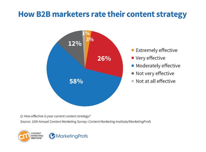


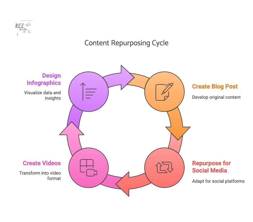


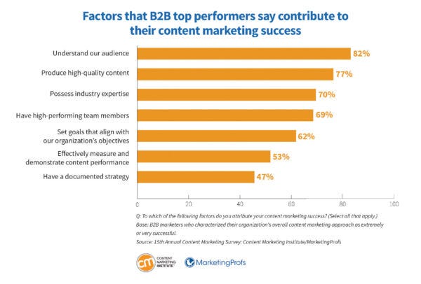


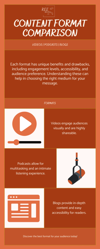


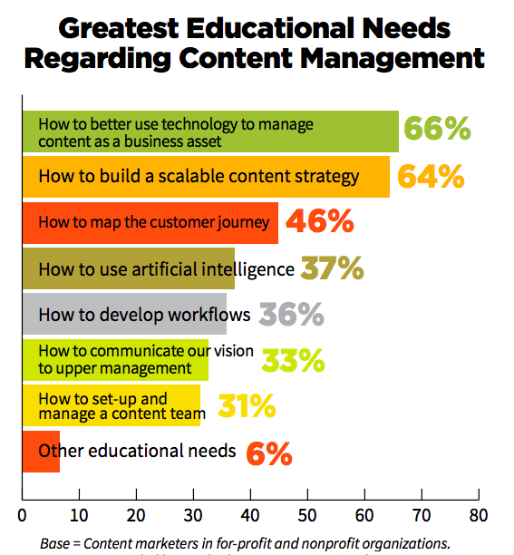


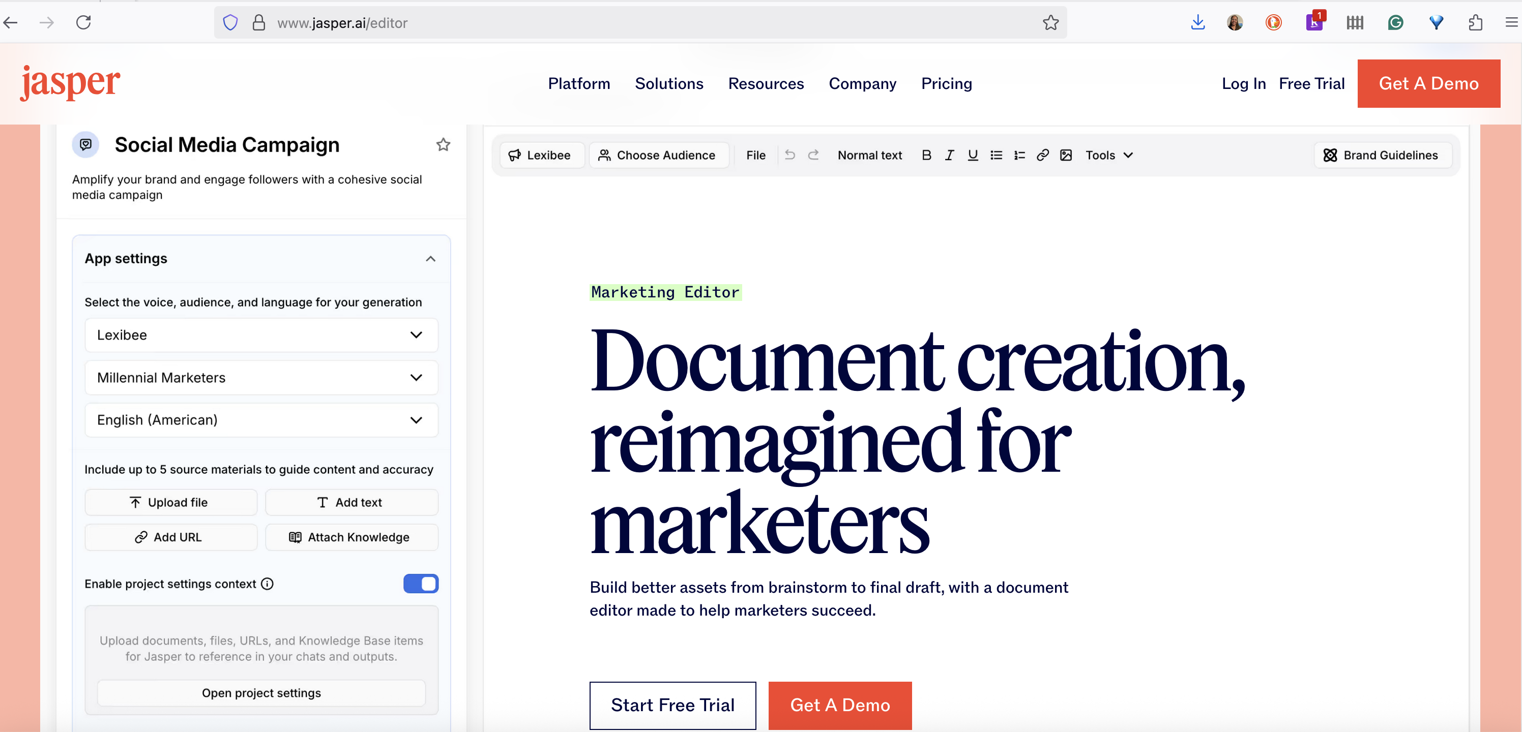
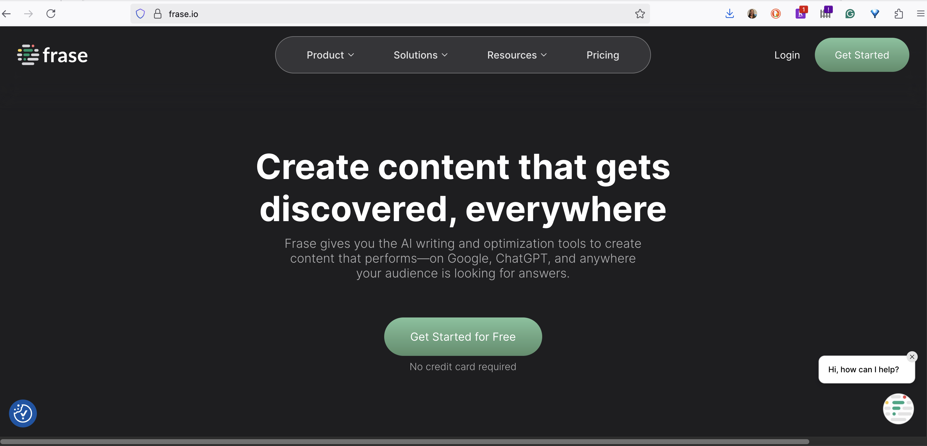
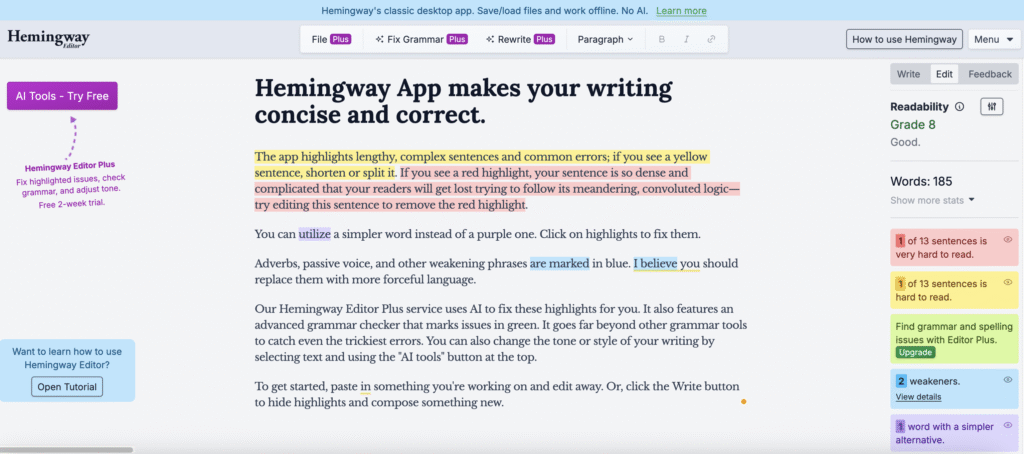
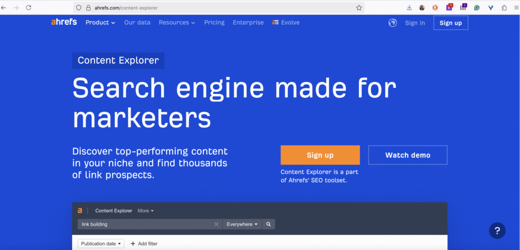
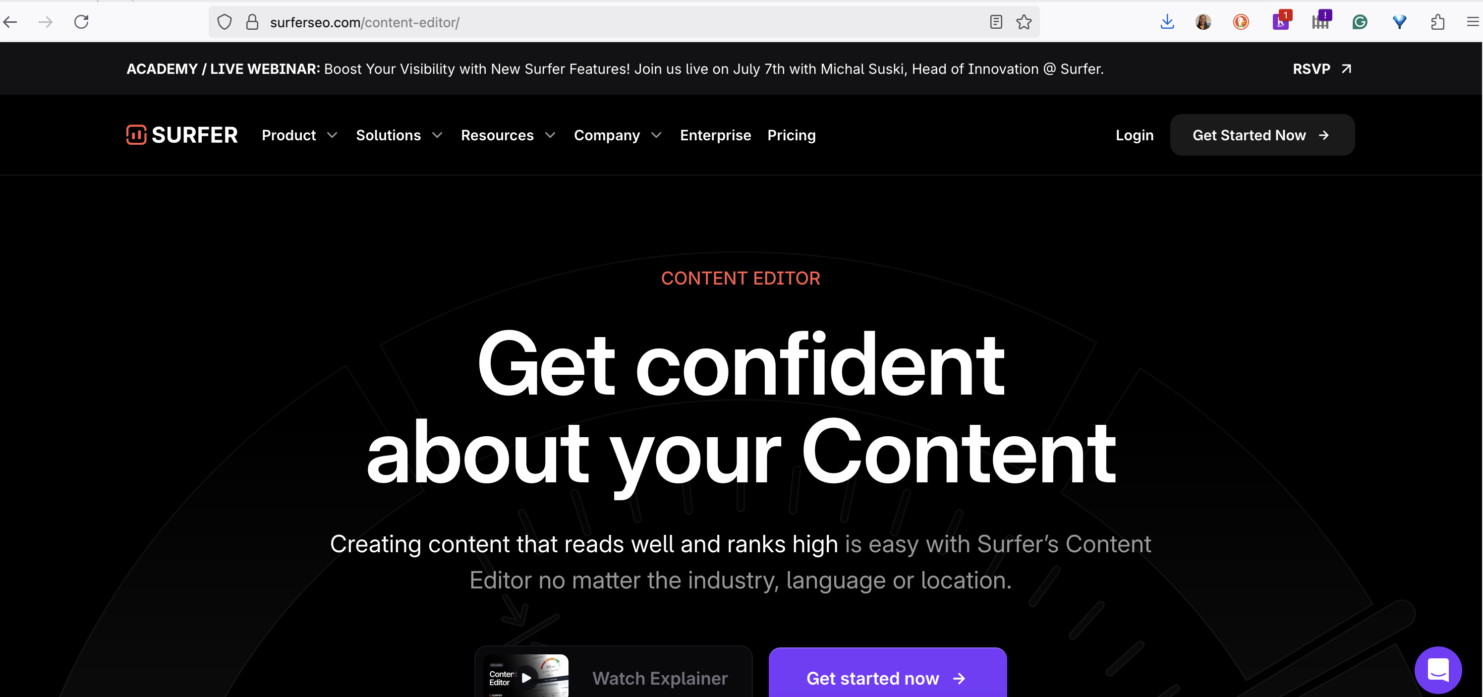


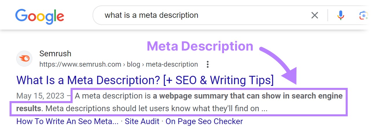
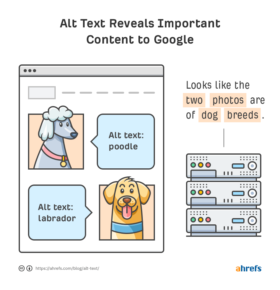


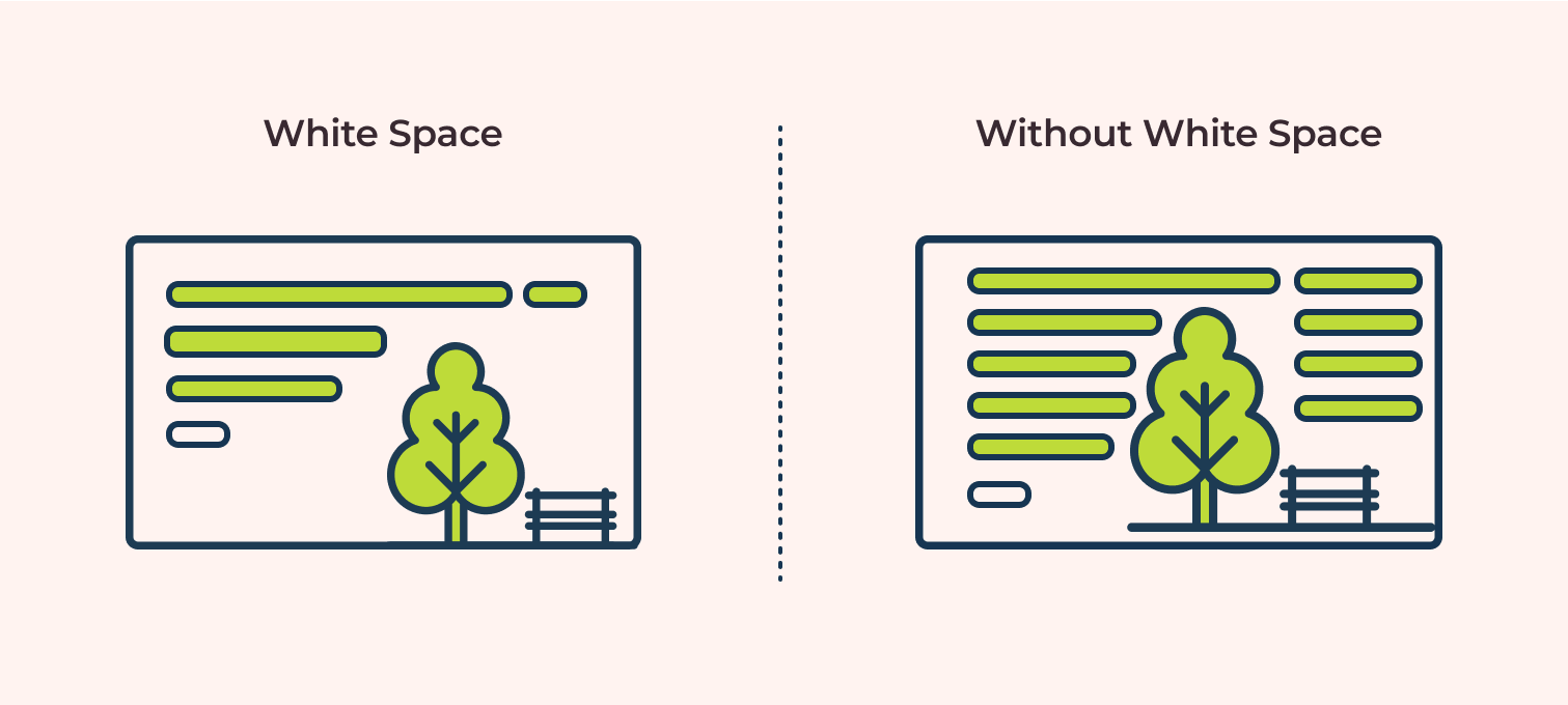


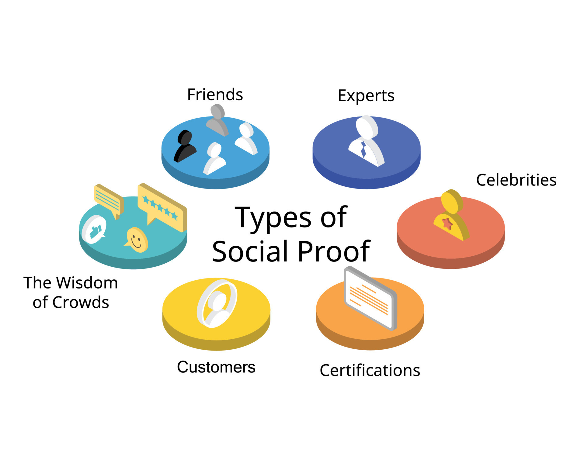


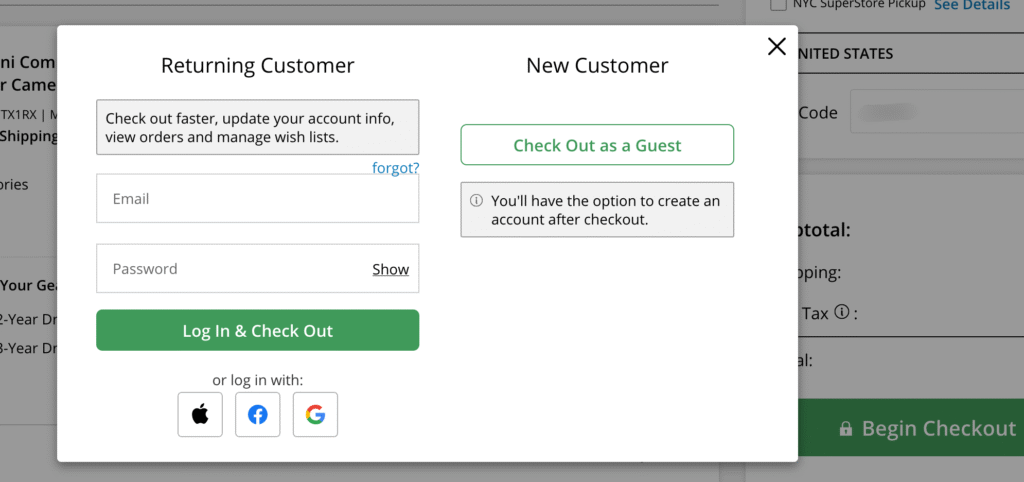
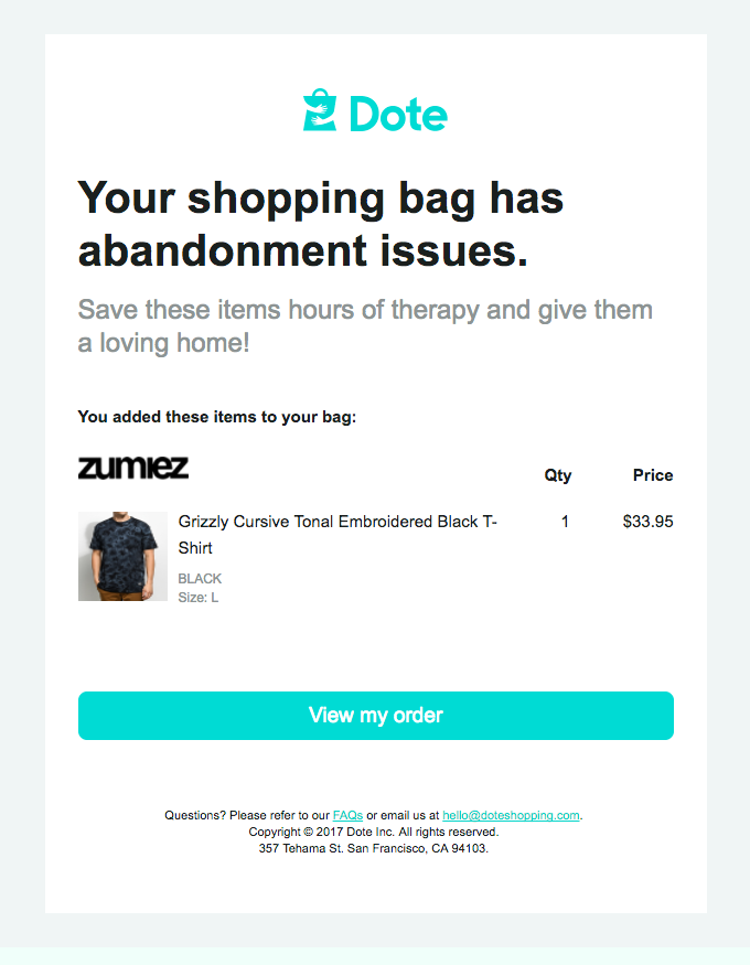

