Did you know that users form an opinion about your website in just 50 milliseconds? That’s faster than a blink. And that snap judgment often determines whether someone will stayad or leave.
You’ve spent hours crafting the perfect About page, meticulously describing your coaching methodology or consulting process and ways of working. But when visitors land on your site, they bounce in seconds, because the design is unclear, and hard to read or navigate.
The squint test is a simple technique that can make or break the user experience (UX) of your website. It’s a way to assess the whether websites, social media posts, and marketing materials guide attention effectively.
For solopreneurs like coaches, consultants, content creators, and voice actors, who often wear multiple hats and manage their own marketing, this technique can mean the difference between a visitor who converts and one who clicks away. 94% of users judge a website based on its design within the first impression, and effective visual hierarchy can increase conversion rates by up to 591% when applied strategically.
Contents
- What's the Squint Test?
- How the Squint Test Works for Better Content Design
- Benefits of Using Squint Tests for Readability
- Common Design Problems the Squint Test Reveals
- The squint test for social media content
- Use Visual Hierarchy in Your Email Marketing
- How to Use the Squint Test for Your Content Marketing
- Measuring Squint Test Results and Success
- Wrap Up
What’s the Squint Test?
The squint test is a quick way to make sure users notice the most important parts of a website or app first.
When you squint, details blur and only the strongest elements (shapes, colors, and buttons) stand out. The big picture becomes clear. Elements that grab attention first reveal themselves. Poor contrast disappears into the background.
This simple action works because it mimics how people actually process visual information: people often scan content before deciding to whether to read it.

When someone lands on your coaching website or scrolls past your LinkedIn post, they don’t carefully read every word. Instead, their brain rapidly scans for the most prominent visual elements to decide whether to engage further or move on. So the squint test helps you check whether the main elements of your content, like headlines, buttons, and main sections, are clear and easy to spot, or if they get lost.
For solopreneurs, this matters even more because you’re competing against businesses with dedicated design teams and marketing departments.
When someone searches for “life coach in Denver,” “African American voice actor” or “business consultant for small companies,” your website might appear alongside competitors who’ve invested heavily in professional design and SEO. The squint test levels the playing field by helping you make strategic visual choices that capture attention effectively.
Why visual hierarchy matters for your solo business
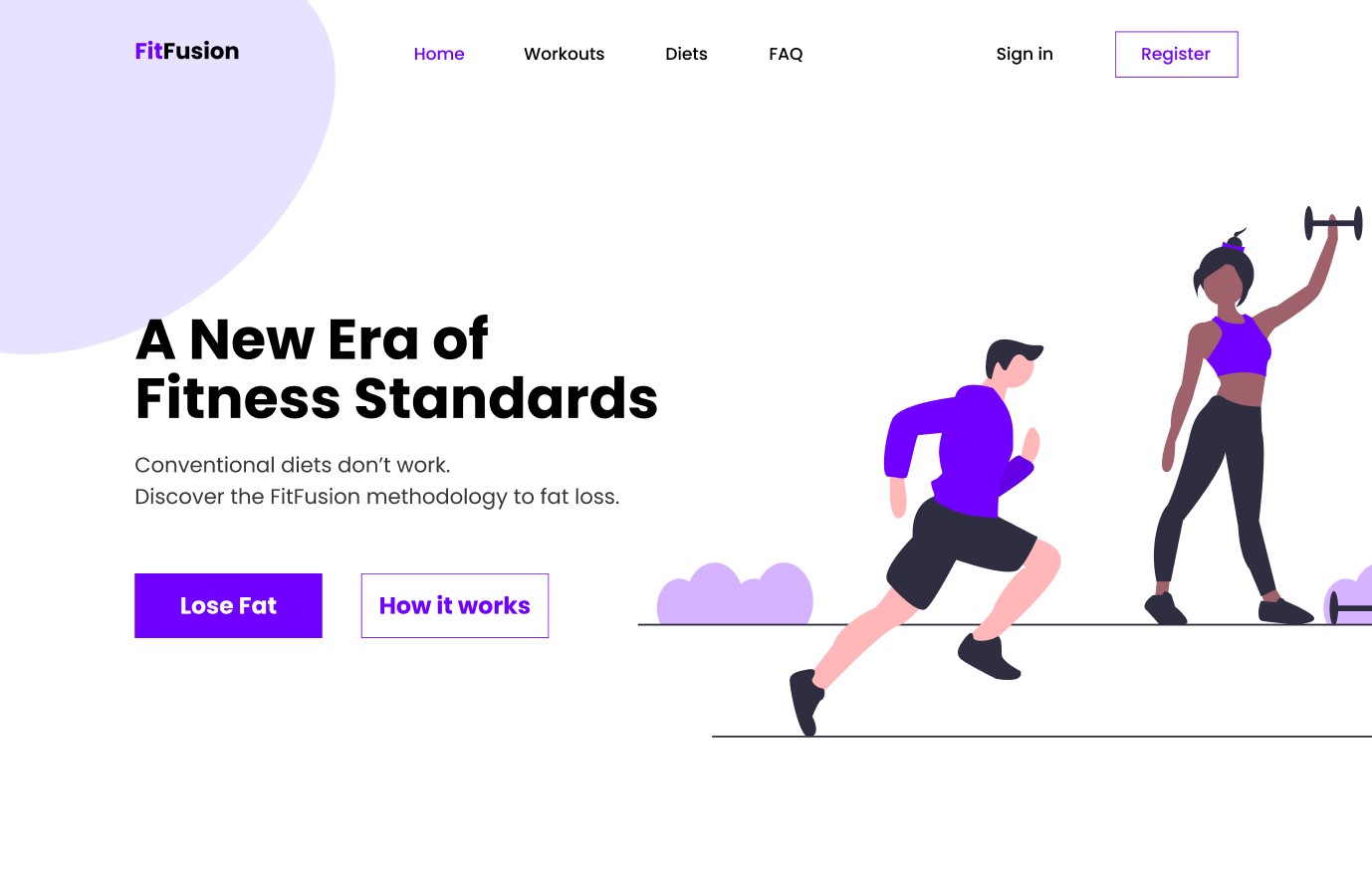
In the typical customer journey, potential client finds your website, landing page, or social media profile. Within seconds, they need to understand three things: what you do, who you help, and why they should choose you. If your visual hierarchy doesn’t guide them to these answers quickly, they’ll leave.
Trust signals are even more critical for solopreneurs. Unlike established companies with brand recognition, you’re often building credibility from scratch with each new web visitor.
Your visual hierarchy needs to strategically highlight testimonials, credentials, and social proof to establish authority. Studies show that business credibility depends on website quality, and professional visual hierarchy signals competence before visitors even read your content.
The psychology works in your favor when done right. Clean, organized layouts create a halo effect where visitors assume your services are equally well-organized and professional. This perception can justify charging higher rates and differentiate you from competitors with cluttered, confusing websites.
For voice actors and content creators, visual hierarchy serves additional functions:
- Portfolio/Demos: Your portfolio needs to guide attention to your best work first.
- Contact info: Your booking information must be immediately accessible and easy to find. Prospective clients, casting directors and producers will NOT hunt for it–they’ll just move on to the next.
Research shows that conversion-focused design relies heavily on proper visual hierarchy. According to a study by Roger West, strategic use of visual hierarchy can significantly impact conversion rates by guiding users’ attention to key conversion points like calls-to-action (CTAs) and special offers.
Your personality should shine through consistent visual branding that supports your unique voice in a crowded market.
How the Squint Test Works for Better Content Design
Performing a squint test is surprisingly straightforward, but doing it at the right time and in the right way makes the difference.
How to do a squint test

Step 1
Start with your homepage open on your computer screen. Sit back about arm’s length from your monitor, and slowly squint your eyes until text becomes blurry but you can still make out shapes, colors, and general layout. Don’t strain—just gently reduce your vision until details fade. And always test in normal lighting since too much glare or darkness can distort results.
Step 2
Now ask yourself: How do your eyes travel across the page? What grabs your attention first? Is it your headline, a client testimonial, your professional photo, or perhaps a distracting graphic element you never intended to emphasize? The elements that remain most visible when squinting represent what your visitors will notice first.
Design elements to review
Pay attention to these key indicators during your test:
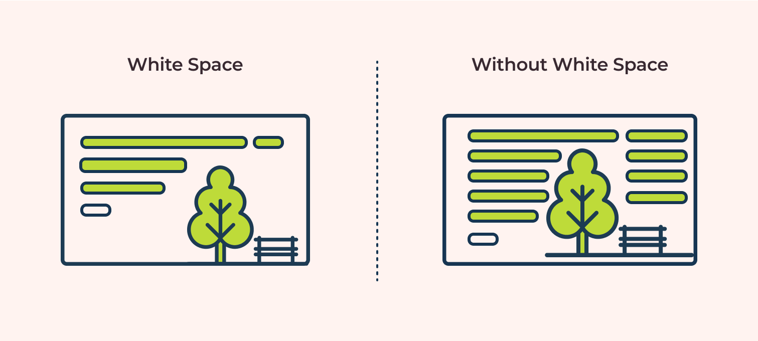
- Size and spacing create natural focal points. Larger elements command attention, while generous white space around important content makes it stand out. If your call-to-action button disappears when squinting, it’s probably too small or lacks sufficient contrast with surrounding elements.
- Color and contrast determine visual prominence. High contrast draws the eye, while similar tones blend together. Your most important information should maintain strong contrast even when squinting. If everything looks gray and muddy, your hierarchy needs work.
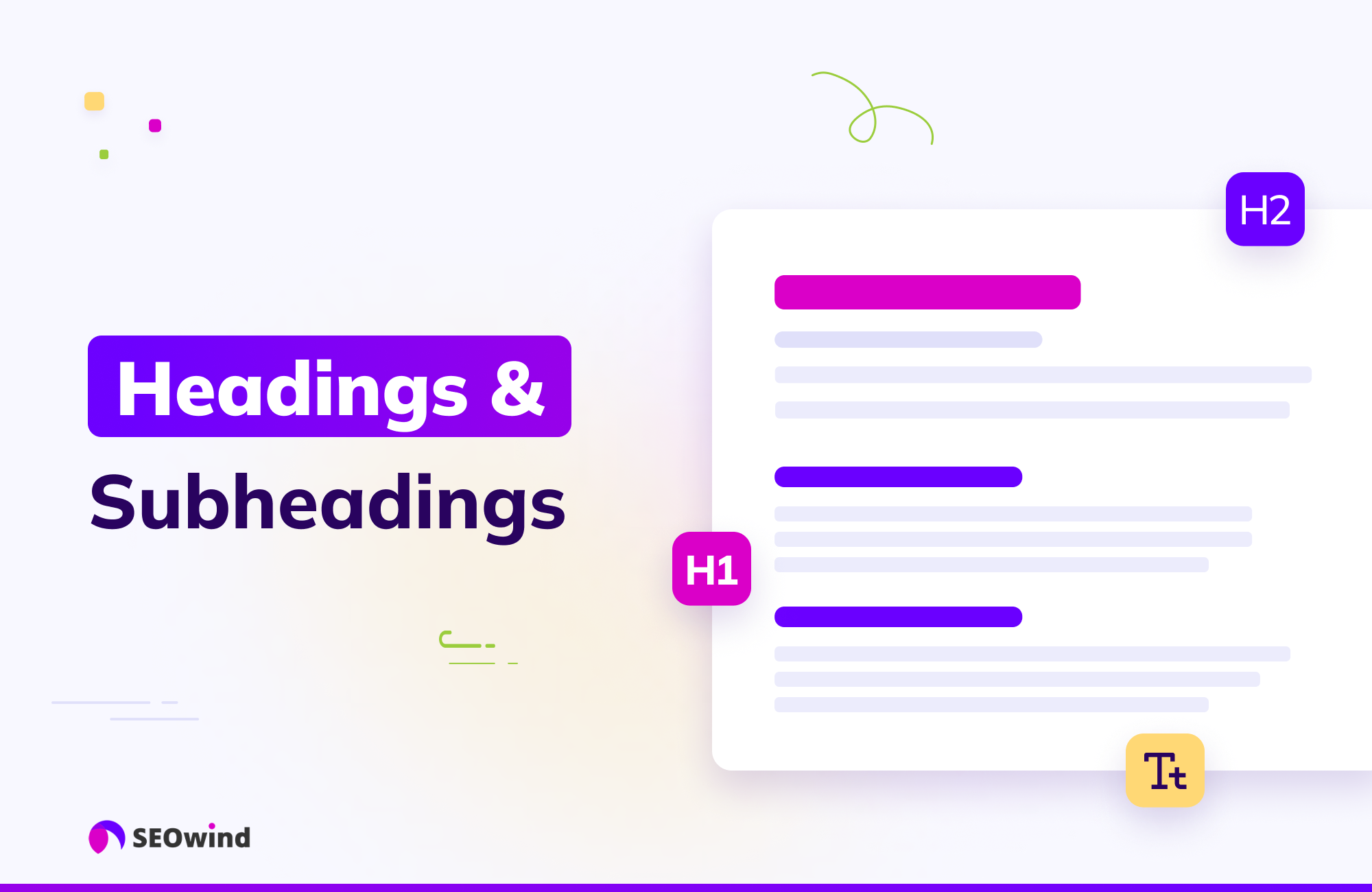
- Typography variations should create clear levels of importance. Headlines should remain visible when squinting, subheadings should be secondary, and body text should recede into the background. If all your text looks the same size when blurred, you need stronger typographic hierarchy.
Repeat the test on mobile devices
Go back and repeat steps 1 and 2 with a phone and a tablet, staying about 12 inches from the screen. Mobile visual hierarchy differs significantly from desktop because of screen constraints and different usage patterns. Your squint test results should make sense for both viewing contexts.
Benefits of Using Squint Tests for Readability

When applied correctly, the squint test offers direct benefits to usability and readability.
Customers can digest your content much easier
Users need to process information in the right order. A squint test shows whether your information architecture guides users naturally through your content. When you blur details, the remaining elements should tell a clear story about what’s most important.
It also directly impacts user engagement, as people need clear visual cues to process information efficiently.
Enhanced contrast and color accessibility compliance
The squint test acts as a quick accessibility check. Elements that disappear when you squint likely have insufficient contrast. This is beyond aesthetics—proper contrast ratios are required for web accessibility compliance.
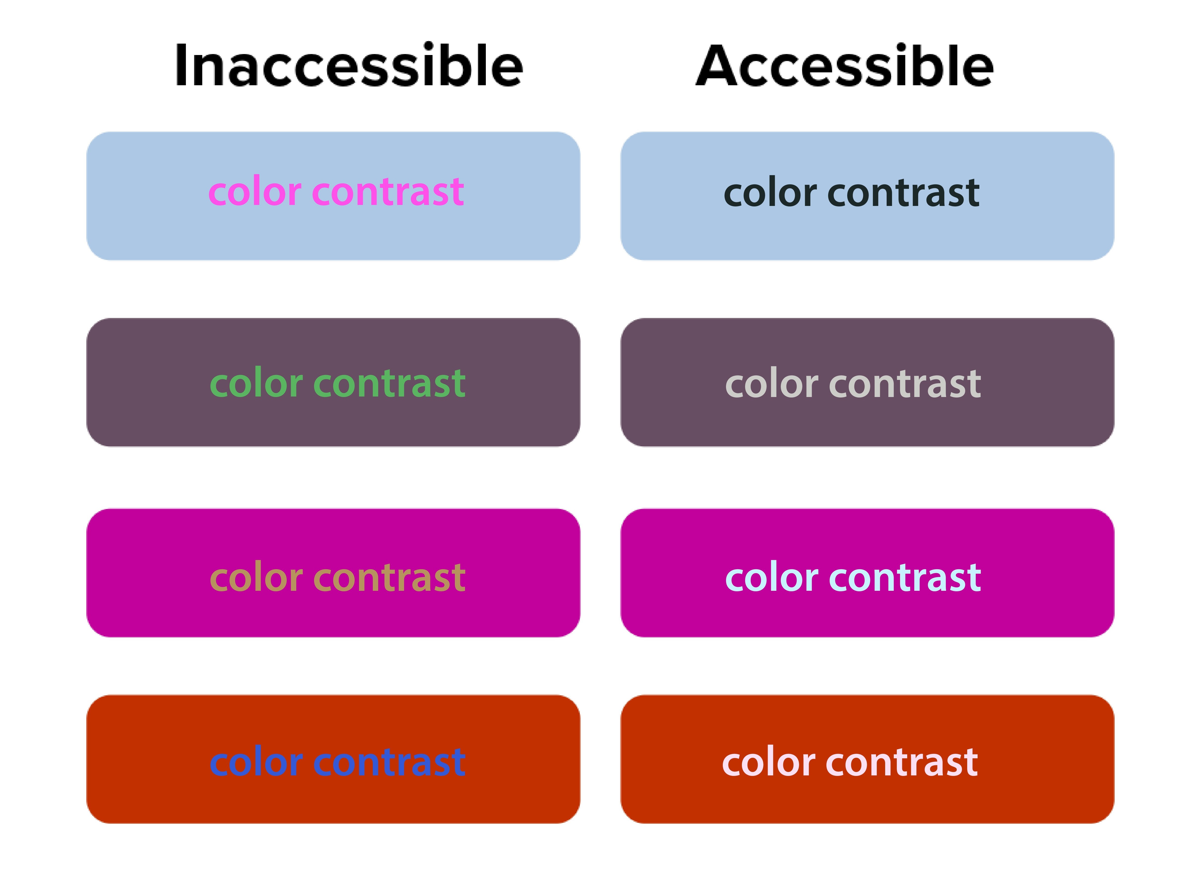
The Digital.gov accessibility guidelines emphasize creating “a clear hierarchy of importance by placing items on the screen according to their relative level of importance.”
Low contrast creates accessibility problems. The squint test naturally emphasizes contrast, making weak text-to-background combinations easy to spot. 90 million Americans over 40 have vision problems, and 7 million have vision impairment.
“Orange you accessible?” featured a case where white text on orange buttons passed both squint tests and WCAG 2.1 color contrast checks. Before the fix, users with vision impairment missed key actions, but afterward, the click-through rate (CTR) improved by 18%.
Better font size and typography decisions
Typography choices become obvious during squint testing. Headers that should stand out but don’t indicate hierarchy problems. Body text that dominates the page suggests sizing issues.
If your body text disappears when squinting, your font size or weight may be too light. Adjusting typography can make a major impact.
NUMI Tech’s study on Typeform showed that the clearest forms were those with single, bold CTAs and solid font weight. People were more likely to finish forms if they quickly identified the main action, driving up completion rates.
Common Design Problems the Squint Test Reveals
Squint testing reveals hidden flaws that traditional review often misses, but many solo business owners unknowingly sabotage their own success with predictable visual hierarchy errors. These mistakes stem from trying to communicate everything at once instead of guiding visitors through a logical information sequence.
Cluttered layouts with too many competing elements

It may seem like everything is important on your website—especially the homepage. Your services, testimonials, about story, contact information, and credentials all compete for attention simultaneously. But when you squint at these sites, nothing stands out clearly because everything’s fighting for visual prominence. Then your web visitors leave because they can’t quickly identify the most relevant information.
Too many elements competing for attention creates visual chaos and overwhelms users. The squint test simplifies the noise, highlighting whether a dominant focus exists.
Ineffective CTA buttons, placement and styling
CTAs that disappear during squint testing signal major conversion problems.
Your primary action button should be the star of your layout. If it vanishes when squinting, it’s likely too small, poorly colored, or positioned incorrectly. Conversion studies show button placement impacts click-through rates and increases revenue by 83%.
Your “Schedule a Discovery Call” or “Download My Free Guide” buttons should be among the most prominent elements when squinting. Yet many solopreneurs bury these important conversion elements in small text or low-contrast colors that disappear during the squint test.
Inconsistent branding across platforms
Your LinkedIn profile, website, email newsletters, and social media posts should pass the squint test with similar visual priorities. If your Instagram posts emphasize completely different elements than your website, you’re confusing potential clients about what matters most.
Web template constraints
Squarespace, Wix, Webflow and WordPress templates come with predetermined visual hierarchies that may not align with your business needs. Many solopreneurs accept these defaults without testing whether they actually guide attention to business-critical information.
Let’s get into more detail on the specific limitations of each platform.

Squarespace
Squarespace has beautiful templates but limits customization.
When performing the squint test on Squarespace sites, you’ll often find that template designers prioritized aesthetic appeal over conversion optimization. The large, gorgeous images that look stunning at full resolution might overwhelm your actual business message when viewed through the squint test lens.
To optimize within Squarespace’s constraints, focus on strategic content placement and typography choices. Use their built-in style editor to increase contrast on important elements. Choose templates where the navigation and primary call-to-action naturally pass the squint test, even if other elements need adjustment.
Wix
Wix provides complete creative freedom, which can be good and bad. The drag-and-drop interface allows you to place elements anywhere, but this freedom often results in layouts that fail basic hierarchy principles if you don’t have design experience.
Use Wix’s built-in design assistance features and grid alignment tools. Test your layouts frequently with the squint test as you build, rather than waiting until the site is complete. Pay special attention to mobile responsiveness, as Wix’s absolute positioning can create hierarchy problems on smaller screens.
Webflow
Webflow is best for advanced, tech savvy users, but offers powerful hierarchy control if you’re willing to learn it. The visual CSS editor allows precise control over typography, spacing, and color without coding knowledge. However, the learning curve can be steep for solopreneurs focused on growing their businesses rather than mastering web design.
WordPress
WordPress offers more flexibility but requires more decision-making.
The abundance of themes and customization options can actually hurt your visual hierarchy if you’re not careful. Many solopreneurs install multiple plugins and design elements that compete for attention, creating visual chaos that fails the squint test dramatically.
When working with WordPress, start with themes specifically designed for service businesses. Look for designs where testimonials, service descriptions, and contact information are visually prominent. Avoid themes with too many sidebar widgets or navigation options that could distract from your primary business goals.
Let’s shift to discussing how to use the squint test for your social media content.
The squint test for social media content
Social media platforms present unique visual hierarchy challenges because you’re competing for attention in crowded feeds with minimal time to make an impression. The squint test becomes even more critical when you have only seconds to capture someone’s interest as they scroll.
LinkedIn requires professional hierarchy that builds authority.
Your posts need to establish credibility quickly while encouraging engagement. When you squint at successful LinkedIn content from coaches and other solopreneurs, you’ll notice that personal branding elements, key statistics, and clear value propositions remain most visible.
Here’s how you can do the same:
- Start with an irresistible hook: Structure your LinkedIn posts with strong opening lines that remain readable when squinting.
- White space and readable design: Use line breaks and formatting to create visual separation.
- Branded photo: Include your professional photo consistently to build recognition.
- CTA: Most importantly, ensure your call-to-action (whether it’s commenting, connecting, or visiting your website) stands out visually from surrounding content.
Instagram demands immediate visual impact since the platform is inherently visual.
Your images need to pass the squint test independently of text elements. This is particularly important for content creators and voice actors who rely on visual storytelling to showcase their personality and expertise.
Test your Instagram posts by squinting at them in your phone’s preview before publishing. Your key message should be apparent even when details blur. Text overlays should contrast strongly with background images. For voice actors, ensure your recording setup or the subject of your post is prominently visible.
Facebook’s algorithm favors engagement, making hierarchy crucial for organic reach.
Posts that capture attention quickly receive more comments and shares, which signals the algorithm to show them to additional people. The squint test helps ensure your most engaging elements like questions, compelling statistics, or striking visuals get noticed first.
YouTube
For video content across YouTube and all other social platforms, apply squint test principles to thumbnails and opening frames.
These elements determine whether people click to watch your content. Your face, key text, or compelling imagery should remain visible when squinting at thumbnail previews.
Use Visual Hierarchy in Your Email Marketing
Your email newsletters and marketing campaigns need strong visual hierarchy, because people scan emails even faster than websites.
Subject lines
Subject lines represent the first level of your email hierarchy, but once opened, your email design takes over.
The squint test reveals whether your most important elements, like your value proposition, main CTA or key announcement, gets the appropriate visual emphasis.
Structure your emails with a single, clear focal point per message. If you’re promoting a new coaching program or event, that announcement should dominate the visual hierarchy. When you squint at the email preview, make sure the supporting elements like testimonials, bonus information, or secondary offers are visually subordinate to the main elements above.
Mobile optimization
According to Adestra, 61.9% of emails are opened on mobile devices. Your email hierarchy might work perfectly on desktop, but fail completely on phone screens. Always test your email campaigns with the squint test on both desktop and mobile before sending.
Many email marketing platforms provide mobile preview tools, but the squint test offers additional insight into whether your hierarchy actually works in practice. Your unsubscribe link should be minimally visible, while your main message and CTA should remain prominent even when squinting at a small screen.
How to Use the Squint Test for Your Content Marketing

Blog posts, resource guides, and lead magnets all benefit from strong visual hierarchy, particularly for solopreneurs who use content marketing to demonstrate expertise and attract clients.
Blogs
Long-form blog posts need hierarchical structure to maintain reader engagement. Your headline should pass the squint test by being significantly larger and more prominent than body text. Subheadings should create clear visual breaks that remain visible when squinting, helping readers scan for relevant information.
Use the squint test to evaluate whether your key points stand out sufficiently. Important statistics, quotes, or takeaways should be formatted to remain visible when details blur. This might mean using pull quotes, bullet points, or highlighting techniques that create visual emphasis.
Lead magnets
Lead magnets like webinars, checklists and resource guides serve 2 purposes: to provide immediate value to your audience and position you as an expert in your field. The squint test helps ensure these materials look professional and guide readers through the content logically.
Your lead magnets should have a clear visual hierarchy that makes them easy to scan and use. Key action items should be visually prominent, while supporting explanations can be less visually dominant.
Doing this makes your resources more valuable to busy professionals who need quick access to relevant information.
Case studies and testimonials
These items require strategic visual hierarchy to build credibility effectively.
The client’s results and your role in achieving them should be the most prominent elements when squinting. Supporting details about methodology or process can be visually secondary.
Measuring Squint Test Results and Success
Unlike large or mid-size companies with dedicated analytics teams, solopreneurs need simple ways to measure how visual hierarchy improvements impact business results. Understanding how to track and validate your design changes ensures continuous improvement in user experience.
Focus on the data that directly affect your business goals instead of vanity metrics that don’t drive revenue.
The value of squint testing shines when you measure real outcomes. All good design choices should have measurable impact. Squint testing delivers quick wins—and long-term gains.
Track website conversions
Monitor your consultation booking rates, email signup conversions, and resource download numbers before and after implementing squint test recommendations. Even small improvements in these metrics can significantly impact your business growth over time.
Set up Google Analytics goals for key actions like contact form submissions or resource downloads. Compare conversion rates month-over-month as you refine your visual hierarchy. A 1% improvement in conversion rate can mean substantial revenue increases for service-based businesses with high-value offerings.
Check your email engagement metrics

Check whether your hierarchy improvements translate to better content performance. Open rates indicate whether your subject lines and sender name stand out in crowded inboxes.
Click-through rates (CTRs) show whether your email hierarchy successfully guides readers to take a specific action. CTRs on primary CTAs provide direct feedback about hierarchy effectiveness. If your main action button becomes more prominent after hierarchy adjustments, click-through rates should increase accordingly.
Monitor which types of visual hierarchy changes produce the best results for your specific audience. You might find that larger call-to-action buttons significantly improve click-through rates, or that restructuring your email templates increases consultation bookings.
Review your social media analytics
Track engagement rates on posts where you’ve applied squint test principles compared to older content. Look for patterns in which visual approaches generate more comments, shares, and profile visits.
Pay attention to the quality of engagement, not just quantity. Posts that successfully guide attention to your key messages should generate more relevant comments and inquiries from potential clients rather than just generic engagement.
Collect feedback
Qualitative feedback complements quantitative metrics. Ask visitors about their first impressions and navigation experience. This feedback often reveals hierarchy issues that metrics alone might miss.
Five-second tests work well for validating squint test improvements. If people can quickly identify your page’s purpose and main action within 5 seconds, your hierarchy is likely working effectively.
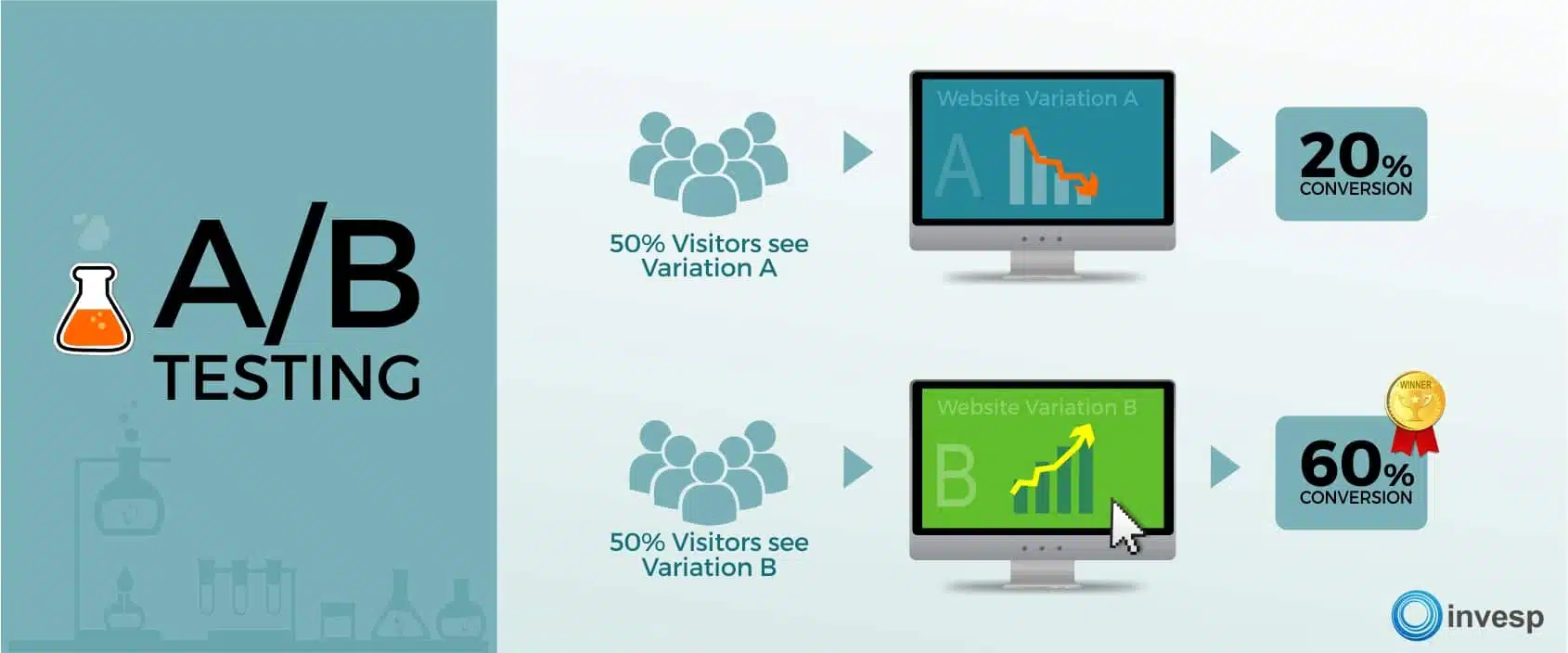
A/B test to validate squint test improvements
A/B testing validates squint test improvements with real user data.
Set up an A/B test where one design is optimized using findings from a squint test, while the other isn’t.
Focus on testing one hierarchy change at a time. This isolation helps you understand which specific improvements worked to drive results. Complex tests with multiple changes make it difficult to identify successful elements.
Monitor your design improvements over time
Visual hierarchy effectiveness can change over time as content updates and user expectations evolve. You should do squint testing regularly to be sure your design continues performing optimally.
Set up automated monitoring for key conversion metrics. Sudden drops might indicate hierarchy problems introduced during content updates or design changes. Regular testing catches these issues before they significantly impact performance.
Don’t stop testing after a single improvement. Monitor metrics monthly. Users’ expectations and devices change, so designs that pass now may need adjustments later.
Wrap Up
The squint test is a way to help improve how potential clients experience your marketing materials and websites. Instead of guessing if your content captures attention effectively, you can quickly evaluate and refine your visual hierarchy to guide visitors toward the actions that will grow your business.
Whether you’re using Squarespace templates, creating LinkedIn posts, or designing email newsletters, the squint test shows whether your most important messages get the appropriate visual emphasis. For coaches, consultants, content creators, and voice actors competing in crowded and competitive spaces, this competitive advantage costs nothing to implement, but can dramatically improve business results.
Every visual choice should either guide potential clients toward working with you or provide value that builds your authority in your field. The squint test ensures these priorities remain clear even when visitors are scanning quickly through their busy digital lives.
Start with your homepage. Squint at it, adjust what doesn’t work, and begin building a visual hierarchy that turns casual visitors into paying clients.
References
Accessibility for visual designers. (2018). Digital.gov. Retrieved from https://digital.gov/guides/accessibility-for-teams/visual-design/
Çakırca, S. (2025). 150+ UX (User Experience) Statistics and Trends (Updated for 2025). UserGuiding. Retrieved from https://userguiding.com/blog/ux-statistics-trends
Do You Look Legit? The Psychology Behind Website Design & Credibility. (n.d.). Rosewood. Retrieved from https://rosewoodmarketing.ca/do-you-look-legit-the-psychology-behind-website-design-credibility/
Fast Facts: Vision Loss. (2024). (n.d.). CDC. Retrieved from https://www.cdc.gov/vision-health/data-research/vision-loss-facts/index.html
Five-Second Testing: Step-by-Step Guide + Example. (2025). Maze. Retrieved from https://maze.co/collections/user-research/five-second-test/
Increase Conversion Rates with High Quality Design: A Comprehensive Guide. (2024). Roger West. Retrieved from https://www.rogerwest.com/design/increase-conversion-rates-with-high-quality-design/
Kennedy, E. D. (2020). UI Tutorial: Scheduling App Redesign (in under 10 Minutes). Learn UI Design. Retrieved from https://www.learnui.design/blog/squint-test-ui-design-case-study.html
Learning from the Best: Top CRO Case Studies. (2025). Retrieved from https://lineardesign.com/blog/conversion-rate-optimization-case-studies/
Lindgaard, G., Fernandes, G., Dudek, C., & Brown, J. (2006). Attention web designers: You have 50 milliseconds to make a good first impression! Behaviour & Information Technology, 25(2), 115-126. Retrieved from https://www.tandfonline.com/doi/abs/10.1080/01449290500330448
Looking Ahead: Improving Our Vision for the Future. (2024). CDC. Retrieved from https://www.cdc.gov/vision-health/data-research/vision-loss-facts/improving-vision-for-future.html
Nielsen, J. (2015). Legibility, Readability, and Comprehension: Making Users Read Your Words. Nielsen Norman Group. Retrieved from https://www.nngroup.com/articles/legibility-readability-comprehension/
Seastrand, E. (2019). Orange You Accessible? A Mini Case Study on Color Contrast. UX Design. Retrieved from https://uxdesign.cc/orange-you-accessible-65afa6cf0a2
Steven, K. (2024). 45 Urgent Call-to-Action Statistics for Marketers. Persuasion Nation. Retrieved from https://persuasion-nation.com/call-to-action-statistics/
The Squint Test: Accessibility Test for Every Interface. (n.d.). NUMI. Retrieved from https://www.numi.tech/post/the-squint-test-accessibility-test-for-every-interface
van Rijn, J. (2025). The ultimate mobile email statistics overview. Email Monday. Retrieved from https://www.emailmonday.com/mobile-email-usage-statistics/