You pour your heart and soul into writing. You research, you draft, you edit. But does your content actually connect with people online? Do they stick around to read what you have to say?
Just writing well isn’t enough. You need a strategy that understands how people read online and what makes them stay. You want to hold their attention, build trust, and guide your reader toward a goal like learning something new, signing up for your list, or buying a product.
This article is your guide to doing just that. We’ll explore the science of online reading, break down proven structures, show you how to plan efficiently, and reveal simple formatting tricks that make a huge difference.
Get ready to make your long-form content impossible to ignore. Let’s dive in to how you can structure blog posts that keep readers glued to your page (“sticky”), and make your content work harder for you.
Contents
- The Psychology Behind Reader Engagement
- 7 Types of Blog Posts That Keep Readers Hooked
- 1. The problem-solution framework for practical topics
- 2. How-to guides with clear step-by-step instructions
- 3. List-based articles that deliver scannable value
- 4. The storytelling method for emotional connection
- 5. Comparison posts that help readers make decisions
- 6. FAQ structure for addressing common pain points
- 7. Case study format for demonstrating proof and results
- Essential Elements of a High-Converting Blog Post
- More Writing Tips to Keep Readers Scrolling to the End
- Visual Elements That Enhance Readability
- Content Planning Tips for Time-Strapped Solopreneurs
The Psychology Behind Reader Engagement

Why do some articles feel effortless to read, while others make your eyes glaze over after two sentences? It’s because of human psychology. Before you can write content they’ll actually read, you have to understand how people interact with text online.
How human attention spans work online (and why traditional writing methods fail)

We’re bombarded with information from every direction–notifications ping, new tabs open, and there’s always another headline with every click and scroll. This fast-paced knowledge dump has changed how we consume content.
The average human attention span online keeps getting shorter and shorter. Stats vary depending on the research, but most say that your audience will take just a few seconds to decide if your content is worth their time. This means you have a tiny window to prove your value.
Traditional writing with long paragraphs and slow build-up often fails online because it doesn’t cater to the need for quick scanning and immediate value. People aren’t settling in to read content with a cup of tea; they’re often scanning on a phone while juggling other tasks.
Think of your own habits. When you land on a page, do you read every single word from the start? You probably just scan headings, bold text, bullet points, and the first sentences of paragraphs to get the gist. And if it looks like too much work, or you don’t quickly find something interesting, you move on.
Your readers do the same thing.
The impact of visual hierarchy on reading patterns
Visual hierarchy is about arranging elements on your page so the most important information stands out. It guides the reader’s eye naturally.
Online, this is crucial because people scan in patterns, often following an “F” shape or “Z” shape on the page. They look at the top area, scan horizontally, then drop down slightly and scan horizontally again, and finally scan vertically down the left side.
When you use visual hierarchy well, you make your content scannable. This includes using:
- Clear headings and subheadings: These act as signposts, breaking up the text and telling readers what each section is about.
- Short paragraphs: Large blocks of text are off-putting online.
- Bullet points and numbered lists: These make information easy to digest quickly.
- Bold text: Highlights key phrases and ideas.
- Images and white space: Break up text and make the page less visually overwhelming.
When you structure your page visually, you help readers find the information they need quickly, which encourages them to stay longer and maybe even read more deeply. Research shows that good visual hierarchy can significantly increase the time users spend on a page, and keeps them engaged.
Emotional triggers that keep readers invested in your content

People connect with content that makes them feel something.
Structure and formatting help readers navigate your content, but emotional triggers are what keep them mentally invested. Which emotions, and how? Try these:
- Curiosity: Hint at what’s coming next keeps readers scrolling. Use questions, create suspense, or promise a solution to a problem where they have to open a loop.
- Empathy: Share a relatable story or acknowledge your audience’s pain point to show you understand their struggles.
- Hope: Offer solutions, tips, or a path to a better outcome to tap into their desire for improvement.
- Surprise: Present unexpected facts or perspectives to grab their attention.
- Validation: Confirm their feelings or experiences to make them feel understood and build trust.
When you tap into these emotions, you create a stronger connection. You move beyond just presenting facts and make your content resonate on a personal level. Emotional content is more likely to be shared and remembered than purely factual information.
Structure matters more than raw writing talent

You don’t need to be a literary genius to write engaging online content, but you do need good structure.
Think of it like building a house. You can use the most beautiful bricks, but if the foundation and framework are weak, the house won’t stand.
Content structure provides that framework. It organizes your ideas logically, guides the reader smoothly from one point to the next, and makes your content easy to follow.
On the other hand, even brilliant writing can be lost in a wall of text without clear headings, short paragraphs, and a logical flow. Online readers value clarity and accessibility over elaborate prose.
Analytics data shows content structure (use of headings, lists, etc.) directly impacts metrics like average time on page and bounce rate.
Good content structure keeps people reading. Different structures serve different purposes and appeal to readers in unique ways, so let’s go over 7 proven structures that can keep their attention.
7 Types of Blog Posts That Keep Readers Hooked

Choosing the right structure for your blog post can make a huge difference in how well it performs. Instead of just writing whatever comes to mind, select a framework that best suits your topic and your goal:
- The problem-solution framework for practical topics
- How-to guides with clear step-by-step instructions
- List-based articles that deliver scannable value
- The storytelling method for emotional connection
- Comparison posts that help readers make decisions
- FAQ structure for addressing common pain points
- Case study format for demonstrating proof and results
1. The problem-solution framework for practical topics

This highly effective content structure addresses a specific issue your audience faces and offers a way to fix it. It works because it immediately connects with the reader’s pain point.
Here’s how it flows:
- Introduce the Problem: Start by describing the challenge, frustration, or pain point your reader is experiencing. Make sure they feel understood.
- Agitate the Problem: Briefly explain the negative consequences of this problem if it’s not addressed. This reinforces the need for a solution.
- Present the Solution: Introduce your solution – your product, service, method, or advice. Explain what it is.
- Explain How it Works: Detail the steps involved or the benefits of your solution.
- Show Proof (optional): Include a case study, testimonial, or data showing the solution’s effectiveness.
- Call to Action (CTA): Tell the reader what to do next.
Let’s see how you could apply this framework with a blog post about saving money:
- You could start by describing the stress of living paycheck to paycheck (Problem).
- Next, describe the inability to save for emergencies or fun things (Agitation).
- Then introduce budgeting as the Solution.
- Explain how to create a budget (How it works).
- Tell a story of a client who saved $5,000 in a year using this method (Proof).
- End by encouraging readers to download your budgeting template (Call to Action).
2. How-to guides with clear step-by-step instructions

People love learning how to do things. How-to guides are incredibly popular because they offer practical, actionable value.
Structure your how-to guide like this:
- Introduce the Goal: What will the reader be able to do after reading your post? State it clearly upfront.
- List Necessary Tools or Materials: If applicable, tell them what they’ll need.
- Present Step-by-Step Instructions: Break down the process into simple, numbered steps. Use clear, concise language and avoid jargon.
- Use Visuals: Include images or screenshots for each step whenever possible.
- Offer Tips or Troubleshooting: Add extra advice or address common issues they might encounter.
- Conclude: Briefly summarize and encourage them to try it. (You don’t need to use the word “Conclusion.”)
Say you wanted to create a guide on “How to Bake Perfect Chocolate Chip Cookies”:
- State that your audience will learn how to bake amazing cookies (Goal).
- List ingredients and tools (Materials).
- Provide numbered steps for mixing, baking, and so on (Steps).
- Include photos of each stage (Visuals).
- Offer tips like not overmixing (Tips).
- End by saying “Enjoy your cookies!” (Conclusion). It wouldn’t hurt engagement to also invite readers to share comments when they try the recipe (CTA).
“How-to” content receives high engagement, with users spending more time on pages compared to other formats, especially when steps are clearly numbered and include visuals.
3. List-based articles that deliver scannable value

Source: Styled Stock Society
Ah, the listicle. Love them or hate them, they work incredibly well online because they are inherently scannable and promise a specific amount of information. Readers know exactly what they’re getting – a list of points that are easy to scan.
Structure your listicle like this:
- Catchy Headline with a Number: (“7 Ways,” “10 Tools,” “25 Tips”)
- Brief Introduction: Explain what the list is about and why it’s valuable.
- Numbered Points: Each point is a subheading (usually H3 or H4).
- Start each point with a bold number or a brief phrase related to the point.
- Write a concise paragraph or two explaining the point.
- Include a relevant image or example for each point (optional).
- Conclusion: Briefly summarize or offer a final thought.
Here’s how this would flow for a listicle called “10 Time-Saving Apps for Solopreneurs”:
- The intro could explain why solopreneurs need time-saving tools.
- Then, you describe #1 App Name (explanation), #2 App Name (explanation), and so on.
List-based content is among the most shared content formats online, because they’re easy to read, share, and come back to later.
4. The storytelling method for emotional connection

Stories are powerful. They grab our attention, make information memorable, and build a deep connection with the reader. Using storytelling in your blog posts makes them relatable and engaging.
Here’s how to structure a story-driven post:
- Setup: Introduce the character (often you or a client) and the initial situation or challenge.
- Conflict/Rising Action: Describe the problem, the struggle, or the obstacles faced. This is where you build tension and reader investment.
- Climax: The turning point or the moment of realization/discovery.
- Resolution: How the problem was solved or the lesson learned.
- Takeaway or Moral: What can the reader learn from this story? How does it apply to them?
Let’s say you wrote a blog post about overcoming failure. Here’s how you could structure it:
- Start with your initial excitement about a project (Setup).
- Describe all the things that went wrong and how frustrating it was (Conflict).
- Share the moment you realized what needed to change (Climax).
- Explain how you implemented the change and succeeded (Resolution).
- End with lessons about perseverance and your advice for the reader (Takeaway).
Research in content marketing shows that incorporating narrative elements can increase reader engagement and brand recall much better than purely factual content.
People remember stories far better than bullet points.
5. Comparison posts that help readers make decisions

When your audience is trying to choose between two or more options (products, services, methods), a comparison post is incredibly helpful. You position yourself as a trusted guide helping them make an informed decision.
Structure a comparison post in this order:
- Introduction: Introduce the items being compared and state the goal–helping the reader decide which is best for them.
- Criteria for Comparison: What factors are you using to compare them (price, features, ease of use, pros, cons)? Present these factors clearly.
- Compare Each Item Based on Criteria: Dedicate a section to comparing the items based on each criterion. You can do this side-by-side or discuss each item’s performance on each criterion.
- Summary Table (optional): Summarize the comparison points in a table makes them easy for readers to scan visually.
- Recommendation: Offer your expert opinion on which option is best for different types of readers or situations.
- Conclusion: Briefly summarize and reiterate the goal.
So if you wanted to compare two products in a post called “Product A vs. Product B: Which is Right for Your Business?,” you’d:
- Introduce both products (Intro).
- List factors like cost, features, and support (Criteria).
- Compare Product A and Product B for each factor (Comparison).
- Show a table (Summary).
- Recommend Product A for small businesses and Product B for larger enterprises (Recommendation) for example.
- Summarize the product offerings and your advice on choosing them (Conclusion)
Data from e-commerce blogs shows comparison posts often lead to higher click-through rates (CTRs) on affiliate links and product pages, indicating they effectively guide purchase decisions.
6. FAQ structure for addressing common pain points

If you find yourself answering the same questions from your audience over and over again, a Frequently Asked Questions (FAQ)-style blog post is a great way to provide value and address common pain points upfront. This structure is highly user-focused.
Here’s how to structure an FAQ post:
- Introduction: State that this post will answer common questions about a specific topic.
- Group Questions (optional ): If you have several questions, group similar questions under broader subheadings (“Pricing Questions,” “Usage Questions”).
- List Questions as Subheadings: Make each question a subheading (H3 or H4).
- Provide Clear, Concise Answers: Directly answer the question below the subheading. Keep answers focused, concise, and easy to understand.
- Link to More Resources: If an answer requires more detail, link to other blog posts or pages on your site where readers can get more info.
- Conclusion: Briefly wrap up and encourage readers to ask any further questions in the comments.
Say you’re writing a blog about “Your Top Questions About Starting a Podcast, Answered.” You could:
- Introduce the topic (Intro)
- Group questions into “Getting Started” and “Equipment” (Group Questions).
- List questions like “What microphone do I need?” or “How do I choose a topic?” as subheadings, providing clear answers therein.
A blog post with an FAQ structure is highly effective for SEO because it directly answers user queries. They often rank well for long-tail keywords based on common questions.
7. Case study format for demonstrating proof and results

When you need to show your audience detailed proof that your methods, products, or services actually work, a case study post is the answer. Case studies are customer success stories, and they provide concrete proof using real-world examples.
Structure a case study like this:
- Headline Highlighting the Result: Start with the main outcome (“How [Client Name] Increased Traffic by X% Using Our Strategy”).
- Introduction: Introduce the client and their initial situation or challenge (the “before”).
- Problem: Detail the specific problems or goals the client had before working with you.
- Solution: Explain the specific steps, strategies, or services you implemented to help them.
- Results: Present the quantifiable outcomes and benefits achieved (the “after”). Use numbers, percentages, and data whenever possible.
- Visual Proof (optional): Include charts, graphs, or screenshots demonstrating the results.
- Conclusion or Takeaway: Summarize the success and explain what others can learn from this case.
- Call to Action: Encourage readers facing similar problems to contact you.
Have you seen results with your clients? You could write a case study like, “How Sarah Doubled Her Email List in 3 Months with My Lead Magnet Workshop:”
- Introduce Sarah and her scenario of having a small email list (Intro).
- Explain her goal was rapid list growth (Problem).
- Detail your workshop contents and her implementation steps (Solution).
- Show the jump in her subscriber count with a graph or other visual element (Results).
- Summarize that targeted training works (Takeaway).
- Invite readers to join the next workshop (Call to Action).
Case studies are powerful trust-builders. Research indicates that case studies are one of the most influential content types in the decision-making process.
Choosing one of these content structures gives your writing a clear direction and makes it easier for your reader to follow along and get the information they need. Regarding how long your blog post should be, try to write posts that are at least 2,000 words for a better SEO ranking (or long enough to address your topic without fluff).
Now let’s talk about the elements that enhance all of these structures.
Essential Elements of a High-Converting Blog Post
Specific parts of a blog post make it work effectively online. These elements grab your reader’s attention from the get-go and keep them moving through your content.
Attention-grabbing headlines that promise specific value
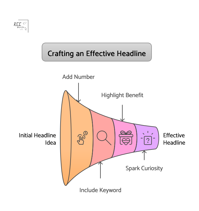
Your headline is the first thing people see, often in search results or on social media. It’s your single chance to make a strong first impression and convince someone to click, so a generic headline won’t cut it.
Your headline must promise something specific and valuable to the reader.
For example, instead of using the headline “Tips for Better Writing,” which sounds generic and average, try something like “7 Quick Ways to Write Blog Posts People Actually Finish.”
The second headline is specific (7 ways, quick) and promises a clear benefit (posts people finish).
Great headlines include elements in many of the blog post structures we previously covered:
- Numbers
- Keywords your audience uses
- A clear benefit or solution
- Curiosity (“What I Learned,” “The Secret to…”)
Studies show a massive difference in CTRs between average and compelling headlines. Some sources suggest a powerful headline can increase clicks by 500% or more compared to a weak one. The optimal length for your headline is 10 to 18 words (about 60 to 100 characters) to get the highest CTRs.
Spend time crafting headlines that get your audience’s attention, and resonate with their needs and desires.
Opening hooks that create immediate interest

Okay, they clicked your headline! Now you have a few seconds to convince them to keep reading your article.
How do you do that? With a strong opening hook.
Your hook is the first sentence or two of your introduction, and it needs to be compelling enough to draw the reader in. Get straight to the point or pique their curiosity immediately.
Effective hooks often:
- Ask a relatable question: “Struggling to get people to read your blog posts?”
- Share a surprising statistic: “Did you know the average online attention span is just 8 seconds?”
- Tell a brief, intriguing story: “I used to spend hours writing, only to see people bounce after a paragraph…”
- State a bold or contrarian claim: “Everything you think you know about online reading is wrong.”
- Promise a direct benefit: “Imagine writing posts that keep readers scrolling non-stop.”
Look at successful bloggers and writers in your niche. How do they start their articles? What makes you want to keep reading? Practice writing several different hooks for the same article and see which feels strongest.
Strategic use of subheadings to guide readers through your content
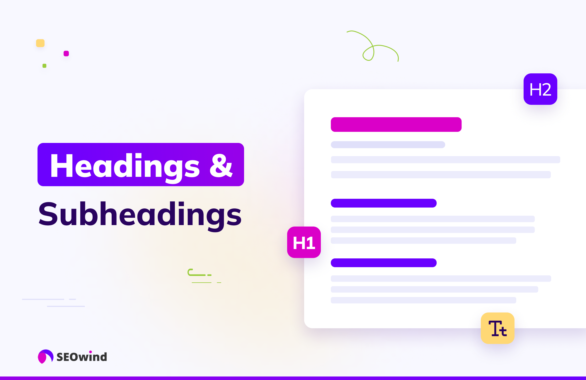
Subheadings are mini-headlines throughout your article that break up walls of text and allow readers to scan the main points quickly.
Use subheadings strategically:
- Make them descriptive: Tell the reader what the section is about.
- Use keywords: This helps with SEO and lets scanners know the relevance of the section.
- Break up your content logically: Each subheading should cover a distinct idea or step.
- Use H2, H3, H4 tags appropriately: This creates a clear hierarchy for both readers and search engines.
Remember the “F” and “Z” scanning patterns we discussed earlier? Subheadings are where your reader’s eyes will land as they scan down the page. If your subheadings are clear and interesting, the reader is more likely to stop and read the paragraphs below them.
The ideal paragraph length for digital reading

Source: Styled Stock Society
Forget what you learned about paragraph length in English class. Short paragraphs are where it’s at. Walls of text look daunting on a screen, especially on mobile devices.
Aim for paragraphs with 1 to 4 sentences, and use simple language that your audience understands. (Sometimes a single sentence can be its own paragraph for emphasis.) This creates lots of white space, making your content much easier on the eyes and more inviting to read.
Short paragraphs encourage scanning. A reader can quickly glance at a short paragraph and decide if they want to read it fully. But if they see long paragraphs, they might skip the whole thing.
Content readability tools like Hemingway App, Grammarly and Readable flag long paragraphs that can hinder one’s reading experience, because shorter paragraphs improve comprehension and engagement.
Using bucket brigades to maintain momentum

Bucket brigades are short phrases that act as transition sentences, pulling the reader from one paragraph to the next. They’re like mini-hooks between paragraphs that create flow and curiosity, and encourage the reader to keep going. (I’m using them in this article!) They often use punctuation that creates a slight pause or question, like colons or ellipses.
Examples of bucket brigades:
- Here’s the deal:
- But why does this matter?
- And guess what happened next?
- What does this mean for you?
- The best part?
- So, how do you do it?
Do you see how they make you want to keep reading to find the answer? Using simple phrases like these keeps the momentum going and reduces the chances of a reader dropping off between points.
Once you master these essential elements–headlines, hooks, subheadings, short paragraphs, and bucket brigades–you build a strong foundation for content that holds attention.
More Writing Tips to Keep Readers Scrolling to the End
Keeping a reader engaged isn’t just about the essentials. Your body copy should also hold their attention, and you can do that with the flow and energy of your writing at the sentence and paragraph level. These techniques make your content feel conversational, interesting, and easy to follow.
Craft transitions between sections

Source: Styled Stock Society
Smooth transitions are like bridges between different ideas or sections in your content. They prevent the reader from feeling lost or abrupt as they move from one point to the next.
Good transitions:
- Summarize the previous point and introduce the next.
- Use transition words or phrases.
- Ask a question related to the next section.
- Create anticipation for what’s coming.
For example, at the end of a section about headline writing, you might transition to a new section about introductions by writing: “Once you’ve hooked them with a great headline, how do you make sure they keep reading? That’s where your opening hook comes in.” This sentence connects the two topics logically.
Blog posts with clear transitions have better flow and keep readers engaged for longer periods, according to content readability analysis.
Vary sentence structure and length

Source: Styled Stock Society
Reading sentence after sentence of the exact same length and structure can be monotonous. Readability tools and some SEO tools score content better when you vary the sentence structure and length in your long-form content.
Varying your sentence structure and length keeps the reader’s brain engaged and makes your writing more dynamic.
- Mix short sentences with slightly longer ones.
- Start sentences with different words.
- Use active voice.
- Insert a single sentence here and there as a powerful paragraph break.
Consider this example:
A) “Readers have short attention spans. You need to grab them fast. Headlines are important. Hooks are also important.”
B) “Readers online have incredibly short attention spans. So, how do you possibly grab them fast enough? It starts, of course, with a powerful headline. But once they click? That’s where your opening hook takes over.”
Which version is more interesting to read? If you chose B, you see my point.
Inject personality without losing clarity

Source: Styled Stock Society
Your readers want to connect with a human, not a robot. Injecting your personality into your writing makes it unique, relatable, and enjoyable to read. But clarity is still king – don’t let personality make your points unclear.
How to add personality:
- Use contractions (like “you’re” instead of “you are”).
- Use personal pronouns (“I,” “we,” “you”).
- Tell relevant personal anecdotes or stories.
- Use conversational language (as if you’re talking to a friend, but keep it professional).
- Share your opinions or perspectives (where appropriate).
- Use humor (if it fits your brand and topic).
Compare these two examples:
- A) “This technique is recommended for optimal results.”
- B) “I’ve used this technique myself, and honestly? The results were incredible—I saved hours of time.”
Example B seems more personal and trustworthy, wouldn’t you agree?

Content that includes personal anecdotes and a conversational tone is perceived as more authentic and relatable by readers.
Include open loops that maintain curiosity

When you open a loop, the reader’s brain wants to close it.
Copywriting experts often use open loops in sales pages and articles to keep readers engaged and guide them towards a desired action.
An open loop is a psychological technique where you start discussing something or ask a question, but you delay providing the answer or resolution until later in the content. (Episodic TV does this all the time via “cliffhangers.”) This creates curiosity and encourages the reader to keep going to find out what happens or get the answer.
Some ways to use open loops in your content:
- In the introduction, mention you’ll reveal a “secret tactic” later in the post.
- Ask a compelling question early on and promise to answer it in a specific section.
- Start a short story but pause it and say you’ll finish it after the next few points.
- Hint at a surprising result or outcome that you’ll detail later.
For instance, early in a post about writing, you might say, “And one of the most powerful techniques I discovered completely changed how I write introductions. I’ll share exactly what it is in Section 3.”
The last sentence builds anticipation—now the reader has a reason to read on (or skip) to Section 3.
By implementing these writing tips, you make your content flow better, sound more human, and actively encourage readers to stay engaged from the first sentence to the last.
Next up: Making your content visually appealing.
Visual Elements That Enhance Readability
We’ve talked about structure and writing style, but how your content looks on the page is just as important for online readers. Visual elements break up text, highlight key information, and make your post more inviting.
Strategic use of images, charts and infographics

Visuals aren’t just decoration; they are powerful communication tools. They can explain complex ideas quickly, evoke emotion, and make your content more shareable. HubSpot’s 2025 State of Marketing Report announced the #1 trend in marketing: visual storytelling is overtaking text-heavy content formats.
Use visuals strategically:
- Featured image: Choose a compelling image that represents your post and grabs attention in social feeds and search results.
- Within the Post: Use images to illustrate points, break up walls of text, or add personality.
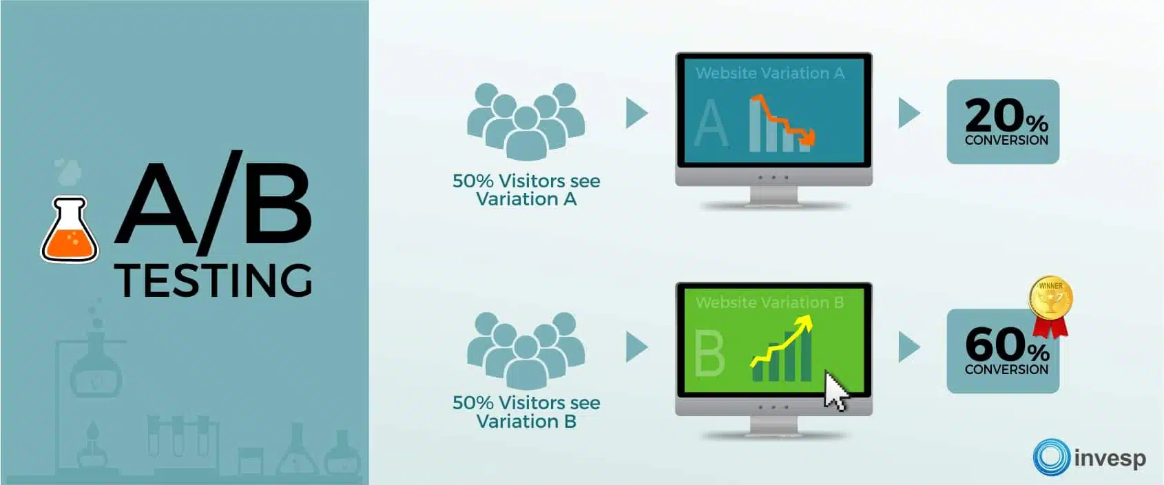
- Charts and graphs: If you have data, present it visually. A chart is much easier to understand than a paragraph of numbers.
- Infographics: Summarize complex processes or data-heavy topics into a shareable infographic.
- Break up text: Place images between sections or after long paragraphs.
In a post about social media statistics, instead of listing numbers, you could create and insert a simple bar chart showing which platforms are most popular. For a how-to guide, include a screenshot of each step to make it easy for your readers to learn and follow along.
Content with relevant images gets significantly more views and shares than text-only content. Webpages with 7 or more images get 116% more organic traffic. But don’t just add images randomly; make sure they add value and support your text.
Formatting techniques that break up text walls

Few things will make an online reader bounce from your site faster than a giant wall of text. Content with formatting like lists and bold text is easier to read and understand, and improves reader satisfaction.
Use simple formatting techniques to create visual breaks and make your content scannable with:
- Short paragraphs of 1 to 4 sentences.
- Subheadings to divide up your main points and sections.
- Bullet points and numbered lists for lists of items, steps, or key takeaways.
- Bold or italic text to highlight crucial words or phrases (use sparingly).
Instead of writing a long paragraph listing the benefits of your service, use a bulleted list. Instead of just stating a key term, bold it when you first introduce it.
Callout boxes to highlight key points

Callout boxes (sometimes called block quotes or pull quotes) are a great way to make important information pop off the page. They are visually distinct from the main body of text and draw the reader’s eye.
Use callout boxes for:
- Key statistics or data points
- Memorable quotes
- Definitions of important terms
- Key takeaways from a section
- Actionable tips
If you mention a compelling statistic about email marketing conversion rates, put it in a callout box. If you have a powerful quote from a case study participant, highlight it this way. This ensures that even scanners will catch the most critical information.
Web usability studies show that highlighting key information using visual breaks like callout boxes improves content comprehension and retention.
White space makes reading easier
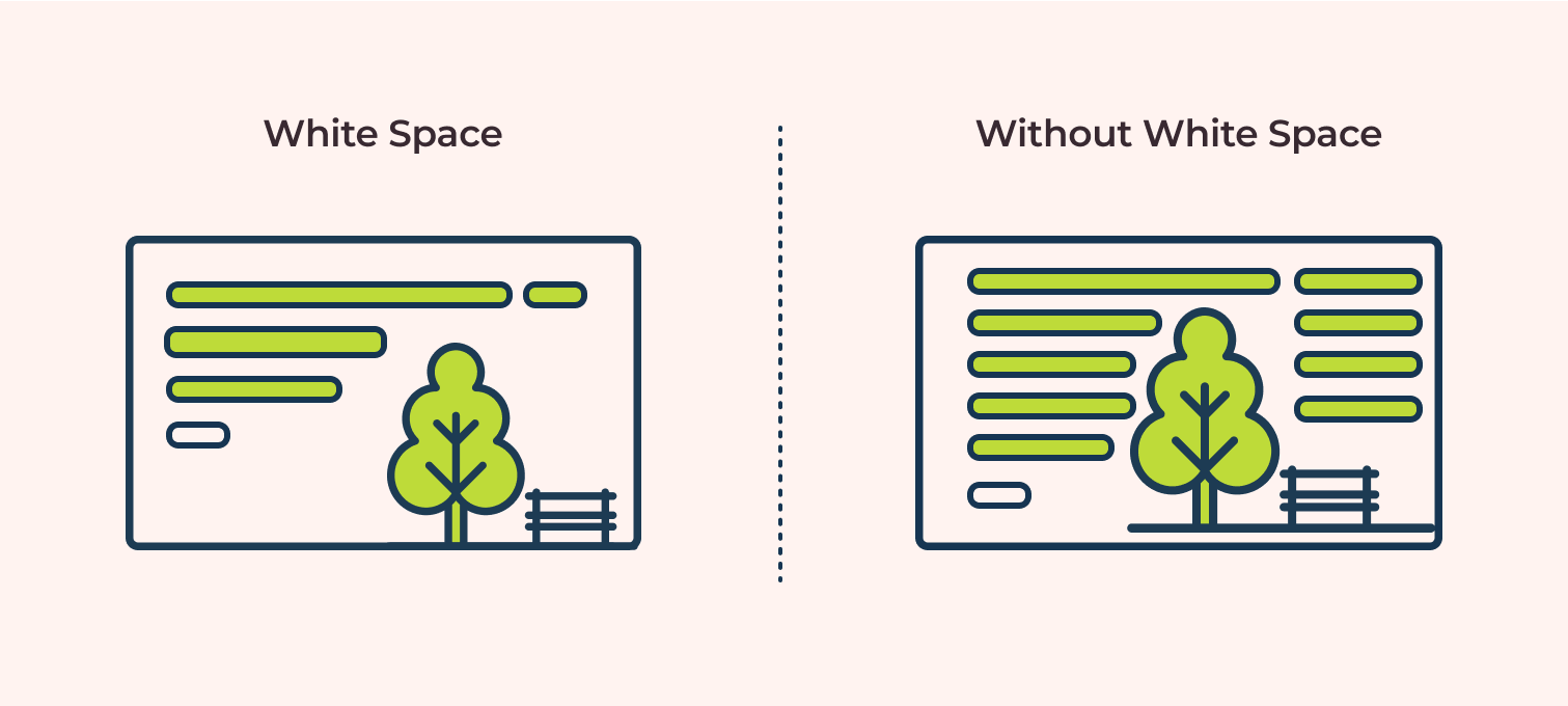
White space is the empty space on your page–the margins, the space between lines of text, the space between paragraphs, and the space around images. It’s essential for readability because it makes your content easier on the eyes.
Too little white space makes your content look cramped, overwhelming, and difficult to read. Enough white space makes the content feel light, airy, and inviting.
Pay attention to:
- Line spacing: Ensure enough space between lines of text.
- Paragraph spacing: Add extra space between paragraphs (short paragraphs help with this too).
- Margins: Don’t let your text stretch all the way across the screen; use margins.
- Space around images and other elements: Give visuals room to breathe.
Look at two versions of the same blog post–one with tiny margins and no space between single-sentence paragraphs, and one with healthy margins and extra space between paragraphs. The second one gives you a more pleasant reading experience.
User experience (UX) research consistently shows that adequate white space improves readability and reduces eye strain, encouraging users to stay on the page longer. By intentionally using visuals and formatting, you make your content visually appealing and easy for busy online readers to consume.
In the final section of this pillar post, let’s strategize how to produce this content without spending all your time on it as a busy solopreneur.
Content Planning Tips for Time-Strapped Solopreneurs
As a solopreneur, you wear many hats. Content creation is vital, but it can feel overwhelming when you’re also handling sales, marketing, client work, and everything else. The key is smart planning and efficient execution.
How to create a sustainable content calendar you’ll actually follow

A content calendar isn’t just a nice-to-have; it’s a necessity for staying consistent and organized. But it needs to be realistic for your schedule.
Here’s how to build one you can stick to:
- Assess Your Capacity: How much time can you realistically dedicate to content each week or month?
- Choose Your Publishing Frequency: How often can you publish based on your capacity? Once a week? Twice a month?
Note: Consistent quality is more important than frequency. It’s better to post high-quality content once a month than post mediocre content every week.) - Brainstorm Topics: Generate a list of topics based on your audience’s needs, your expertise, and your business goals. Refer back to the structures we discussed.
- Map Topics to Dates: Assign topics to specific dates on a calendar. Don’t just write “Blog Post”; write “Blog Post: [Specific Topic/Headline Idea].”
- Break Down Tasks: For each post, list the steps: Research, Outline, Draft, Edit, Format, Publish, Promote.
- Schedule Time Blocks: Put specific time blocks in your calendar for each of those tasks. Treat them like appointments.
Example: Instead of a vague note like “I need to write blog posts,” your calendar could have:
- Monday, 9 to 10 AM: Research for “5 Lead Magnet Ideas” post.
- Tuesday, 1 to 3 PM: Draft “5 Lead Magnet Ideas” post.
- Wednesday, 10 to 11 AM: Edit and Format “5 Lead Magnet Ideas” post.
- Thursday, 2 PM: Publish “5 Lead Magnet Ideas” post.
Having a visual plan reduces mental clutter, and makes the process feel less daunting and stressful. Those who use a content calendar are significantly more likely to report success with their content strategy. CoSchedule has a free content calendar (not sponsored).
Batch writing techniques to maximize productivity

Source: Styled Stock Society
Productivity research often highlights batching similar tasks as a key strategy for improving focus and output.
Batch writing means dedicating a block of time to complete a specific writing task for multiple pieces of content. This is a productivity superpower for solopreneurs.
Instead of working on one blog post from start to finish, you might do your content batching like so:
- Batch Outline: Outline three blog posts in one sitting.
- Batch Draft: Draft the intros for five blog posts, then draft the main body for all five, then draft the conclusions for all five.
- Batch Edit: Edit several drafted posts back-to-back.
Why does this work? It reduces context switching. Your brain stays in “outlining mode” or “drafting mode,” which is more efficient than switching between tasks for a single post.
Here’s how this could look:
On Monday, you outline 3 posts. On Tuesday, you draft the first half of all 3. On Wednesday, you draft the second half. By the end of the week, you have 3 drafts ready for editing, instead of maybe just one finished post.
Incorporate batching strategy into your content calendar, and watch your productivity soar!
Repurposing strategies to get more mileage from single pieces
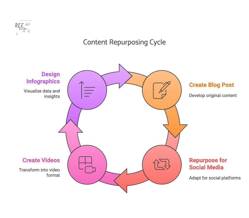
You spent time creating that awesome blog post. Don’t let it live and die on your blog! You can reuse your content in so many ways to reach more potential clients and customers.
Repurposing means taking the core ideas from one piece of content and turning them into different formats for other platforms. This is crucial for solopreneurs because it maximizes the return on your content creation effort.
Some ideas for repurposing:
- Turn key points into social media posts (threads, carousel posts, individual updates).
- Create graphics or infographics from data points or lists.
- Record a short video summarizing the main ideas.
- Turn the article into a script for a podcast episode or YouTube video.
- Expand a section into a longer guide or email series.
- Create quote images from impactful sentences.
Say you write a pillar blog post on “10 Marketing Mistakes Solopreneurs Make.” You can reuse parts of that post to:
- Turn each mistake into a separate social media post for the next 10 days.
- Create an infographic summarizing all 10 points.
- Record a 5-minute video discussing the top 3 mistakes.
- Turn the post into a solo podcast episode.
Business owners who effectively repurpose content can see a significant increase in their reach and engagement across channels. Repurposing allows you to reach different audiences on different platforms without creating everything from scratch.
Simple research methods that don’t eat up your whole day

Effective blog posts often require research – understanding your audience, finding data, or gathering information on a topic. But research can feel like a black hole that swallows your time. Keep it simple and focused.
Quick research methods:
- Listen to Your Audience: What questions do they ask in emails, comments, or on social media? What problems do they mention?
- Keyword Research Tools: Use simple tools (even free ones) to see what terms people are searching for related to your topic.
- Check Competitors: See what topics successful blogs in your niche are covering. What are they not covering?
- Browse Forums and Groups: Look at discussions on platforms like Reddit, Facebook Groups, or Quora in your niche to see what pain points people have with your topic.
- Use Google Search: Look at the “People Also Ask” section and related searches for your topic ideas.
- Set Time Limits: Decide in advance how long you will spend on research for a specific post (30 to 60 minutes) and stick to it. (This should be part of your content calendar.)
Let’s suppose you want to write about email marketing for beginners. You check a keyword tool and see lots of searches for the long-tail keywords “best email subject lines” and “how to grow email list fast.” Later, you browse a Facebook group and see beginners asking about choosing email software. This quick research tells you exactly what problems to address and what keywords to use, saving you hours of aimless searching and guessing.
Efficient research methods are key to consistent content creation, allowing solopreneurs to spend more time writing and promoting.
By implementing these planning and productivity tips, you can create a consistent stream of engaging content without burning out.
Phew, we’ve covered a lot of ground! From understanding how people consume online content to specific structures, planning tricks, visual boosts, and writing techniques—you now have a powerful toolkit for creating blog posts that don’t just hook your readers, but keep them engaged.
When you focus on clear structure, scannable formats, emotional connection, and maintaining momentum with your writing, you respect your reader’s time and deliver information in a way that resonates with them.
Adding visuals and paying attention to white space makes your posts inviting, while using transitions, varying sentences, injecting personality, and creating open loops keeps your readers scrolling all the way to the end.
And as a solopreneur, strategizing your content strategy with calendars, batching, and repurposing ensures you can consistently create great content without sacrificing all your time.
Whether you use the problem-solution framework, a listicle, or weave in storytelling, choose the right content structure to give your content purpose and direction. Start with one of them for your next post, and watch how it impacts your reader engagement metrics. You might be surprised at how much longer they stick around.
References
#BrandsGetReal: What consumers want from brands in a divided society. (2018). Sprout Social. Retrieved from https://sproutsocial.com/insights/data/social-media-connection/
10 Content Hooks that Will Keep your Readers Engaged and Coming Back for More. (2024). The Blog Social. Retrieved from https://www.theblogsocial.com/10-content-hooks-keep-readers-engaged/
12 Effective Ways to Improve Content Engagement in 2024. (2024). Content Whale. Retrieved from https://content-whale.com/blog/12-ways-to-improve-content-engagement/
21 Essential Affilate Marketing benchmarks & KPIs for Success in 2025. (2025). Partnero. Retrieved from https://www.partnero.com/articles/21-essential-affiliate-marketing-benchmarks–kpis-for-success-in-2025
6 Types of Content That Attract Backlinks. Digital SEO Land. Retrieved from https://digitalseoland.com/blog/linkable-content-types-that-attracts-backlinks/
Clark, B. (2021). 22 Sure-Fire Headline Formulas that Work. Copyblogger. Retrieved from https://copyblogger.com/10-sure-fire-headline-formulas-that-work/
Go, S. (2024). The Top 24 Website Metrics to Track in 2025. Semrush. Retrieved from https://www.semrush.com/blog/website-metrics/
Hamby, A. & Edson Escalas, J. (2023). Connecting the Plot Points: How Consumers Use and Respond to Narratives. Association for Consumer Research. Retrieved from https://doi.org/10.1086/727829
How to Use Readability Scores in Your Writing | Grammarly Spotlight. (2020). Grammarly. Retrieved from https://www.grammarly.com/blog/product/readability-scores/
Lee, R. (2022). How To Write SEO-Friendly Headlines That Drive Traffic and Clicks. Thrive Marketing. Retrieved from https://thriveagency.com/news/how-to-write-seo-friendly-headlines-that-drive-traffic-and-clicks/
Lowe, S. (2024). 10 Types of Content Marketing for B2B You Should Try. Future B2B. Retrieved from https://www.futureb2b.com/resources/10-types-of-content-marketing-for-b2b-you-should-try/
Mileva, G. (2024). Content Calendar Examples to Plan Content Like a Pro [+Free Template]. Influencer Marketing Hub. Retrieved from https://influencermarketinghub.com/content-calendar-examples/
Moran, K. (2020). How People Read Online: New and Old Findings. Nielsen Norman Group. Retrieved from https://www.nngroup.com/articles/how-people-read-online/
Pernice, K. (2017). F-Shaped Pattern of Reading on the Web: Misunderstood, But Still Relevant (Even on Mobile). Nielsen Norman Group. Retrieved from https://www.nngroup.com/articles/f-shaped-pattern-reading-web-content/
Readability and document stats. (n.d.). Hemingway App. Retrieved from https://hemingwayapp.com/help/docs/readability
SEO Statistics That Prove Its Effectiveness in 2023. (2023). Markitors. Retrieved from https://markitors.com/seo-statistics-that-prove-its-effectiveness-in-2023/
Stahl, S. (2023). B2B Content Marketing Benchmarks, Budgets and Trends: Outlook for 2024 [Research]. Content Marketing Institute. Retrieved from https://contentmarketinginstitute.com/b2b-research/b2b-content-marketing-benchmarks-budgets-and-trends-outlook-for-2024-research/
Stoddart, T. (2024). How To Write A Headline That Drives More Clicks. Copyblogger. Retrieved from https://copyblogger.com/how-to-write-headlines-that-work/
Tate, R. (2013). Tabloid chic: How Racy Headlines unlock Money and Power. Wired. Retrieved from https://www.wired.com/2013/02/tabloid-chic-the-rise-of-racy-headlines/
The long and short of it: how bucket brigades could save your long form content. (2020). Write Arm. Retrieved from https://www.writearm.co.uk/news/the-long-and-short-of-it-how-bucket-brigades-could-save-your-long-form-content/
The State of Marketing 2025. (2025). HubSpot. Retrieved from https://www.hubspot.com/state-of-marketing
The Ultimate guide to Content Batching: Save Time and Get Consistent. (n.d.). Hello Media. Retrieved from https://hellomediasocial.com/blog/guide-to-content-batching
Transitions Word List. (n.d.). Readable. Retrieved from https://help.readable.com/en/article/transition-words-list-9j1t6v/
Wang, H. & Chan, M. (2023). 5 Formatting Techniques for Long-Form Content. Nielsen Norman Group. Retrieved from https://www.nngroup.com/articles/formatting-long-form-content/