
Website User Experience Tips for Solopreneurs to Boost Engagement and Conversions
Did you know that 88% of online customers won’t return to a website after a poor user experience?
As a solopreneur, your website is often your primary storefront, marketing engine, and customer service hub all rolled into one, working for you 24/7. But is it working effectively?
In the crowded online space, simply having a website isn’t enough. You need a site that visitors not can only find easily, but also enjoy using. A great user experience (UX) keeps visitors engaged and convert them into loyal customers.
This article will walk you through essential website user experience tips specifically tailored for solopreneurs. We’ll talk about psychological triggers that influence visitor behavior, and cover practical strategies to improve your site’s performance, navigation, design, calls-to-action, trust signals, and checkout process. By implementing these tips, you can create a better customer experience, boost customer engagement, and drive more website conversions.
Contents
- Why Website UX Matters
- Speed Up Your Website Loading Time
- Create Clear, Intuitive Navigation
- Design for Visual Hierarchy and Scannable Content
- Craft Compelling Calls-to-Action
- Include Social Proof Elements
- Optimize Your Forms and Checkout Process
- Build Trust with UX and Content Design
- Put UX at the Heart of Your Solopreneur Website
- Wrap-Up
- References
Why Website UX Matters

What is user experience and how does it apply to a website?
Good UX and content design means making your website easy, intuitive, and pleasant for people to interact with. For a one-person business, optimizing UX isn’t just a nice-to-have; it’s a critical factor for success. It directly impacts how visitors perceive your brand, whether they stick around to learn more, and ultimately, whether they become customers.
Smooth, intuitive UX guides visitors naturally towards your desired actions, whether that’s signing up for a newsletter, filling out a contact form, or making a purchase. Conversely, a clunky, confusing, or slow website frustrates users and sends them clicking away – often straight to a competitor. Good UX and content design removes friction from the user journey, making it easier for visitors to convert (take action).
Why should you, as a busy solopreneur, dedicate precious time and potentially resources to improving your website’s user experience? The answer lies in the direct impact UX has on your bottom line.
Cost-benefit analysis of UX improvements vs. other marketing investments
As a solopreneur, every dollar counts. You might wonder if investing in UX will give you a better return on investment (ROI) than spending more on ads or other marketing channels.
Research consistently shows that the answer is a resounding Yes:
- Forrester Research reported that a well-designed UI could raise website conversion rates by up to 200%, and better UX design could yield conversion rates up to 400%.
- A Google study revealed that mobile sites with user-friendly layouts generated 53% more sales than poorly designed sites (Think With Google, 2020)
While specific numbers vary from study to study, a better user experience equals more conversions.
Often, UX improvements involve optimizing what you already have, potentially offering a higher ROI than constantly chasing new traffic through paid channels. Various studies from Forrester, Nielsen Norman Group and others suggest every $1 invested in UX can yield a return between $2 and $100.
Driving traffic to a poorly designed website is like pouring water into a leaky bucket. You might get initial visitors, but they won’t convert, and your marketing budget is wasted. Improving your website’s UX and content design is like fixing the leaks to ensure the traffic you get has a much higher chance of converting. This makes your existing marketing efforts more effective and provides a firm foundation for your business to grow. Unlike social media platforms, your website is an owned channel that no one can take away.
Improved UX reduces bounce rates and increases average session duration

Have you ever visited a website, felt lost, and immediately left? That’s a bounce.
Your bounce rate measures the percentage of visitors who land on your site and leave without interacting further. A high bounce rate often signals UX problems – perhaps the site loaded too slowly, the navigation was confusing, or the content wasn’t what they were looking for.
Average session duration tells you how long visitors typically stay on your site.
Good UX and content design elements like clear navigation, fast loading times, and engaging content make visitors want to stick around longer and learn more about what you offer. Improving UX elements directly addresses the reasons people leave quickly.
Let’s go deeper into these elements, starting with the speed that your website loads.
Speed Up Your Website Loading Time
Your site’s loading speed directly affects user satisfaction, engagement, and conversions.

3 to 5 seconds determines whether visitors stay or leave
If your site takes too long to load, potential customers will simply leave before they even see what you offer. 40% of website visitors, and more than half of mobile users will abandon websites that take more than 3 seconds to load.
Google research indicates that as a webpage load time goes from 1 second to 3 seconds, the probability of a visitor bouncing increases by 32%. If it goes to 5 seconds, the probability increases by 90%.
Websites loading within 2 seconds typically have an average bounce rate of 9%, while those taking 5 seconds see bounce rates jump to 38% (Pingdom, 2021).
Aim for a loading time under 3 seconds to keep site visitors engaged.
Optimize images for faster load times
One of the biggest culprits of slow websites are large, unoptimized images. To improve your website speed, first consider the size of the images you use, and then:
- Resize images: Don’t upload images straight from your camera or stock photo site. Resize them to the actual dimensions needed on your webpage before uploading. A banner image may only need to be 1920 pixels wide, not 5000.
- Compress images: Tools like ImageOptim and TinyJPG reduce file size without sacrificing quality.
- Pick the right file format: Use for JPEGs for photos, PNGs for graphics with transparency, and SVG for graphics and icons.
Also consider using newer image formats like WebP, which often provide better compression than JPEG or PNG. Many WordPress plugins can automatically convert your images to WebP for supported browsers.
WordPress plugins to improve speed
If your website runs on WordPress, you have several plugins to choose from that can significantly improve website performance (not sponsored):
- Caching plugins like WP Rocket, LiteSpeed Cache (which I use), and W3 Total Cache store static versions of your pages. This means they don’t have to be generated from scratch for every visitor, speeding up your site’s load time.
- Image Optimization plugins like Smush, ShortPixel, and Imagify can automatically compress and resize images upon upload and even convert them to formats like WebP.
- Asset Optimization plugins like Asset CleanUp and Perfmatters let you disable unnecessary scripts (CSS and JavaScript) from loading on specific pages where they aren’t needed, reducing bloat.
Installing plugins on WordPress is pretty straightforward, but if you need help, I recommend going to WPBeginner for easy tutorials (not sponsored).
Tools to test your website speed and benchmark improvements
You can’t improve what you don’t measure. Regularly test your page speed using online tools like these (not sponsored):
- Google PageSpeed Insights: Provides scores for mobile and desktop, highlighting specific issues and opportunities for improvement. Focus on metrics like Largest Contentful Paint (LCP), Interaction to Next Paint, INP, and Cumulative Layout Shift (CLS), known as Core Web Vitals.
- GTmetrix: Offers detailed performance reports, waterfall charts showing load order, and allows testing from different locations.
- Pingdom Website Speed Test: Displays performance grades, page size, load time, and request counts.
Use these tools before making changes to get a baseline. Then afterward, make the changes described in this section to see the impact of your optimizations.
Once you’ve got your site loading quickly, visitors need to be able to find their way around easily, which brings us to navigation.
Create Clear, Intuitive Navigation

Your website’s navigation is like a map. If the map is confusing, torn, or leads to dead ends, you’ll get lost and frustrated.
Clear, intuitive navigation design is like a map that guides visitors smoothly through your site to help them find the information they need. Users shouldn’t have to guess where to find something.
The psychology behind effective website navigation structures
Our brains naturally prefer order, hierarchy, and simplicity. If site visitors struggle to find key pages (Services, Contact etc.), they’ll bounce.
Good navigation respects user psychology by reducing the mental effort required to use your site (cognitive load). A principle in psychology of design called Hick’s Law states that the time it takes to make a decision increases with the number and complexity of choices. Keeping your main navigation menu concise with 5 to 7 main items makes it easier for users to process and choose.
Group related pages logically under clear, predictable headings (“Services,” “About,” “Blog,” “Contact”). Keep your main navigation the same across all pages for consistency.
Conduct a navigation audit

Not sure if your navigation is effective? Audit your site using heatmaps from tools like Hotjar to identify where your site visitors click most often (not sponsored). Check for broken links, cluttered menus, or buried pages that could frustrate users.
Perform a simple audit with these steps:
- List the main tasks: What are the main things you want users to do on your site (learn about services, find pricing, contact you, read blog posts)? These should be your menu labels.
- Do a user test: Put yourself in your user’s shoes. Ask a friend who is unfamiliar with your site to complete these tasks using only the navigation. Was it easy? Were there confusing labels? Did you hit a dead end because something was missing or unclear?
- Check analytics: Use website analytics (like Google Analytics 4 or Navigation Summary reports) to see how visitors actually move through your site. Are they dropping off at certain points? Are they using the search bar excessively because they can’t find things via the menu?
- Run a simple card sort: Write down the main pages/topics of your site on cards (physical or virtual). Ask a few people (ideally from your target audience) to group these cards in a way that makes sense to them. This can reveal intuitive groupings you may not have considered.
Mobile navigation considerations for solopreneurs
With more than half of web traffic coming from mobile devices, mobile responsiveness and navigation are a must.
A mobile responsive website means that its design and layout automatically adjusts to the screen of the device in use.
Common mobile navigation patterns include:
- Hamburger menu: This three-line icon is widely used to tuck the menu away, saving space. Ensure the menu, once opened, is easy to scan and tap.
- Bottom navigation bar: For apps or sites with a few core actions, a persistent nav bar at the bottom of the page can provide quick access to key areas.
- Thumb-friendly design: Place key navigation elements within easy reach of a user’s thumb. Test your site on mobile devices of different sizes.
- Clear labels: Keep menu item labels concise and clear on smaller screens to save space.
Take a mobile-first design approach, where you design for mobile constraints on a very small device first and then adapt for larger screens. Ensure menus, dropdowns, and buttons function smoothly on smaller screens, and are still easy to read. Using a single-column layout helps too.
A mobile-first design leads to an accessible, cleaner, and more focused navigation overall, and more satisfied users.
Set breadcrumbs and secondary navigation elements

Breadcrumbs are navigational aids that show users their current location within the site structure. They typically appear horizontally near the top of a page (Home > Services > Web Design). Not only do they enhance usability, but they can improve SEO rankings, as search engines value clear site structure.
Breadcrumbs help users orient themselves and easily navigate back to higher-level pages. Studies by Nielsen Norman Group show users can complete tasks faster when websites offer breadcrumbs, especially on deep, complex sites.
Secondary navigation might include links in the footer (for privacy policies and terms of service) or sidebar navigation for related content within a specific section (like blog categories). Use secondary navigation judiciously to avoid cluttering the main navigation.
A/B testing strategies for navigation improvements
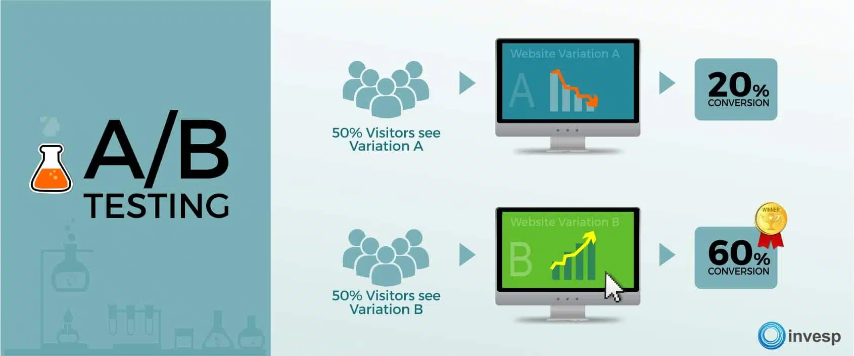
A/B testing (also known as split testing) is a way to evaluate two versions of the same thing.
Once you have some hunches about how to improve your site navigation, use A/B testing to validate them. You could test:
- Menu labels: Does “Our Work” perform better than “Portfolio”?
- Item order: Does placing “Contact” last in the menu improve conversions?
- Number of items: Does a slightly shorter or longer menu affect user flow?
- Mobile menu style: Does a bottom bar outperform a hamburger menu for your specific goals?
If you want to do an analysis of user habits, use a heatmap to see where users click most on a website.
Start with small, focused tests, and experiment with menu styles, positioning (top vs. sidebar), and category labels. Tools like Optimizely, VWO, and HubSpot allow you to show different navigation versions to different segments of your target audience and measure which performs better against your goals, such as a lower bounce rate or higher goal completions. (This content is not sponsored by these tools.)
Now let’s move on to web design and content.
Design for Visual Hierarchy and Scannable Content
People don’t read websites; they scan them. Your website design needs to establish a clear visual hierarchy to make content easy to scan and digest.
Structure content for F-pattern and Z-pattern reading patterns
Users typically scan in an F-pattern for text-heavy pages and a Z-pattern for layouts with visuals. Research by Nielsen Norman Group identified two common web reading patterns:
- F-Pattern: Users often scan in a pattern that resembles the letter “F.” They read horizontally across the top, then scan down the left side, occasionally reading horizontally again on interesting headings or lines. This means placing key information (headings, subheadings, initial sentences) at the top and left is crucial.
- Z-Pattern: For less text-heavy pages or simpler layouts, users might scan in a “Z” shape, where they look across the top, diagonally down and left, then across the bottom. Use this pattern for landing pages by placing key elements like your logo (top-left), main heading, key visuals/points (along the diagonal), and a call-to-action (bottom-right).
Structure your page layout knowing users will likely scan. Place key elements like headings, subheadings, and bullet points and CTAs to catch their eye along these paths.
Direct their attention with proper contrast, size and color
Visual hierarchy uses design principles to signal importance without explicitly stating it. Key techniques include:
- Size: Make headings significantly larger than body text. Make important buttons larger than secondary links.
- Color: Color psychology suggests certain colors evoke specific emotions or actions (in the U.S., blue conveys trust, while red can evoke urgency), but context and contrast are often more important than the specific hue. Use contrasting colors to make key elements (like CTAs) stand out. Ensure sufficient color contrast between text and background for accessibility.
- Contrast: Contrast draws attention. For example, bold headings and bright CTA buttons stand out against neutral backgrounds. High contrast (dark text on a light background) improves readability and accessibility. Use contrast strategically to draw attention to focal points.
- Placement: Users perceive elements placed higher on the page or in prominent positions (like the top or center) as more important than others.
Make scannable content with subheadings, bullet points, and short paragraphs

No one wants to read a wall of text. Here’s some ways to create scannable content:
- Font size: Use a text font size where users don’t have to squint to read. Any font size under 14 points will compromise readability.
- Short paragraphs: Aim for paragraphs of 1 to 4 sentences, left-aligned. This creates more white space and makes the text less daunting to read. I love using Hemingway Editor to simplify complex sentences and check the reading level of my writing (not sponsored).
- Meaningful subheadings: Use clear, descriptive headings with the proper heading tag (H2, H3, etc.) to outline the content structure and allow users to jump to sections of interest.
- Bulleted and numbered lists: Ideal for listing features, benefits, steps, or key takeaways.
- Bold or italic text: Use formatting to highlight key terms or phrases within paragraphs, but don’t overdo it.
Eye-tracking studies show that concise, scannable text formats can improve usability by 47% (Nielsen Norman Group). These techniques improve readability and help users quickly grasp the main points, respecting their time and scanning habits for all forms of online reading, not just websites.
Effective use of white space to improve readability
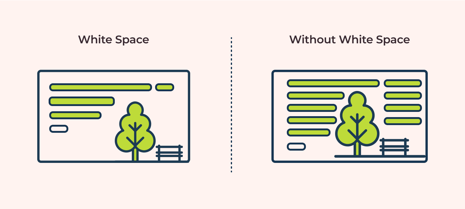
White space enhances focus and reduces cognitive load, making your site easier to read. Avoid cramming too much copy into any section of the page by adding white space around elements on your page.
White space helps to:
- Reduce onscreen clutter: Makes the page feel calmer and less overwhelming to read through.
- Improve focus: Helps draw the user’s eye to important elements by separating them from surrounding content.
- Helps understanding: Studies show that good use of white space between paragraphs and in margins increases reading comprehension.
Don’t be afraid to let your content breathe.
Balance text and visuals for maximum engagement
While text conveys detailed information, visuals (images, icons, videos) capture attention, illustrate points, break up text, and evoke emotion.
Images and infographics can complement written content, but too many visuals can overwhelm visitors. To keep things balanced:
- Include relevant images: Ensure images support the content and aren’t just decorative filler. High-quality, authentic photos work better than generic stock photos to establish trust with your brand.
- Use icons: Icons can quickly convey concepts and add visual interest to lists or features.
- Consider using video: Short explainer videos or testimonials can be highly engaging.
- Maintain consistency: Visual elements should align with your brand identity and the overall design consistency of the site.
Well-structured, scannable content naturally leads the user toward the next step: taking action.
Craft Compelling Calls-to-Action

A call-to-action (CTA) is an instruction designed to get your site visitor to do something, like signing up for your emails, buying your product, or booking a consultation.
Effective CTAs are crucial for lead generation, driving sales, and moving potential customers through your sales funnel (also called a conversion funnel). A weak or unclear CTA means missed opportunities.
CTAs: What makes a person click?

The most effective CTAs tap into basic user psychology to encourage your target audience to act on something. Wording like “Get Started” or “Claim Your Free Trial” emphasizes simplicity and value.
Create CTAs that convert with these characteristics:
- Clarity: Users need to know exactly what will happen when they engage with a click or tap. Be specific and use action-oriented language. Use strong action verbs (“Get,” “Download,” “Subscribe,” “Book,” “Shop”). Instead of “Submit,” try “Send My Message” or “Get Started.”
- Concise: Keep CTAs short, with no more than 3 words per button.
- Benefit-Oriented: Clearly state the benefit or outcome (“Get Your Free Quote,” “Download the Ebook,” “Book a Consultation,” or “Start Saving Today” vs. “Submit”). The text should clearly communicate what the user will get when they engage.
- Low perceived risk: Assure users (“No credit card required,” “Cancel anytime,” or “Learn more”).
- Visual prominence: Design the CTA to stand out.
- Sense of urgency: Mention limited availability or time-sensitive discounts. Phrases like “Limited Time Offer” or “Shop Now Before It’s Gone” can encourage immediate action, but can backfire if they’re overused or seem inauthentic. Use these phrases sparingly.
- Address objections: Add small text near the CTA to preempt concerns and remove hesitation, like “No credit card required,” “Cancel anytime,” “Free 15-minute call,” or “Secure checkout.” , You can also use social proof (“Join 1,000+ happy customers”). This builds trust right at the decision point.
Best practices for CTA position and color
Where and how your CTA appears matters:
- Position: Place CTAs in context, where user motivation is likely high, and visible without excessive scrolling:
- Above the fold on landing pages
- After compelling benefit descriptions
- At the end of blog posts.
- Color: Use a brand color that contrasts strongly with the background and surrounding elements, make the button pop.
A/B testing different colors is often worthwhile. HubSpot found that red buttons outperformed green buttons by 21% in one test, but emphasized that context is key.
When to use primary vs. secondary CTAs on a single page
Not every visitor is ready to buy during their first visit to your site. Offering options caters to different stages of the customer journey:
- Primary CTA: Your main desired action (“Buy Now,” “Request a Demo”). This should be the most visually prominent CTA on the page.
- Secondary CTA: Sometimes, asking for a small, low-risk action first (a micro-commitment) is the right choice (“Learn More,” “Download Free Guide,” “Add to Wishlist”). These secondary CTAs hould be less prominent (an outline style button or text link) so they don’t compete visually with the primary CTA. Examples include:
- Signing up for a free newsletter.
- Downloading a valuable free resource (checklist, template).
- Following you on social media.
Successfully completing these small interactions builds familiarity and a degree of trust, making visitors more receptive to your primary CTAs later in their user journey.
Take a look at these examples from DesignCourse (before and after):
Including both primary and secondary CTAs provides a path forward for more users, potentially capturing leads you might otherwise lose. However, don’t put too many CTAs on any webpage except a landing page. Emails with a single CTA increase clicks by 371% and sales by 1,617%!
Examples of high-converting CTAs for solopreneur websites
Tailor your CTAs to your specific online business model:
- Service providers:
- Book Your Free Consultation
- Get a Custom Quote
- Download My Portfolio
- Request Project Details
- Coaches and consultants:
- Schedule Your Discovery Call
- Enroll in the Course
- Join the Waitlist
- Access the Free Masterclass
- E-commerce sellers:
- Shop Now
- Add to Cart
- Buy It Now
- Explore the Collection
- Get 10% Off Your First Order
- Content Creators and bloggers:
- Subscribe to My Newsletter
- Download the Checklist
- Read More
- Join the Community
HubSpot has even more CTA examples. Remember to test what resonates best with your audience.
Compelling CTAs work best when users trust you, which is where social proof comes in.
Include Social Proof Elements

Trust is a key factor when a visitor decides whether to become your customer. Social proof is incredibly powerful for building website credibility and encouraging conversions.
Social proof shows visitors that others already trust and value your products or services. Social proof builds confidence in your brand, because when they see that others had a good experience with your business, they feel safer becoming customers themselves.
Types of social proof most effective for solopreneur businesses
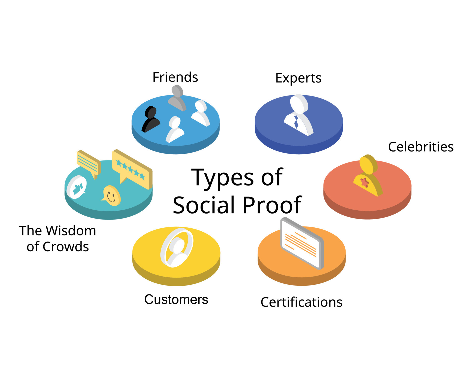
You don’t need massive follower counts to leverage social proof. Effective types include:
- Testimonials: Direct quotes from happy clients, ideally with their name and photo for authenticity. Video testimonials are even more powerful.
- Reviews: Ratings and reviews on your site or third-party platforms (Google Reviews, Yelp, industry-specific sites).
- Case studies: Detailed stories of how you helped a client achieve specific results.
- Client logos: If you’ve worked with recognizable businesses (even small local ones), displaying their logos can lend authority.
- Metricsand statistics: Mentioning the number of clients served, projects completed, or positive survey results (“95% client satisfaction rate”).
- Media and PR mentions: Logos of publications or websites where you’ve been featured or made appearances (“As seen in…”).
Place your testimonials, reviews, and case studies strategically

Context matters. Don’t hide your social proof on a single “Testimonials” page. Place social proof where it directly supports the claim or action you want the user to take:
- Homepage: Feature a few strong testimonials or client logos above the fold or near your main value proposition.
- Service/Product pages: Place relevant testimonials or case study snippets near the description or CTA for that specific offering.
- Landing/Checkout/Contact pages: A short quote or trust seal near a form can reassure users at the point of conversion.
- Case study section: A dedicated area for detailed success stories.
Studies show that placing testimonials near CTAs can significantly increase conversion rates. BrightLocal’s 2023 Consumer Review Survey found that 98% of consumers read online reviews for businesses.
How to gather compelling testimonials when you’re just starting out
Getting those first few testimonials can feel challenging. Focus on quality over quantity. A few detailed, authentic testimonials are better than many generic ones. Here’s how to get testimonials:
- Start with beta testers or early adopters: If you’re launching something new, offer a discount to early users in exchange for feedback and testimonials.
- Ask directly: Reach out personally to clients you know are happy with your work. Make it easy for them by suggesting specific questions or offering to draft something they can approve.
You can also offer to help someone for free in exchange for a testimonial. - Use feedback surveys: Include an optional field asking for permission to use positive feedback as a testimonial. Use tools like Typeform, SurveyMonkey, or Google Forms to gather feedback and request testimonial permission.
- Leverage LinkedIn recommendations: Ask clients for recommendations on LinkedIn, which you can then quote.
Encourage reviews on Google Business Profile, Yelp, Trustpilot, or industry-specific sites. Embed widgets to display these reviews on your site.
Services like Testimonial.to, Endorsal, or Senja make it easy to request text or video testimonials and display them attractively (not sponsored).
You can also include popups on your landing page. Tools like ProveSource show real-time notifications (“Someone just purchased X,” “Jane Doe signed up for the newsletter”) to create urgency and demonstrate activity (not sponsored).
Social proof builds trust, which is especially critical when asking users for information or payment. Let’s look at how to optimize those interactions.
Optimize Your Forms and Checkout Process
Forms (contact forms, signup forms, checkout optimization) are critical points of interaction on your website. If they are confusing, long, or seem untrustworthy, users will abandon them, costing you leads and sales. Streamlining these processes will help you maximize website conversions.
Form field best practices: less is more

The golden rule of form design is to only ask for information that is absolutely necessary. Every additional form field increases friction and the likelihood your ideal customers will bounce.
Studies have repeatedly shown that reducing the number of form fields can increase the form completion rate. For example, replacing “First Name” and “Last Name” with “Full Name” can reduce cognitive load and reduce the friction of a person hesitant to share their full name. Imagescape found that reducing fields from 11 to 4 increased conversions by 120%, and that principle still holds.
Analyze each field: do you really need it right now? Can you gather some information later? Eliminate optional fields unless you will need them later for email segmentation.
Use progress indicators for long forms

Progress indicators (“Step 1 of 3,” a visual progress bar) show users where they are in the process, which can reduce uncertainty, keep them motivated as they fill out each section, and reduce overwhelm. Ensure the indicator accurately reflects the remaining effort.
- Single-Step forms: All fields are visible on one page. Best for short forms (contact, newsletter signup) where the required information is minimal. They feel quick and straightforward.
- Multi-Step forms: The form is broken down into several smaller sections or steps, often with progress indicators. This is the best choice for longer forms (checkout, detailed applications) as they feel less overwhelming initially. Showing users where they are in the process and how much is left can significantly improve completion rates.
Reduce friction in the checkout process
Cart abandonment is a major issue for e-commerce optimization. The Baymard Institute consistently finds high abandonment rates (70% on average across industries), often due to checkout friction. Some ways to counteract that and turn a casual visitor into a paying customer:
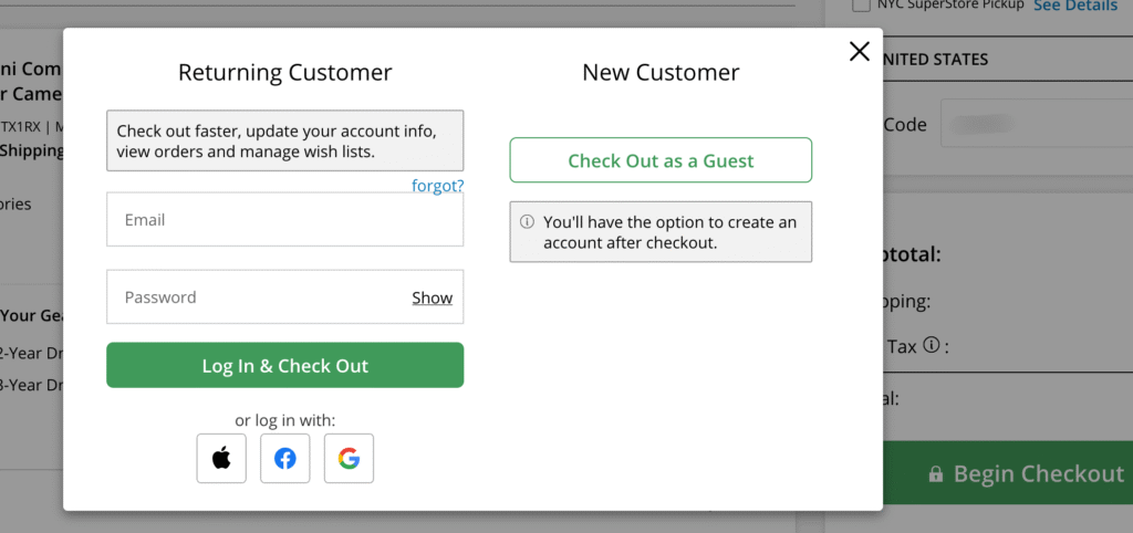
- Offer guest checkout: Don’t force users to create an account or register before buying. This is a major conversion killer and often causes potential customers to bounce.
- Be transparent about costs: Show all costs (shipping, taxes) upfront. Unexpected costs are the #1 reason for cart abandonment.
- Provide multiple payment options: Accept major credit cards, Stripe or other fintech payment processor, and potentially digital wallets like Apple Pay and Google Pay.
- Keep it simple: Only ask for essential shipping and billing info. Use features like address auto-complete. If the item is a digital download, a street address should not be required.
- Ensure security: Display trust badges (SSL certificate, payment logos) clearly.
Recover visitors who abandon a cart or form
Even with optimization, some users will abandon forms or carts. To offset this, set up recovery strategies like these:
- Exit-intent pop-ups: The action of a user who is about to leave the page (mouse moves towards the close button), triggers a popup offering help, a discount, or a reminder to save their progress. Use these carefully to avoid annoying users.
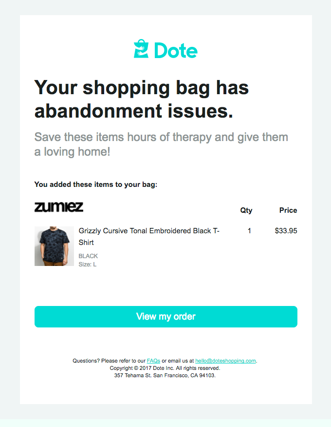
Studies suggest exit intent popups can recover some visitors who are about to bounce. OptiMonk’s cart abandonment popups (exit-intent popups) had the highest average conversion rate at 17.12%. - Abandoned cart emails: For e-commerce, if you capture an email address early in the checkout, send automated emails reminding users about their cart and encouraging them to complete the purchase, maybe with a small incentive. These emails have high open and conversion rates compared to standard marketing emails.
- Form analytics: Hotjar and Microsoft Clarity offer form analysis features showing where users drop off within a form, helping you identify problematic fields (not sponsored).
Optimizing forms is crucial, but overall trust depends on more than just smooth interactions. It’s woven into your site’s entire presentation.
Build Trust with UX and Content Design
Trust is the foundation of any successful business relationship, especially when you don’t have face-to-face interaction. As a solopreneur, building website credibility is paramount. Visitors need to feel confident that you are legitimate, professional, and reliable. This trust is built through a combination of thoughtful design and transparent, authoritative messaging content.
Design elements that convey professionalism and credibility
Your website’s visual design, also known as the user interface (UI), creates an immediate first impression. But a professional look doesn’t necessarily mean expensive or flashy, but it does mean attention to detail:
- High-quality logo & branding: A well-designed logo and consistent brand colors/fonts across your site signal professionalism.
- Clean layout & white space: An uncluttered design makes your site look organized and easier to navigate. Avoid overwhelming users with too much information at once.
- High-quality images: Use clear, relevant, and professional-looking images. Avoid blurry or outdated stock photos.
- Readability: Choose clean, legible typography. Sans-serif fonts (like Arial, Open Sans, Lato) are generally preferred for web body text due to better screen readability and accessibility. Ensure good font size and line spacing.
- Responsive design: A site that looks broken or is hard to use on mobile can instantly destroy your brand credibility.
How to humanize your brand as a solopreneur

People connect with people. As a solopreneur, your personality is your brand advantage (aka your “personal brand”). To show the real person behind your business:
- Use your real name and a recent photo: Include a friendly photo and personal story on your About page to connect emotionally with visitors. This makes you more relatable and approachable.
- Share your story: Briefly explain why you started your business and what drives you. People connect with purpose.
- Use “I” and “You”: Write content in a conversational tone, addressing the reader directly.
- Show your personality: Inject your voice and style into your writing and design. Let visitors get a sense of who you are.
- Be responsive: Respond promptly and personally to inquiries. Good customer service is a differentiator among similar businesses.
Building trust isn’t about tricks; it’s about genuinely presenting yourself and your business professionally, transparently, and authentically.
Content that establishes authority in your field
Demonstrate your expertise and build credibility through high-quality content:
- About page: Share your story, experience, and qualifications.
- Detailed Service/Product Descriptions: Clearly explain the features and benefits of what you offer.
- Blog Posts/Ebooks: Share valuable insights, tips, and knowledge related to your industry in blogs, ebooks, and newsletters. This positions you as an expert. You can repurpose excerpts as short-form content for sharing on social media.
- Case Studies/Portfolio/Demo: Show concrete examples of your work and the results you’ve achieved for others.
Well-researched, well-written content shows you know your stuff and are serious about your business.
Clear communication about security, privacy, and policies
Users are increasingly concerned about data privacy and security. Be transparent and make this information easy to find:
- SSL Certificate: Ensure your site uses HTTPS (the padlock icon in the browser bar). This encrypts data exchanged between the user and your site and is a basic requirement for trust.
Google Chrome explicitly marks non-HTTPS sites as “Not Secure.” - Privacy Policy: Display a clear, accessible privacy policy explaining how you collect and use user data. This is often legally required (GDPR, CCPA).
- Terms of Service (ToS): Outline the rules and guidelines for using your site or services.

Adding trust badges or seals related to security (SSL logos, payment processor logos like Visa/Mastercard) near forms or checkout areas can also reassure users. Studies have shown that recognized trust seals can positively impact conversion rates, though the effect varies.
Transparency in pricing and business operations
Ensure that all your business information is easy to find. Hidden costs or unclear pricing structures can erode trust. Some tactics include:
- Explain your process: Briefly outline how you work, what clients can expect, and typical timelines. This manages expectations and builds confidence. (You can address this in FAQs as well.)
- Clear pricing: Display your pricing clearly and upfront. If you offer custom quotes, explain your process and what factors influence the price. Avoid making users jump through hoops just to understand the costs of your products and services.
A Hotjar survey found that site visitors expect to find your pricing within 3 clicks. - Be Honest about limitations: As a solopreneur, you may not offer 24/7 support. Be clear about your working hours and response times so customers know what to expect. Honesty builds more trust than overpromising.
- Contact information: Make it easy for users to contact you (phone number, email address, and physical address if applicable). A lack of clear contact info is a red flag. Displaying this prominently can increase trust.
Put UX at the Heart of Your Solopreneur Website
Optimizing your website’s user experience isn’t just about aesthetics; it’s a fundamental strategy for achieving your business goals as a solopreneur. Ensuring lightning-fast page speed and intuitive navigation design, crafting compelling CTAs and building rock-solid website credibility all play a part in guiding your visitors to becoming loyal customers.
Good UX and content design:
- Directly impacts conversion rates.
- Reduces bounce rates and increases session duration.
- Builds trust and customer engagement.
- Makes your marketing efforts more effective.
Improving your website’s UX and content is an ongoing process, not a one-time task.
Start by conducting a basic website user experience audit. Pick one or two areas discussed in this article and make changes. Use website analytics and user testing (even informal testing with friends or peers) to measure the impact. Then tweak your design elements and content accordingly.
Wrap-Up
Effective web copy isn’t about clever wordplay or fancy jargon—it’s about clarity, relevance, and customer-centricity. Your visitors arrive with problems to solve and questions to answer. When your web copy addresses these needs directly while guiding users toward a clear next step, you create a frictionless experience that builds trust and drives conversions.
Your website is an “owned channel,” while social media platforms are not. So keep your website up to date. As your business evolves and your understanding of your customers deepens, your website should evolve too. So set up a recurring task to review your web copy every six months or so using this guide.
When you prioritize your users’ needs and create a seamless, enjoyable online experience, you’ll improve your conversion rates, and strengthen your brand reputation and customer relationships. Whether you’re launching a new site or revamping the one you have, these principles will help ensure your web copy works as hard as you do, even while you sleep.
References
Burnam, L. (2025). 31 User Experience Research Statistics to Win Over Stakeholders. User Interviews.
Clem, A. Optimize Your Mobile Experience. (2021). Think with Google.
Find Out How You Stack Up to New Industry Benchmarks for Mobile Page Speed. (2017). Think with Google.
Holst, C. (2024). Reasons for Cart Abandonment – Why 70% of Users Abandon Their Cart (2025 data). Baymard Institute.
How Can I Use Hotjar to Track Interactions with My Forms? Hotjar.
HTTPS FAQs. Google Transparency Report Help Center.
Kirkpatrick, D. (2016). Google: 53% of mobile users abandon sites that take over 3 seconds to load. Marketing Dive.
Laubheimer, P. (2018). Breadcrumbs: 11 Design Guidelines for Desktop and Mobile. Nielsen Norman Group.
Leaning, B. (2025). 49 Call-to-Action Examples You Can’t Help But Click. HubSpot.
Loresco, S. (2024). 7 stats that prove user-centric websites win in 2024 (with tips on how to improve UX). Hotjar.
Lorincz, N. (2024). 18 Popup Statistics You Must Know in 2025. OptiMonk.
Lorincz, N. (2025). Exit-Intent Popup Examples, Tips & Strategies: The Ultimate Guide for 2025. OptiMonk.
Mooney, B. (2008). Fewer fields in a contact form sharply increases conversions. Imagescape.
Morkes, J & Nielsen, J. (1997). Concise, SCANNABLE, and Objective: How to Write for the Web. Nielsen Norman Group.
Niggulis, O. (2025). Which CTA Button Color Converts Best? CXL.
Paget, S. (2023). Consumer Review Survey. BrightLocal.
Pernice, K. (2017). F-Shaped Pattern of Reading on the Web: Misunderstood, But Still Relevant (Even on Mobile). Nielsen Norman Group.
The need for mobile speed. (2017). Think with Google.
Understanding Core Web Vitals and Google search results. (2023). Google Search Central.
Website Load Time in 20231: How Fast is Fast Enough? (2021). Pingdom.
career UX